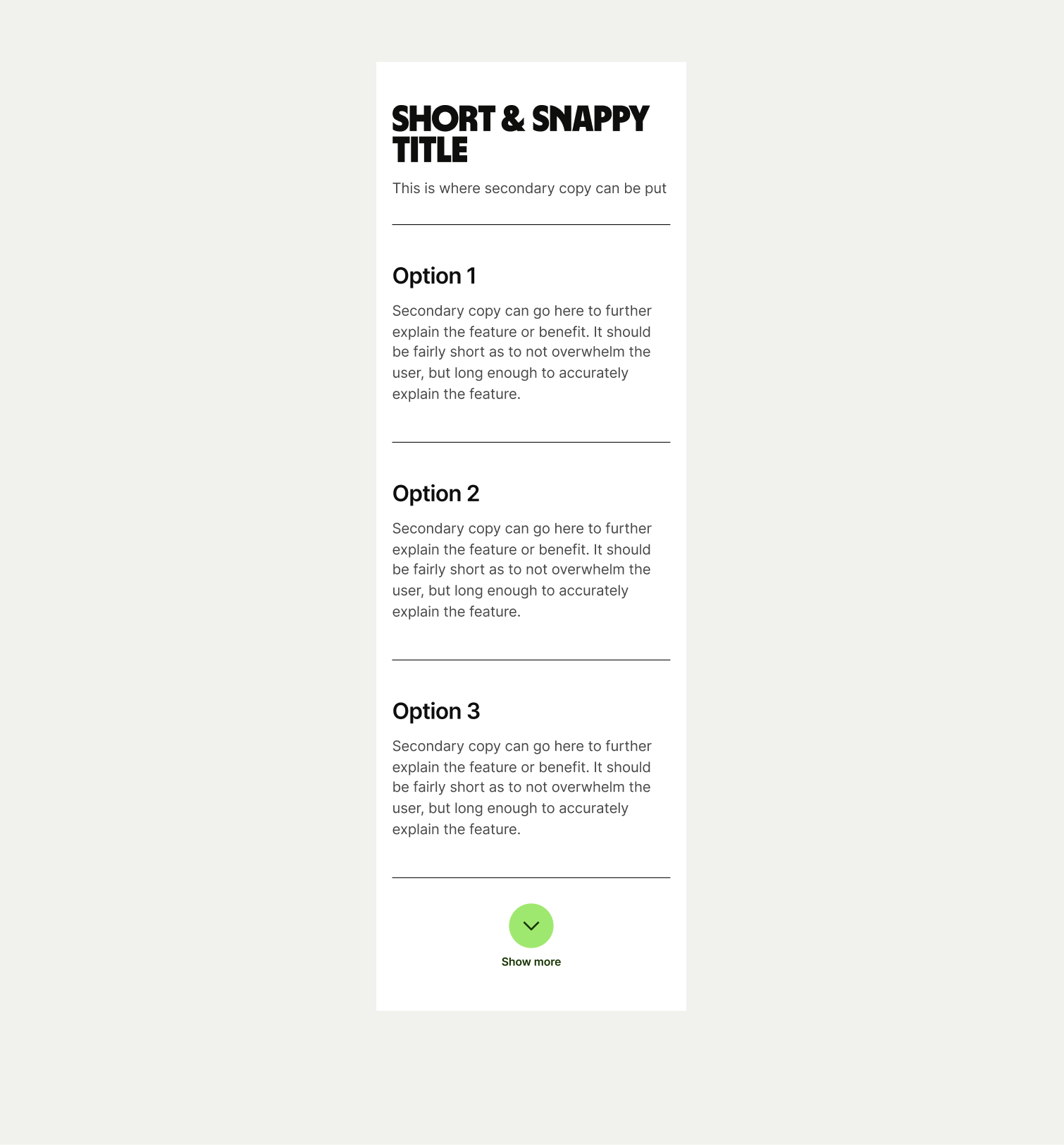
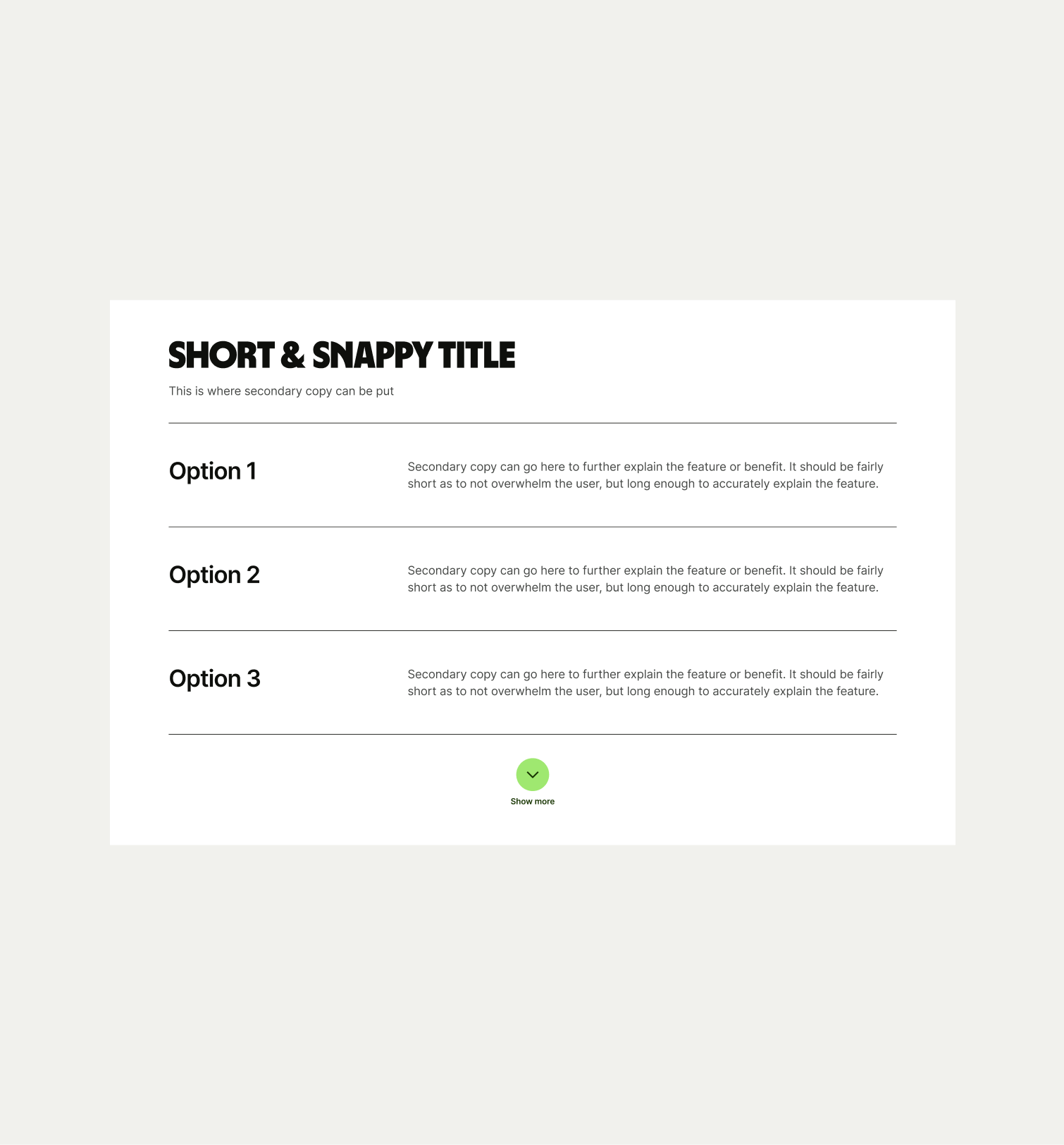
This component can be used to showcase lots of information in an orderly and easily understandable way.
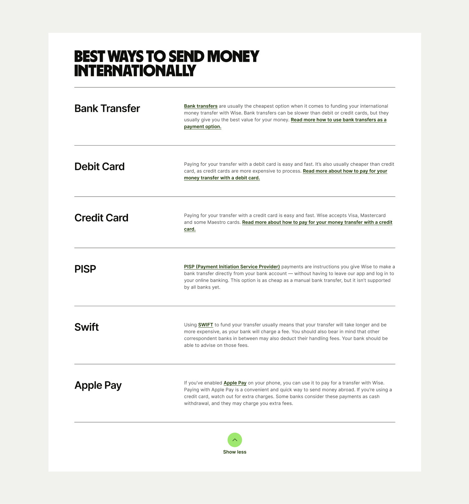
The Text Stack is typically used on pages where we have lots of detailed information. It’s a way of showcasing this information in an orderly and easy to understand way without overwhelming the user. The table can be expanding to reveal more rows and includes the option for hyperlinks within the secondary copy.
- Make sure the secondary copy is descriptive and helpful for the user.
- Don’t make titles too long or explanatory, but rather just a summary of the row.

To ensure that the Text Stack component remains visually appealing and accommodates different languages, adhere to the following content limitations:
Headline: The headline should be short and precise. Ideally fitting across two lines.
Body Copy: The body copy should be precise and clear, keeping in line with our tone of voice. Avoid adding paragraphs of text that might overwhelm the user.
By following these guidelines, you ensure that the Text Stack component can comfortably accommodate different languages while maintaining a consistent and visually pleasing design.
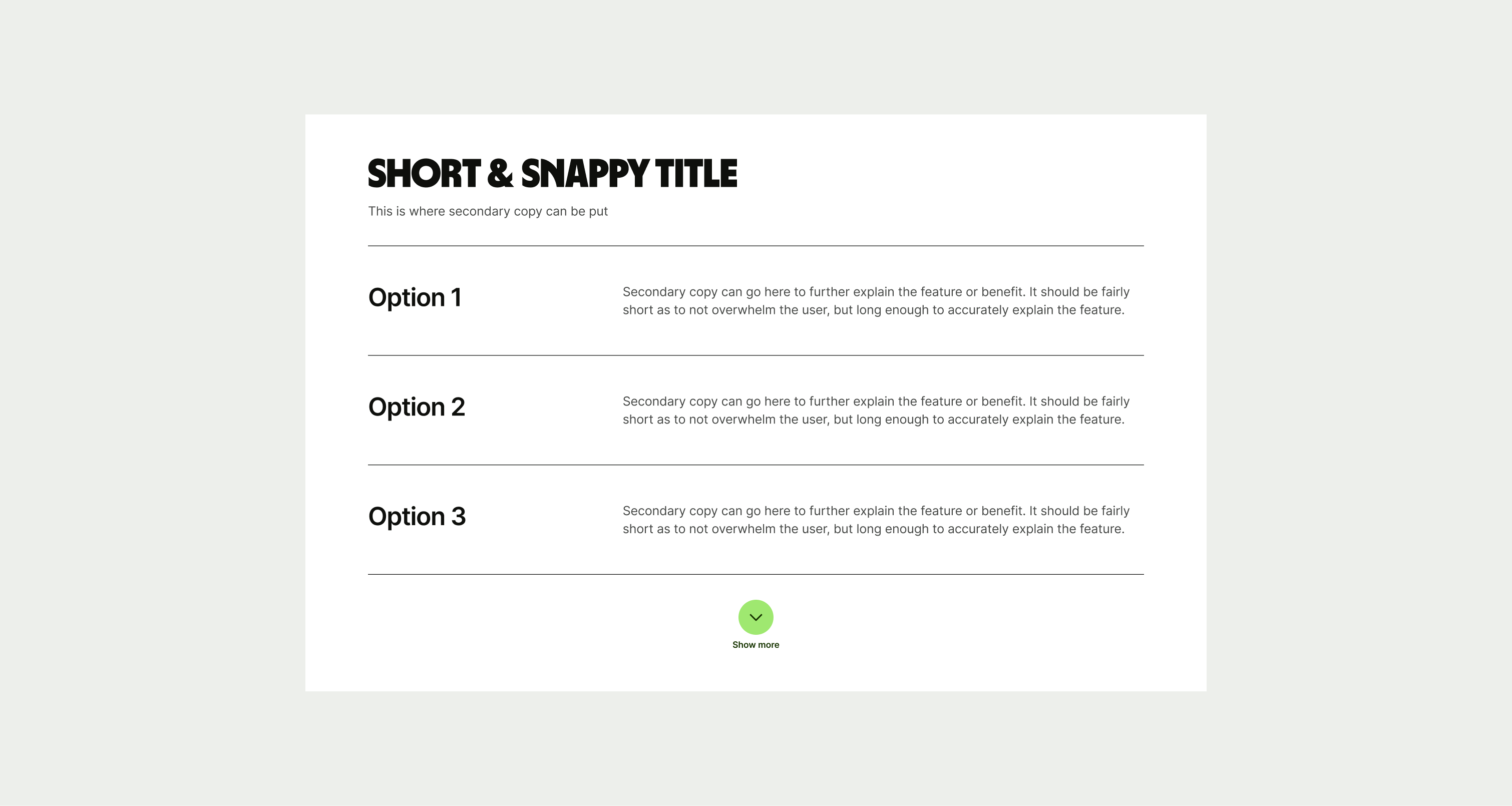
These are the examples of the Text Stack component across different screen sizes.