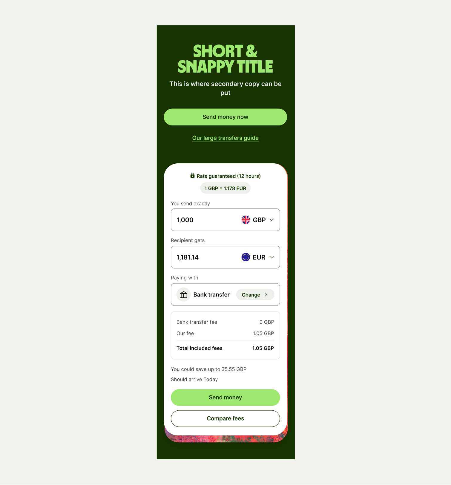
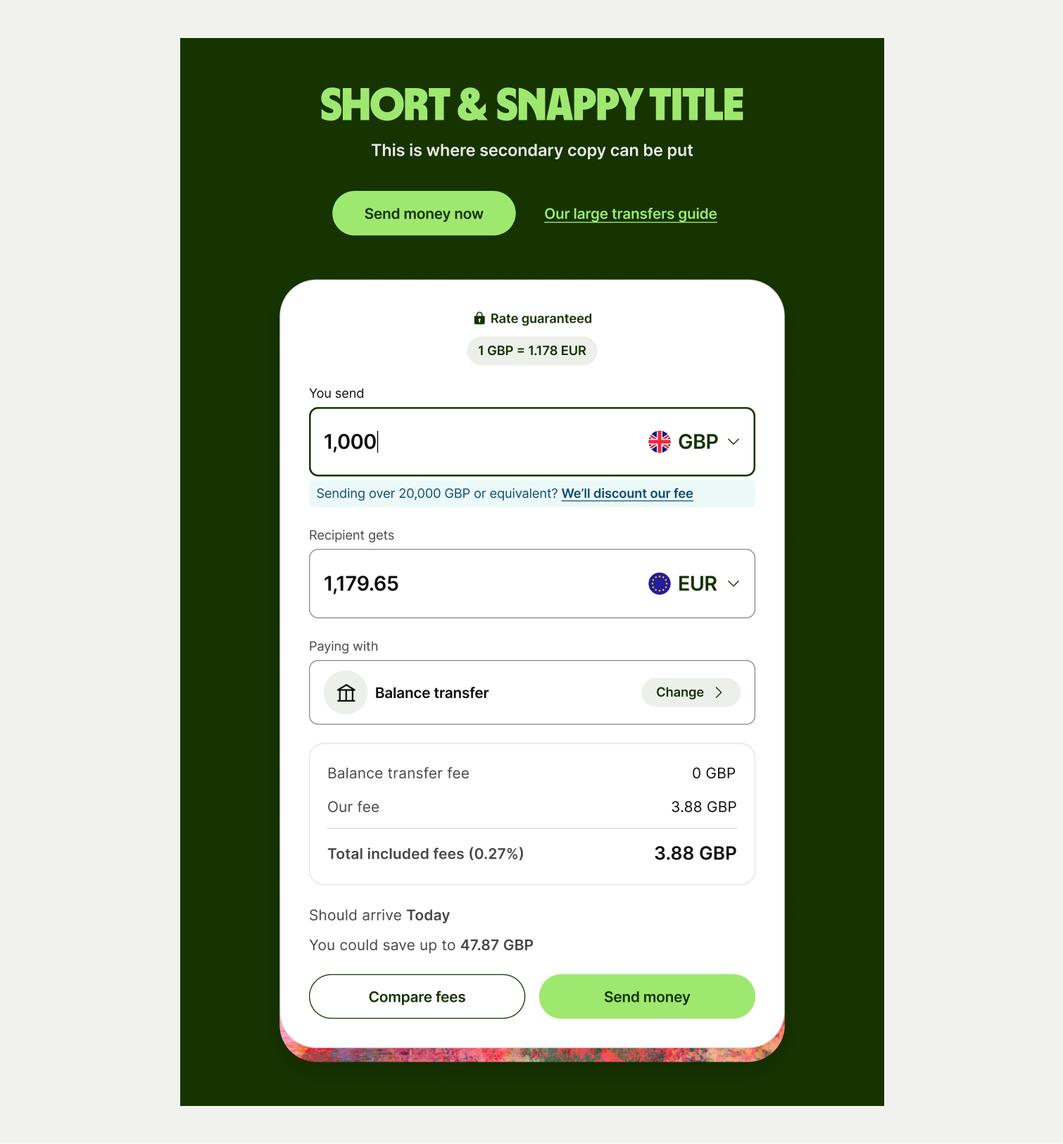
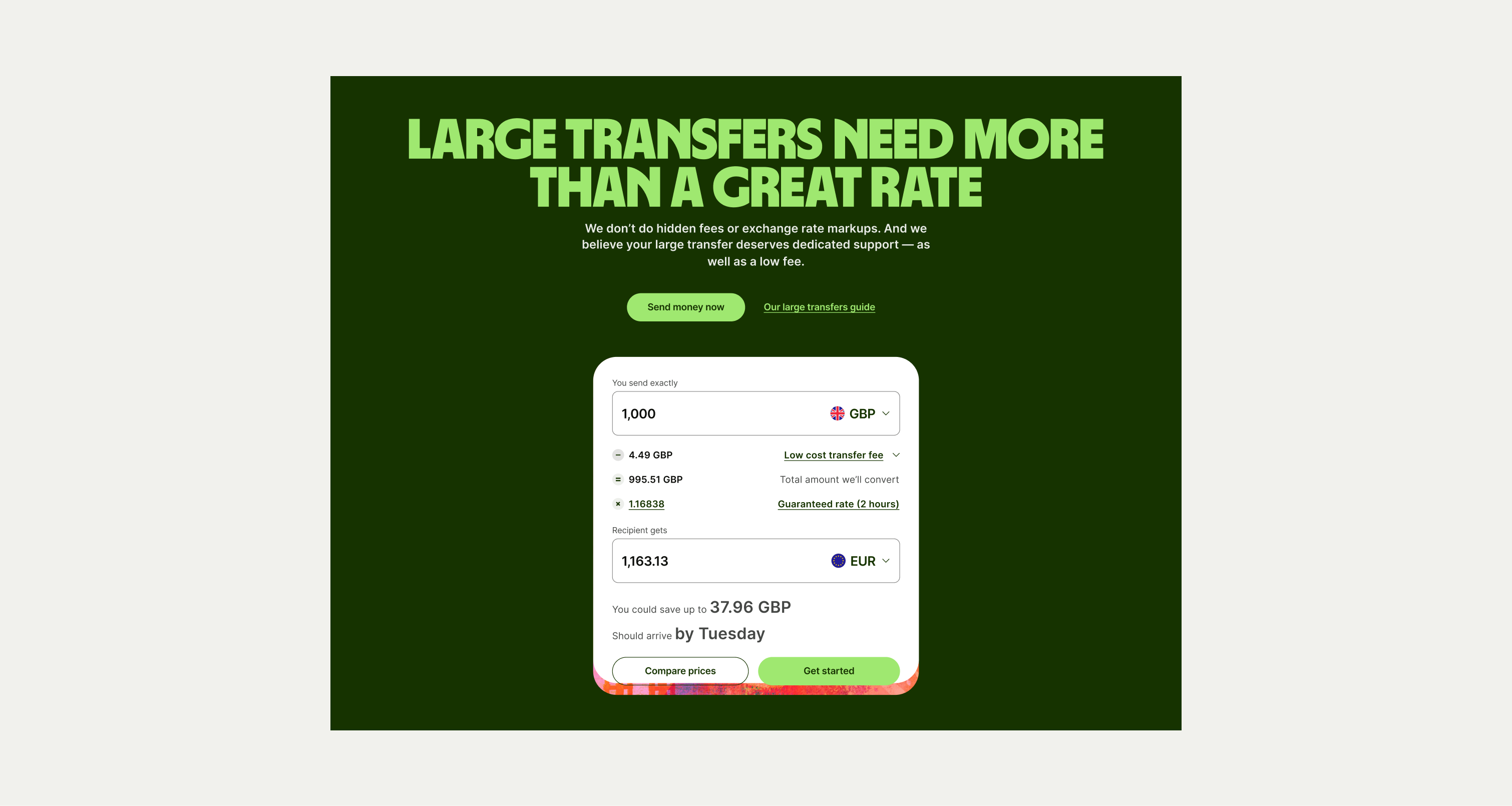
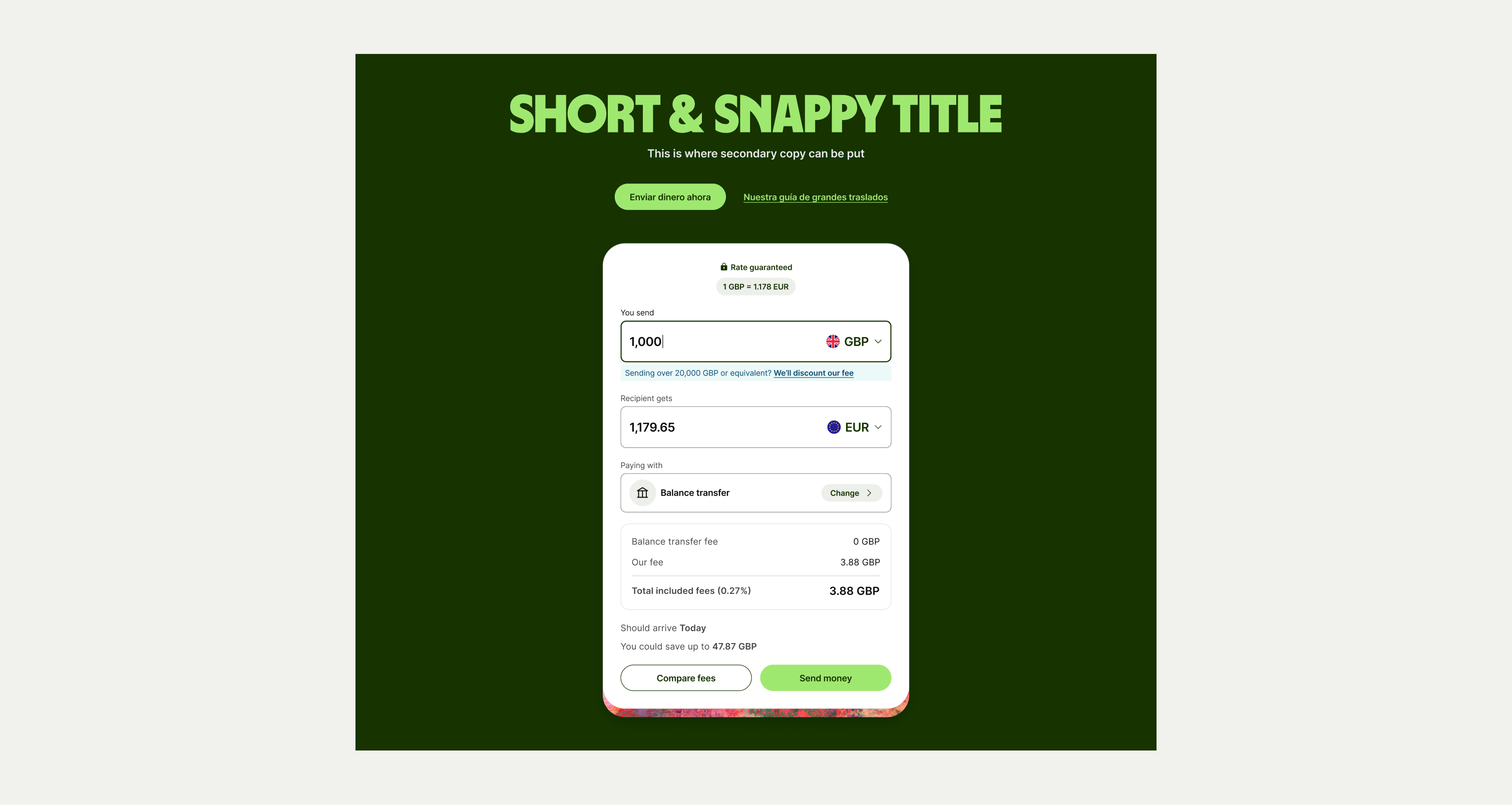
This component is designed to let users interact with our calculators, converters and other features at the start of a page.
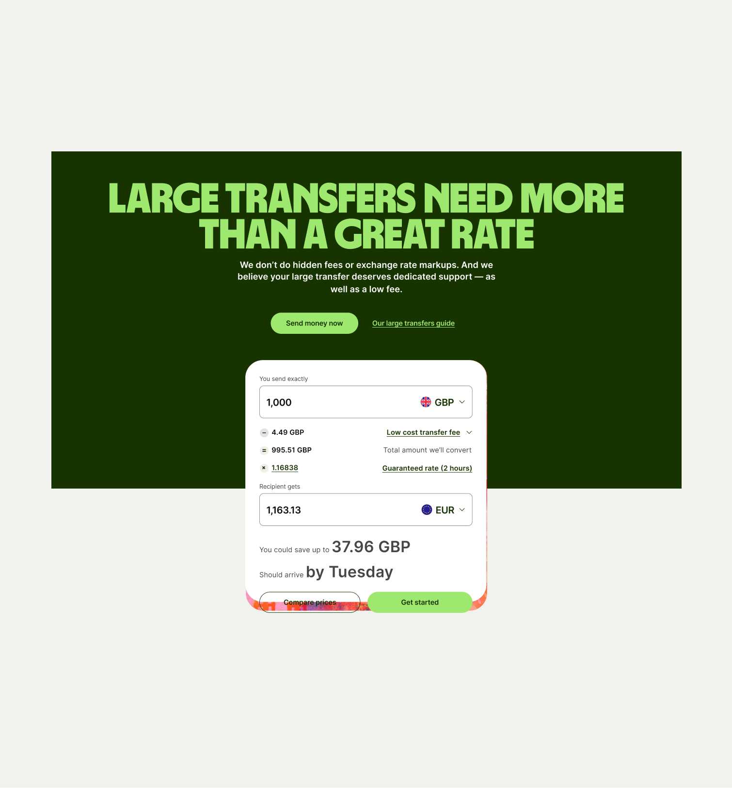
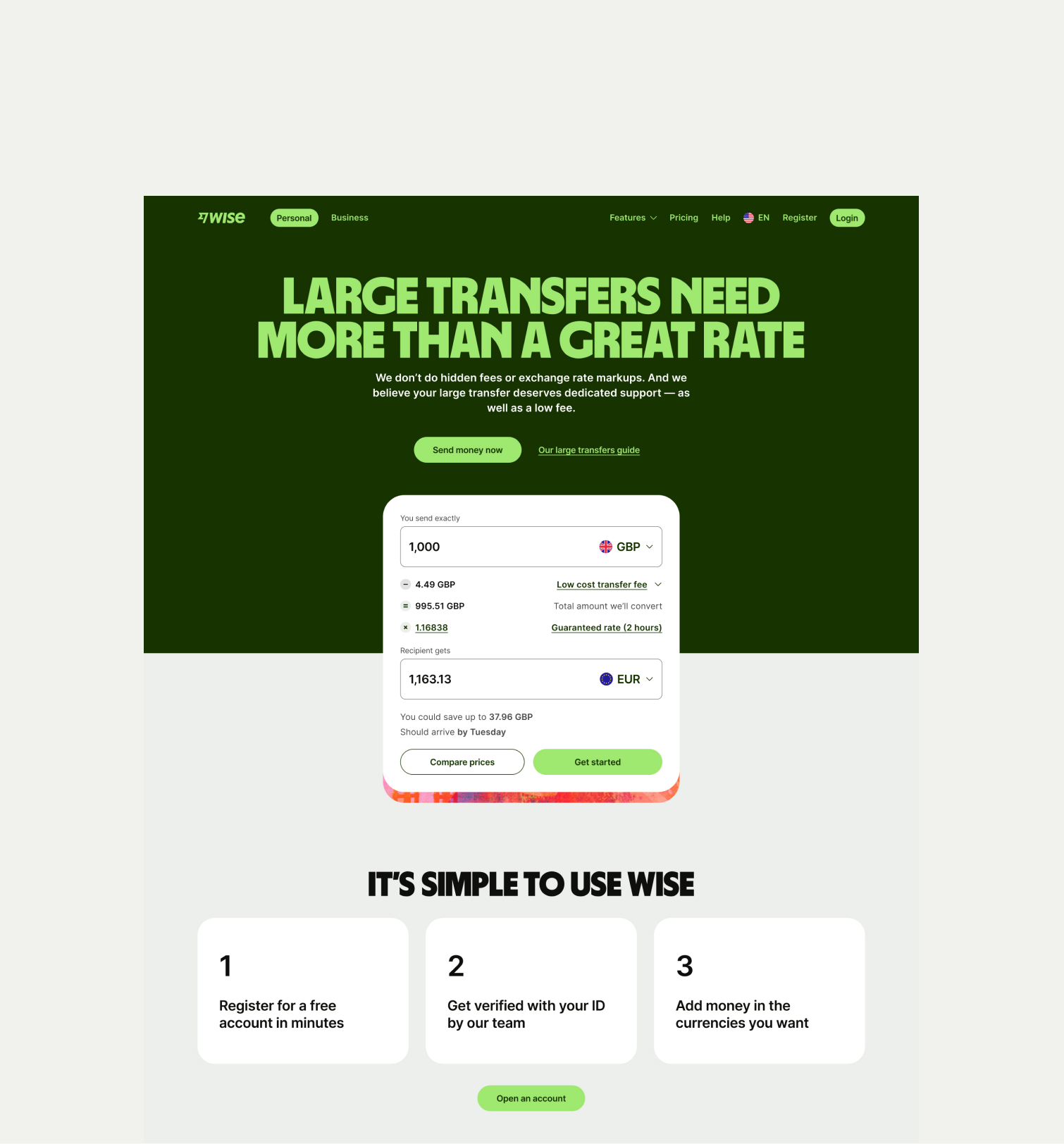
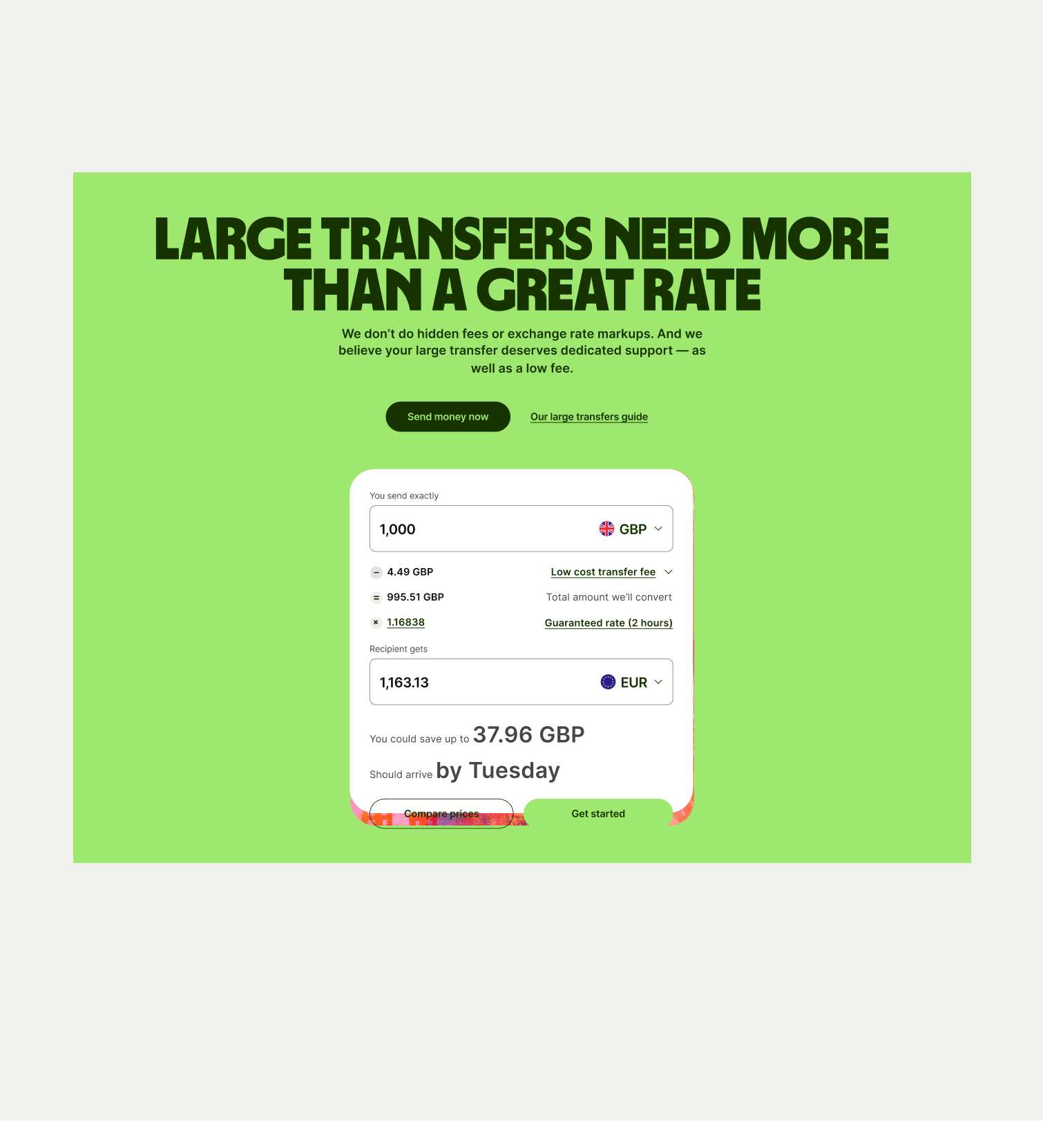
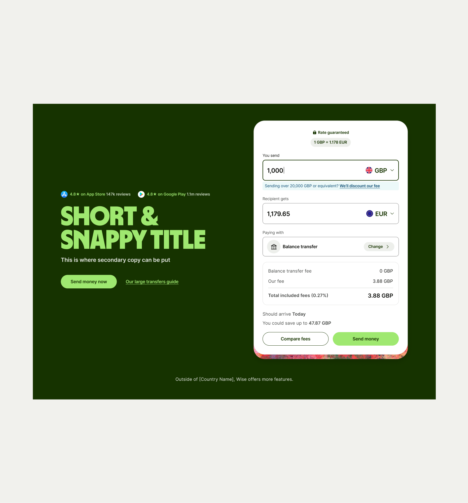
The Hero Interactive can be used on pages to allow users to interact with one of our tools such as a calculator or converter. The component comes in two colour themes of Bright Green and Forest Green. We have the option to split the background colour across the interactive element to create a more visually flowing component. We have the option for both a vertical an horizontal layout.
- Ensure the lower half colour matches to the corresponding component.
- Dont make the copy text too long to risk overwhelming the user, or too short that it isn’t helpful.


To ensure that the Hero Interactive component remains visually appealing and accommodates different languages, adhere to the following content limitations:
Headline: The headline should be short and precise. Ideally fitting across two lines.
Body Copy: The body copy should be precise and clear, keeping in line with our tone of voice. Avoid adding paragraphs of text that might overwhelm the user.
By following these guidelines, you ensure that the Hero Interactive component can comfortably accommodate different languages while maintaining a consistent and visually pleasing design.
These are the examples of the Hero Interactive component across different screen sizes.