This component is used after features sections or highlights to summarise key benefits or services.
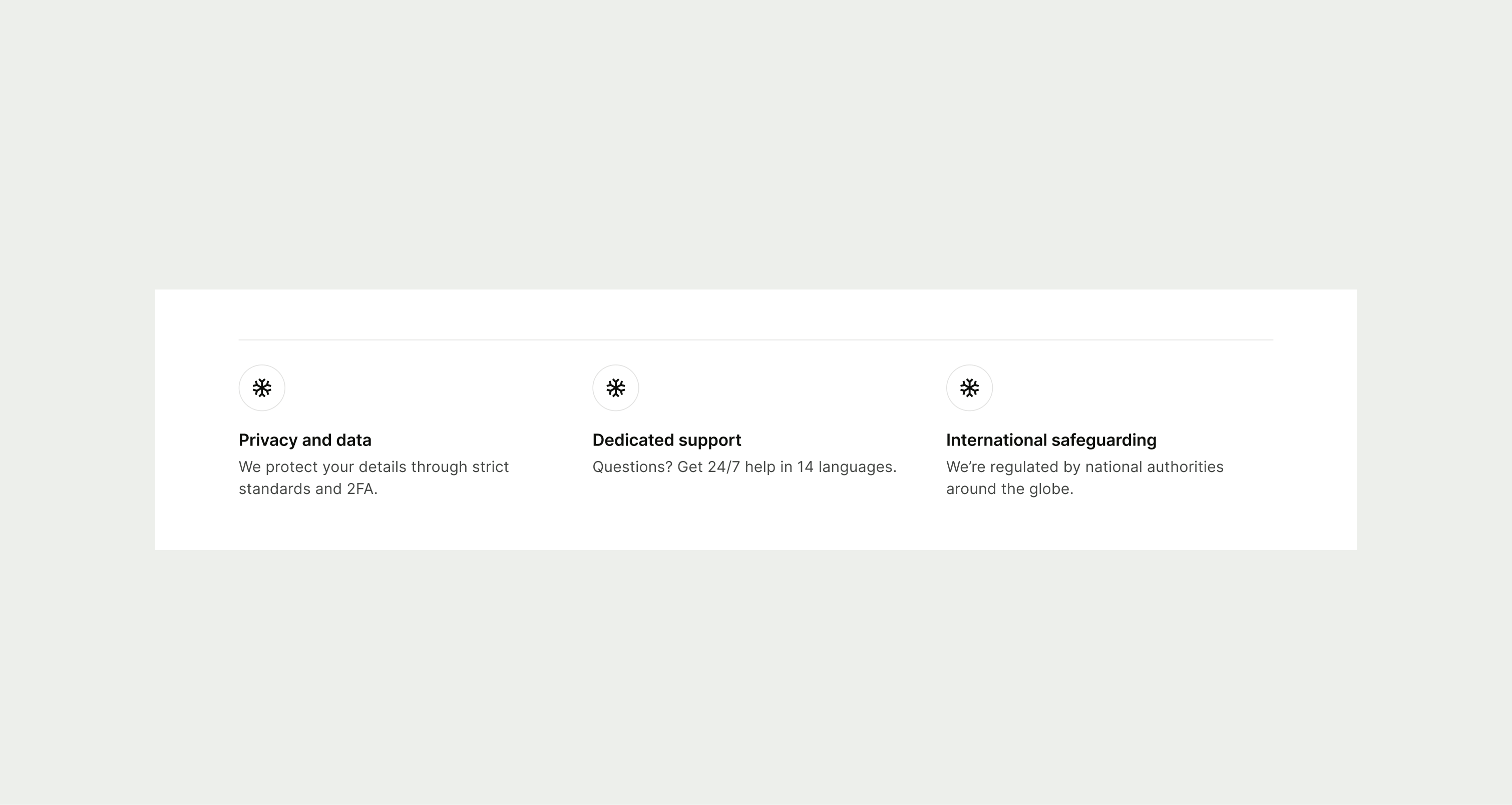
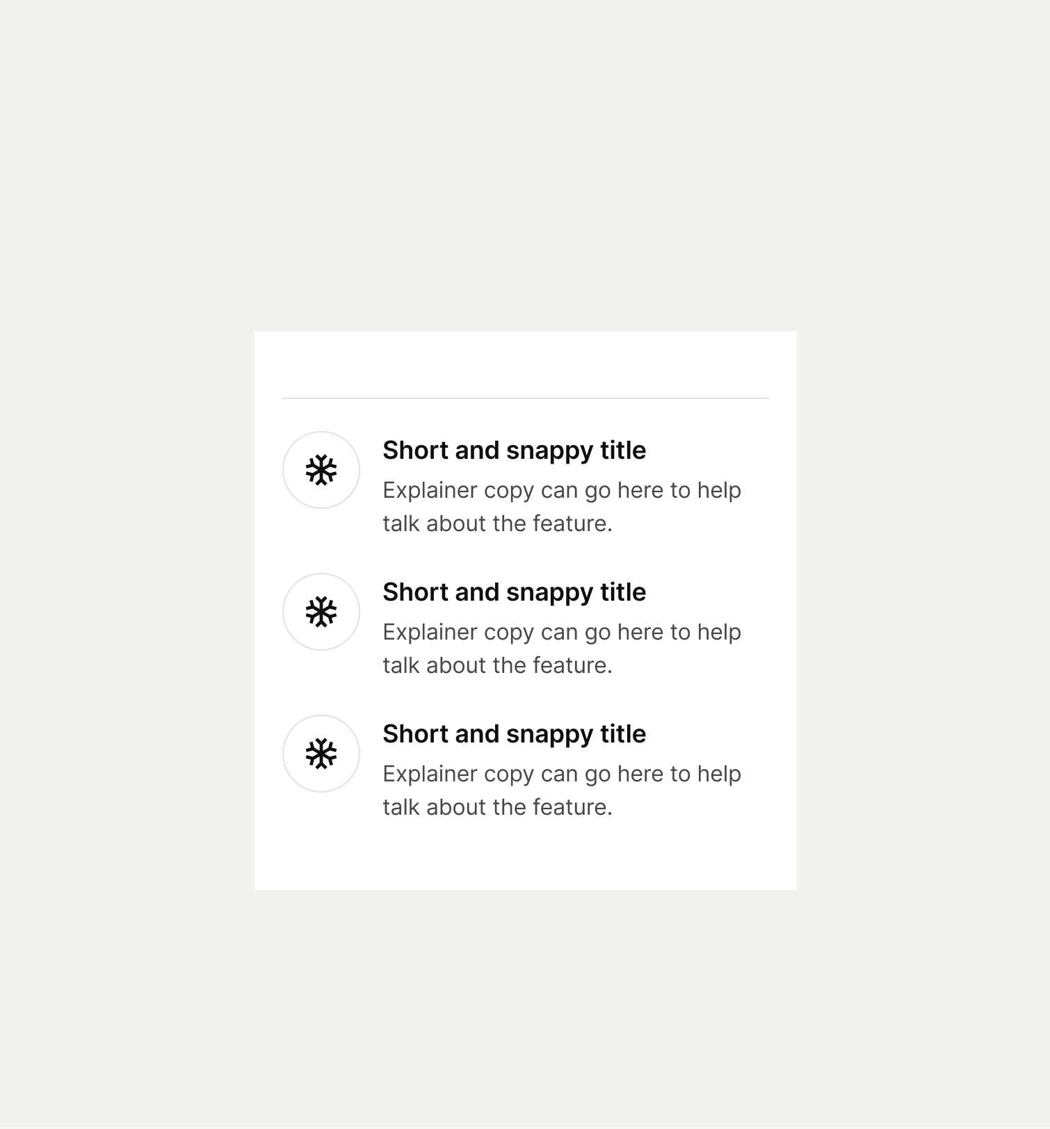
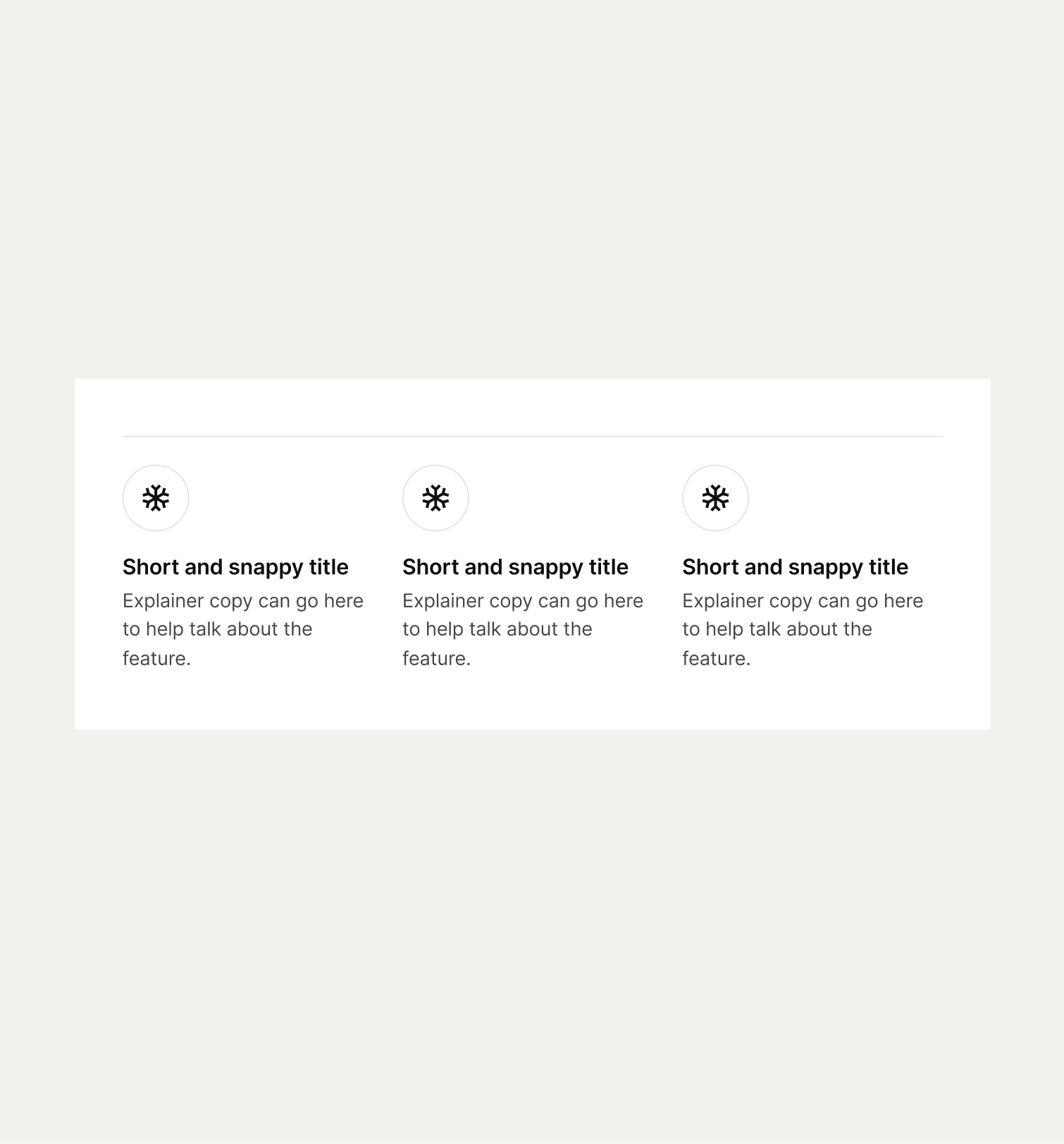
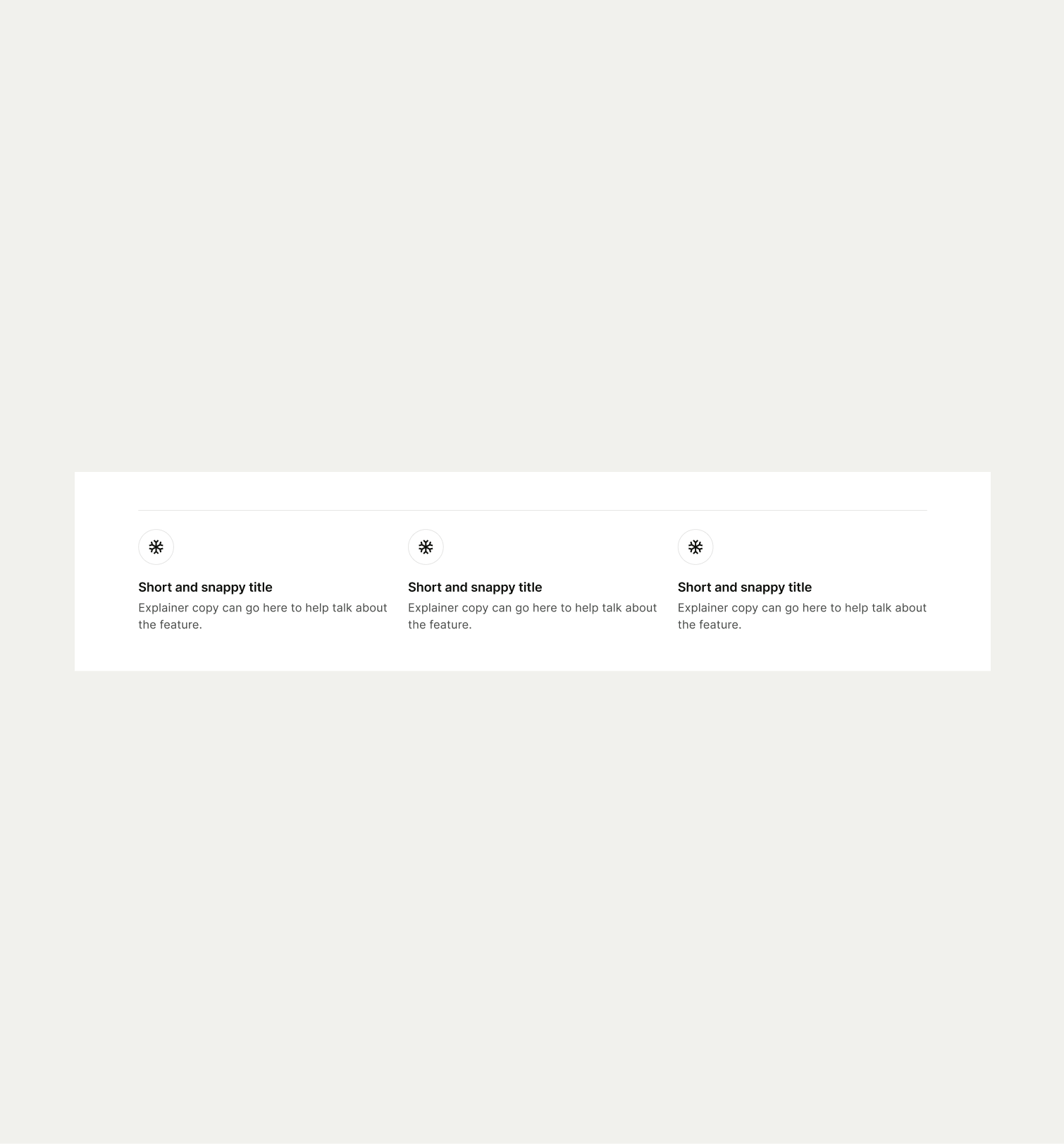
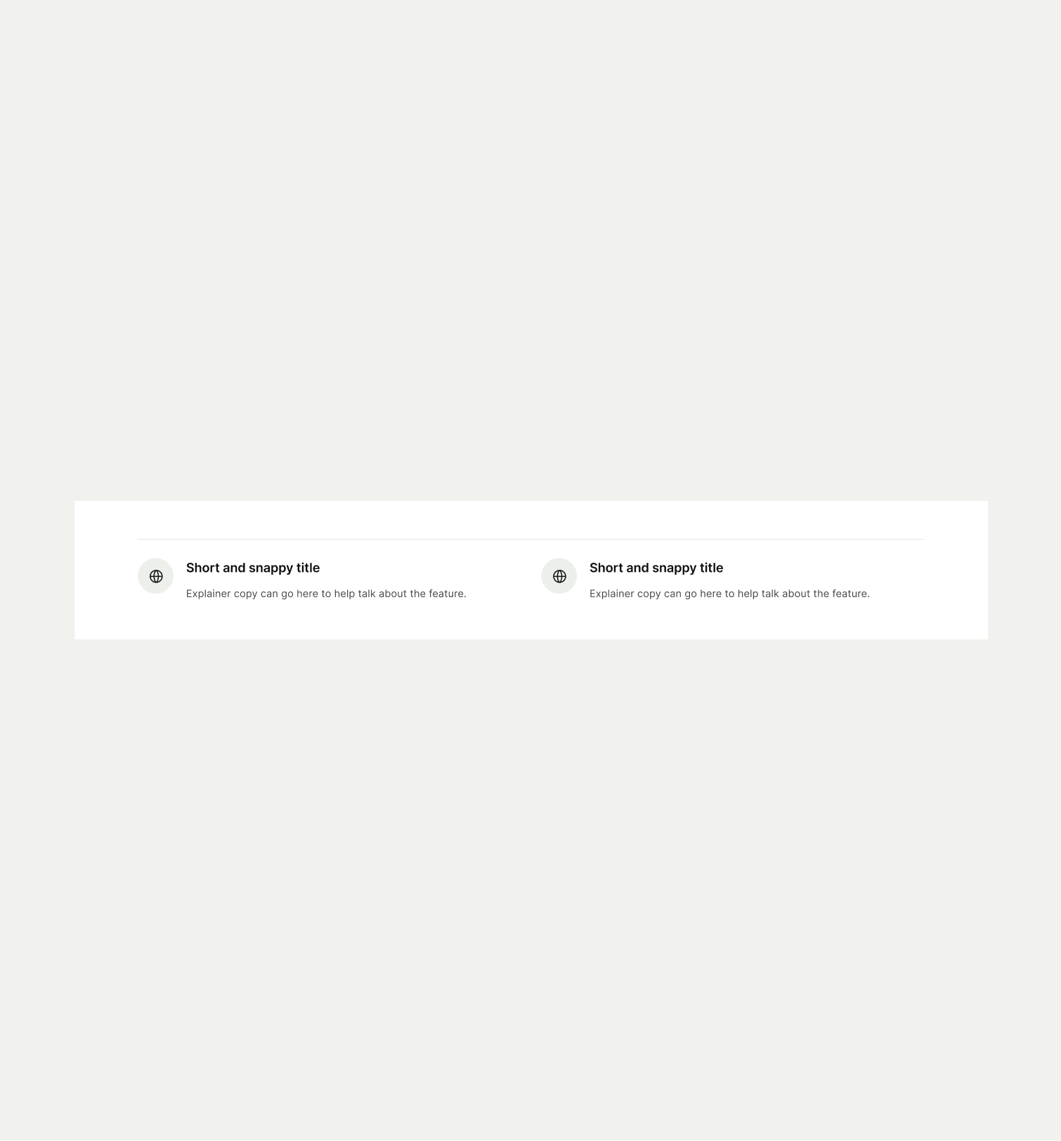
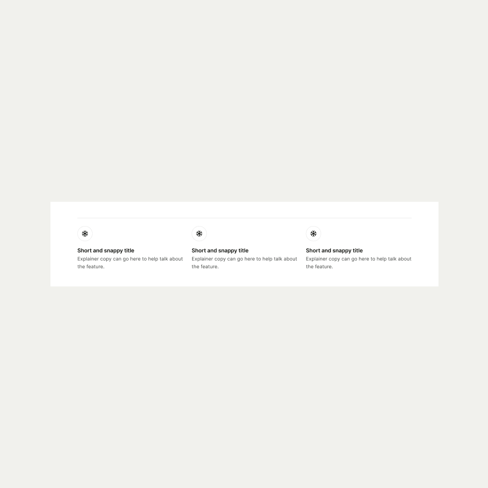
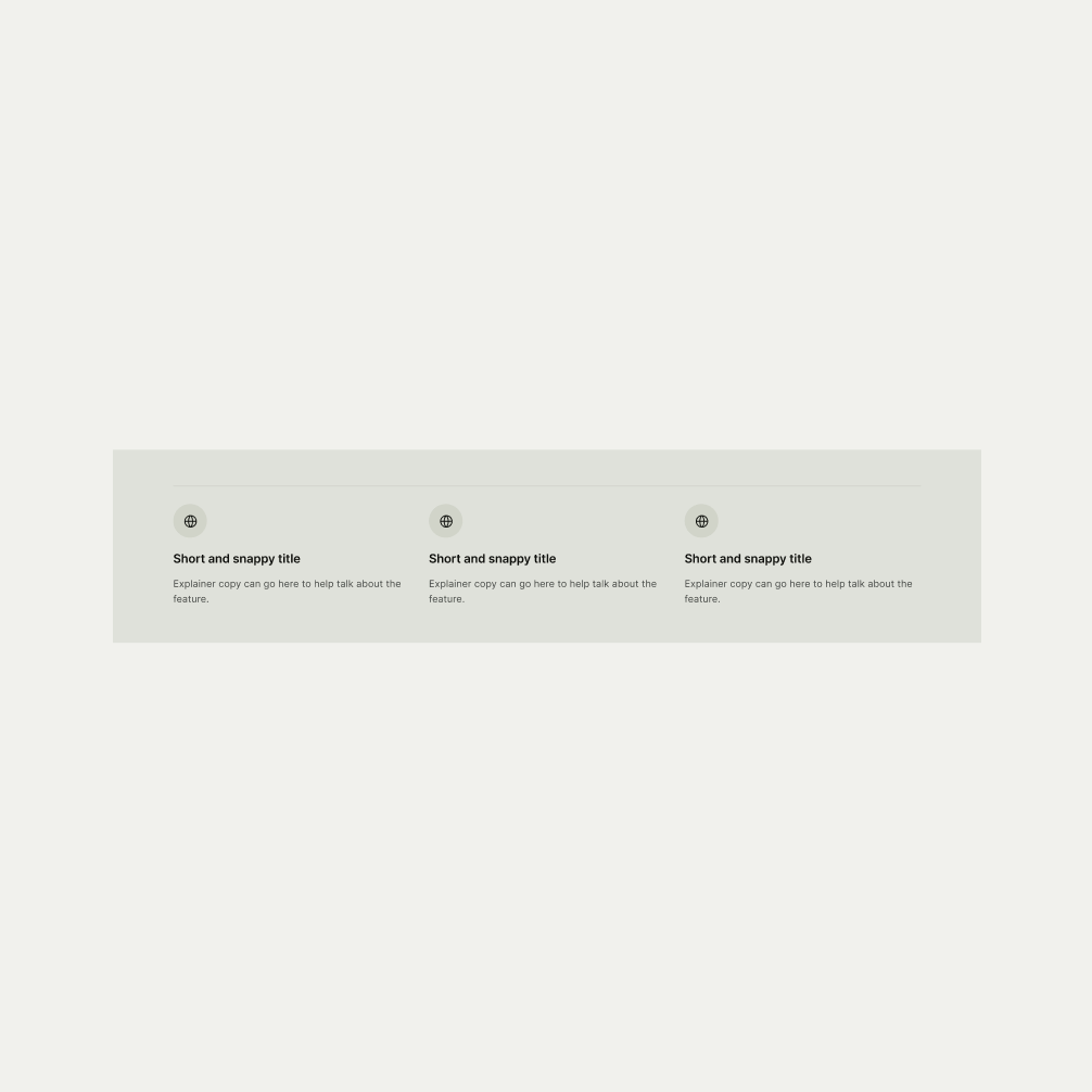
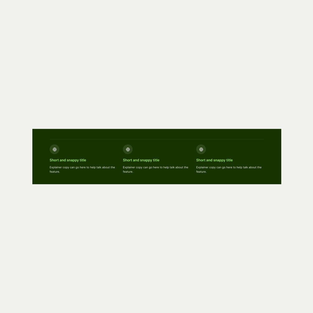
The Icon Divider is used after feature sections or product highlights to summarise the features key benefits or services to the user. It has a maximum of three icons and a minimum of two. The text should be concise and scannable to improve readability. It comes in three themes of Light, Neutral and Forest Green.
- Ensure the icon accurately represents the text.
- Do not use too much text that risks overwhelming the user.
To ensure maximum accessibility for our users, use plain language in accordance with our tone of voice for an inclusive reading experience. The text should be precise and informative. Ensure that images are accompanied by appropriate alternative text (alt text) for screen readers. An ideal alt text is descriptive and concise to convey the meaning and purpose of the image to users who may not be able to see it.

To ensure that the Icon Divider component remains visually appealing and accommodates different languages, adhere to the following content limitations:
Headline: The headline should be short and precise. Ideally fitting across two lines.
Body Copy: The body copy should be precise and clear, keeping in line with our tone of voice. Avoid adding paragraphs of text that might overwhelm the user.
By following these guidelines, you ensure that the Icon Divider component can comfortably accommodate different languages while maintaining a consistent and visually pleasing design.
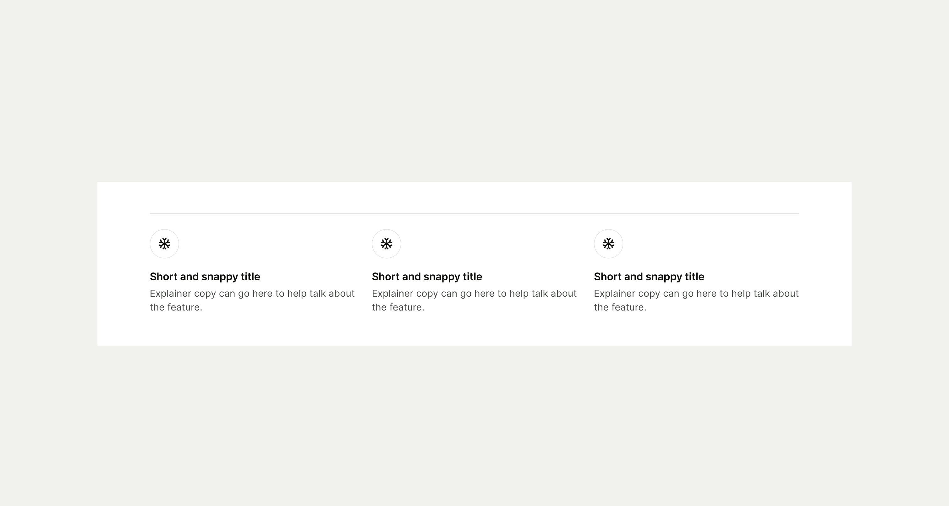
These are the examples of the Icon Divider component across different screen sizes.