This component is designed to offer a space-saving solution by allowing users to expand or collapse sections of content as needed.
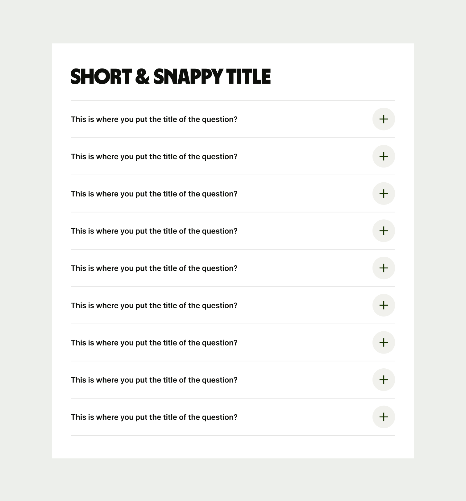
The Accordion component is typically used towards the end of pages to answer specific questions that users might have around a particular feature, offering or anything else to do with Wise.
- Questions/titles should be direct and short, but informative
- Don’t overwhelm the user with too much information for each answer. Hyperlinks can always be added to further explain a point and guide the user to more information.

To ensure that the Accordion component remains visually appealing and accommodates different languages, adhere to the following content limitations:
Headline: The headline should be short and precise. Ideally fitting across two lines.
Body Copy: The body copy should be precise and clear, keeping in line with our tone of voice. Avoid adding paragraphs of text that might overwhelm the user.
By following these guidelines, you ensure that the Accordion component can comfortably accommodate different languages while maintaining a consistent and visually pleasing design.

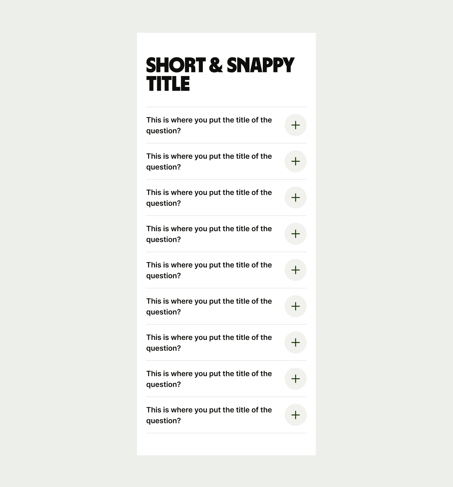
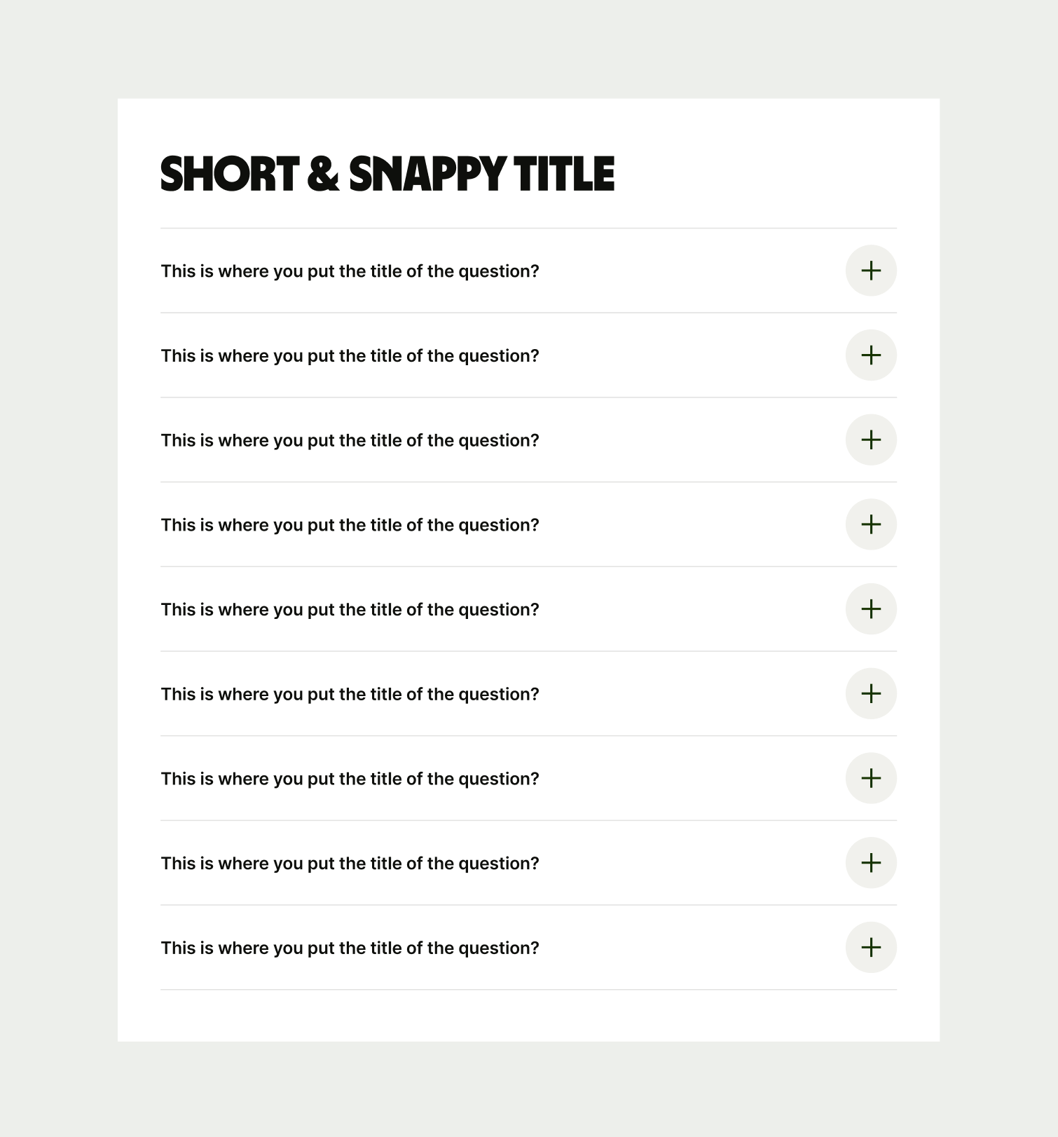
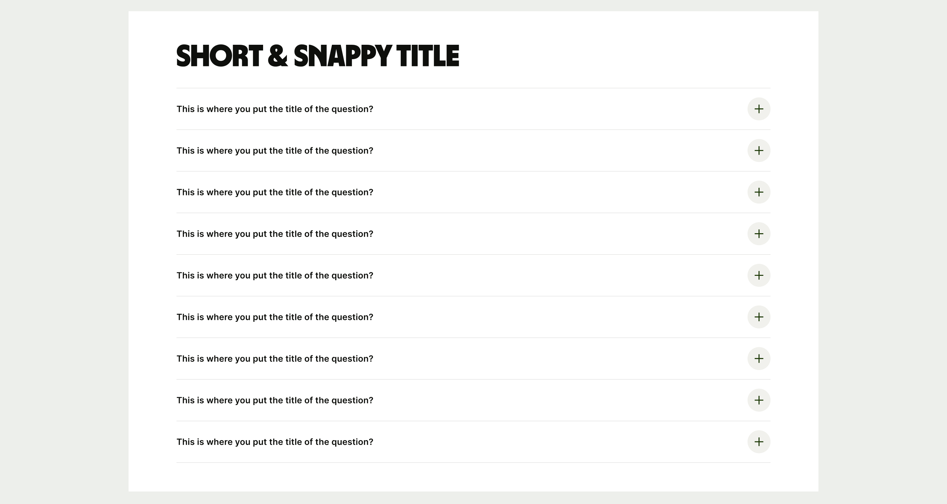
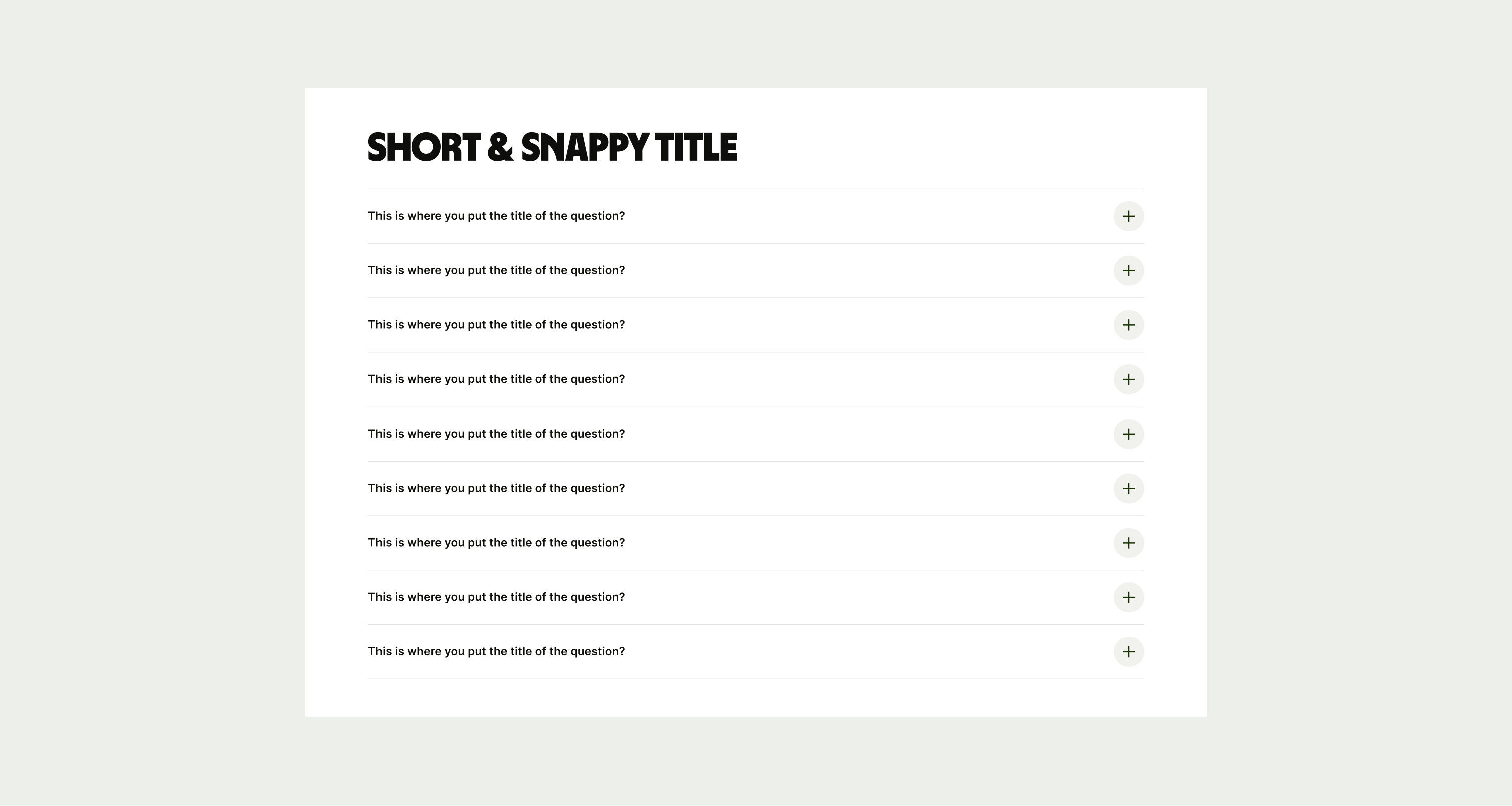
These are the examples of the Accordion component across different screen sizes.