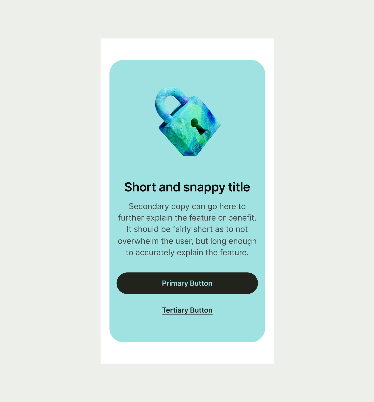
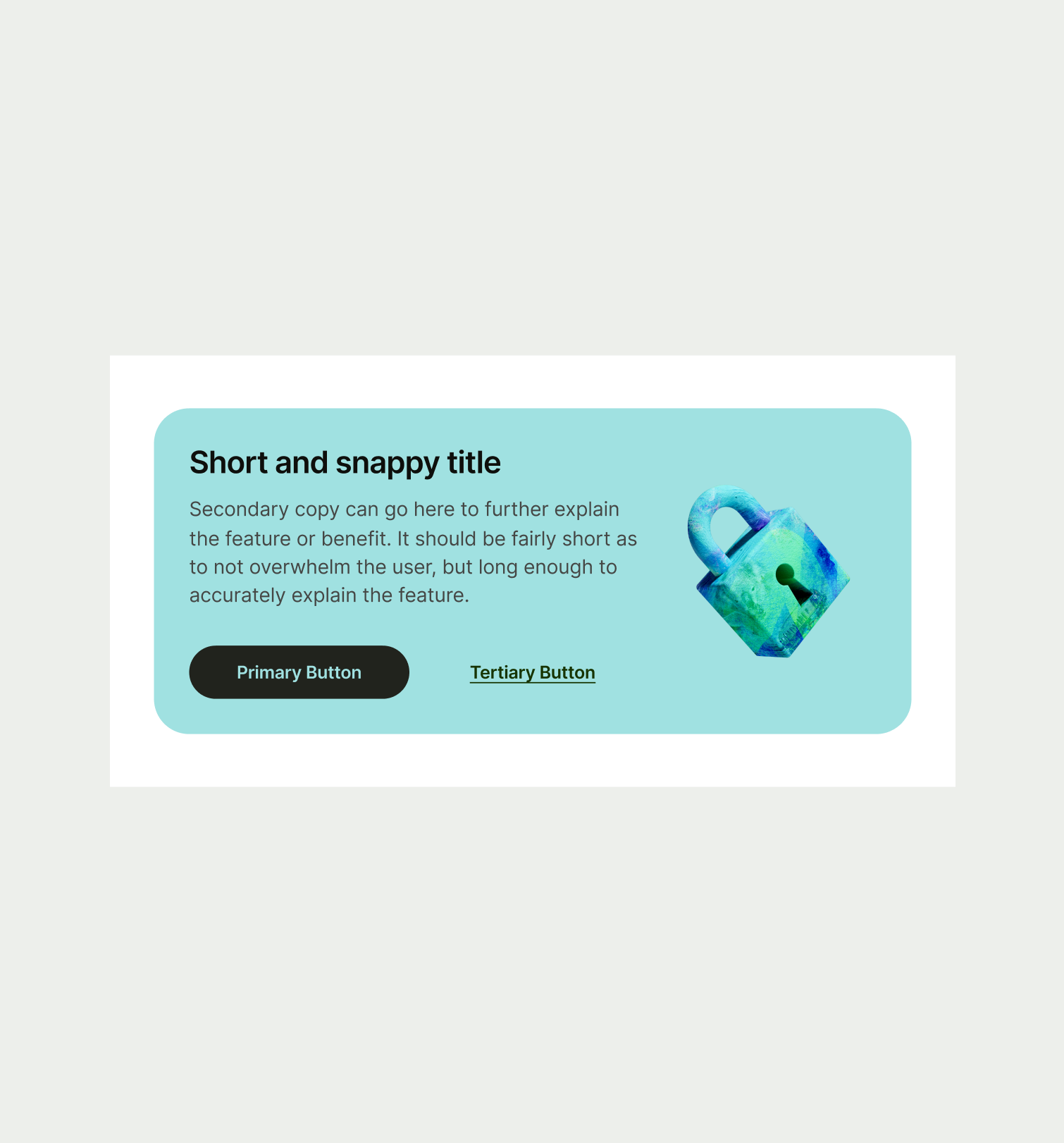
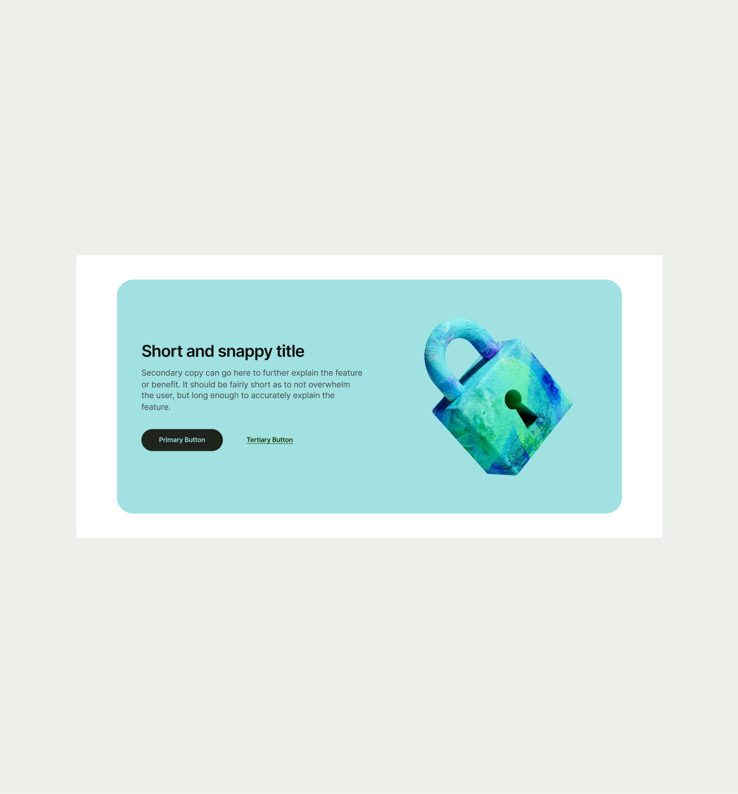
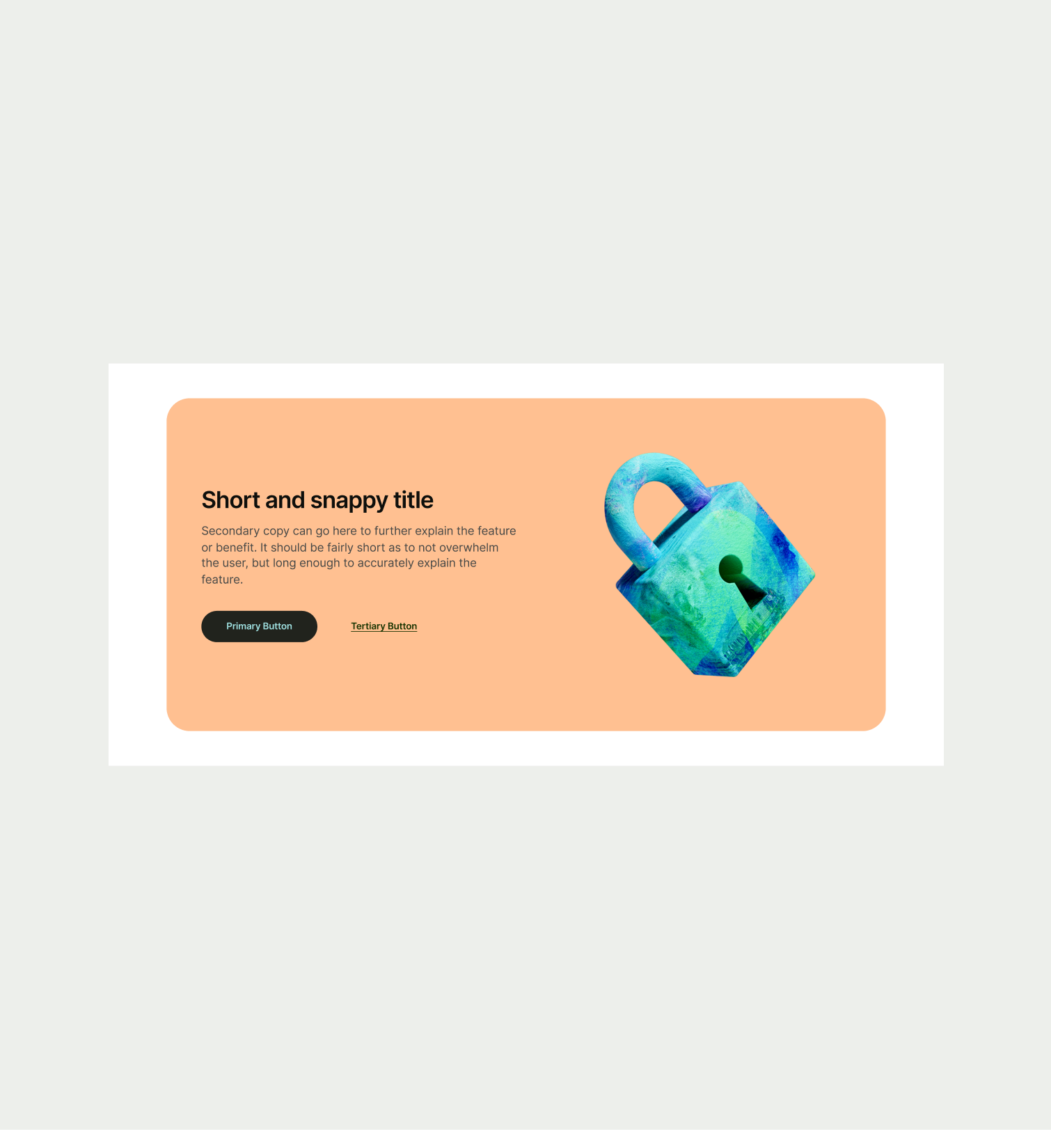
This component can be used to callout a feature or benefit for Wise users or talk in more detail around a certain subject.
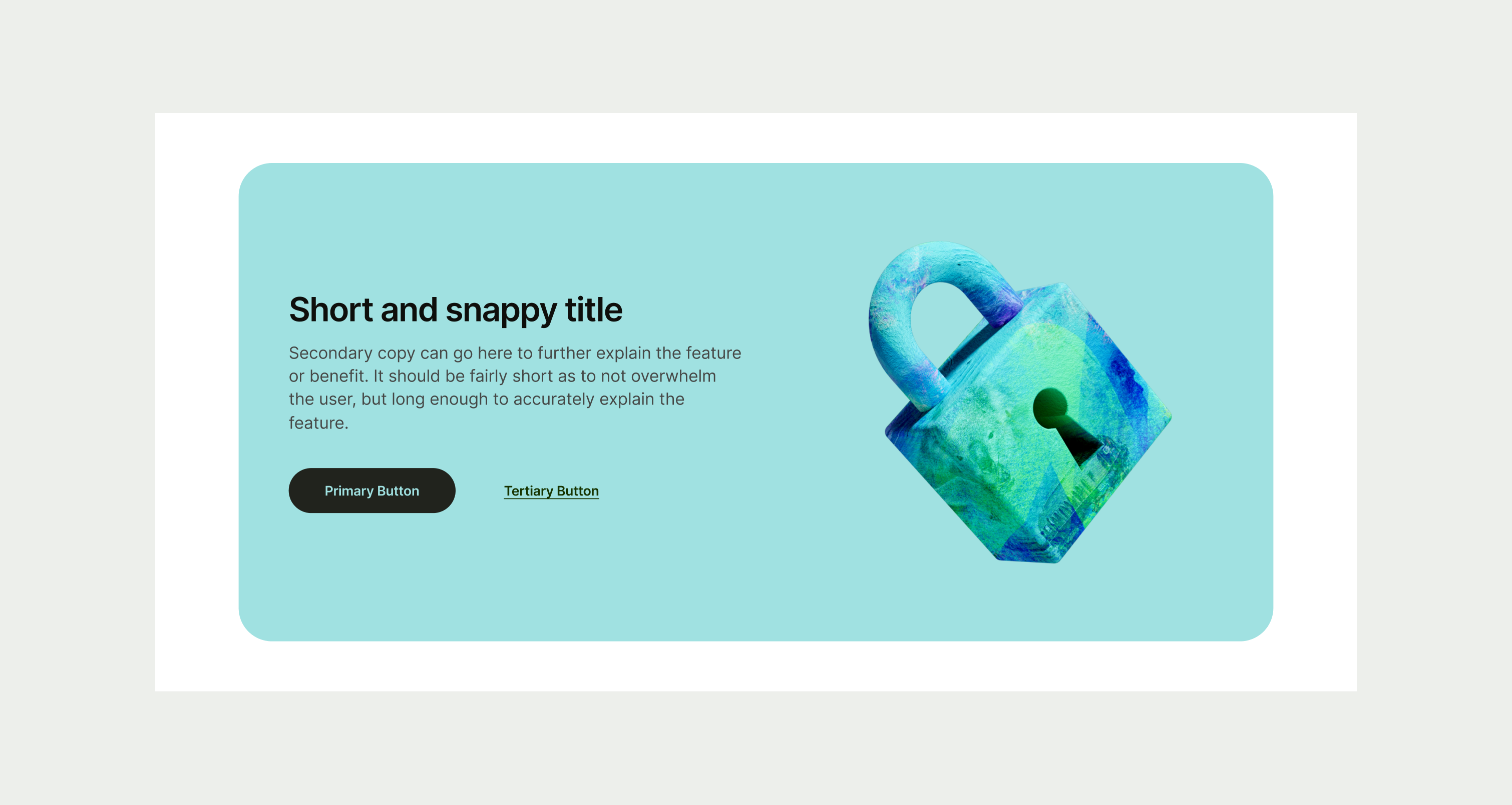
The Callout Small component can be used to highlight a particular feature or benefit for Wise users or to allow users to learn more about the company and our mission. The information used should be kept short and precise and allow for a user to click a call-to-action to learn more. It should always be paired with an illustration. The colours can change but always to a colour pairing outlined in our colour guidelines.
- Craft a concise and compelling headline that clearly communicates the main feature or benefit.
- Do not use colours that aren't paired in our colour guidelines
To ensure maximum accessibility for our users, use plain language in accordance with our tone of voice for an inclusive reading experience. The text should be precise and informative. Ensure that images are accompanied by appropriate alternative text (alt text) for screen readers. An ideal alt text is descriptive and concise to convey the meaning and purpose of the image to users who may not be able to see it.

To ensure that the Callout Small component remains visually appealing and accommodates different languages, adhere to the following content limitations:
Headline: The headline should be short and precise. Ideally fitting across two lines.
Body Copy: The body copy should be precise and clear, keeping in line with our tone of voice. Avoid adding paragraphs of text that might overwhelm the user.
By following these guidelines, you ensure that the Callout Small component can comfortably accommodate different languages while maintaining a consistent and visually pleasing design.
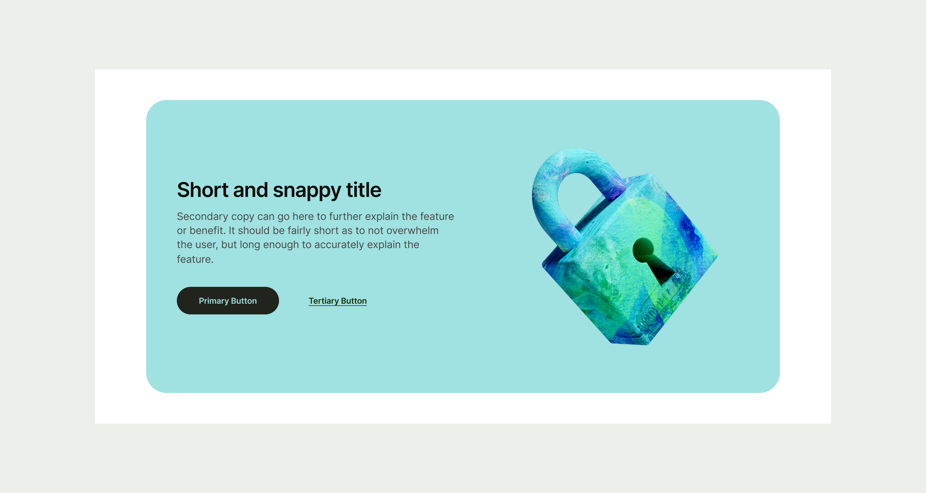
These are the examples of the Callout Small component across different screen sizes.