This component can be used to help introduce content as a standalone piece of text.

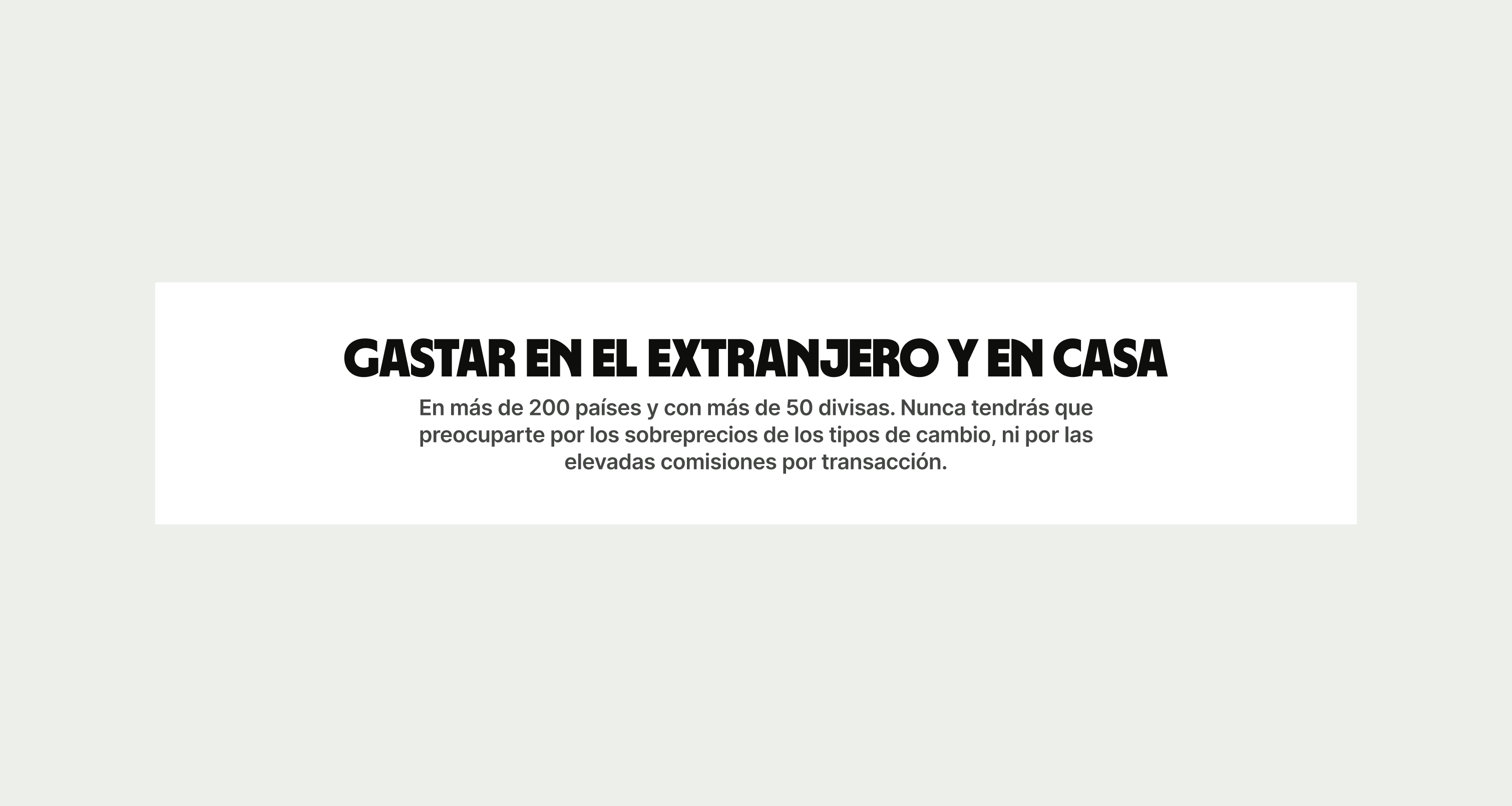
The Text Headline can be used to help introduce content or for a standalone piece of text. In comes in three theme for Light, Neutral and Forest Green. Text should be kept to a minimum to avoid bad readability and layout.


To ensure that the Text Headline component remains visually appealing and accommodates different languages, adhere to the following content limitations:
Headline: The headline should be short and precise. Ideally fitting across two lines.
Body Copy: The body copy should be precise and clear, keeping in line with our tone of voice. Avoid adding paragraphs of text that might overwhelm the user.
By following these guidelines, you ensure that the Text Headline component can comfortably accommodate different languages while maintaining a consistent and visually pleasing design.
These are the examples of the Text Headline component across different screen sizes.