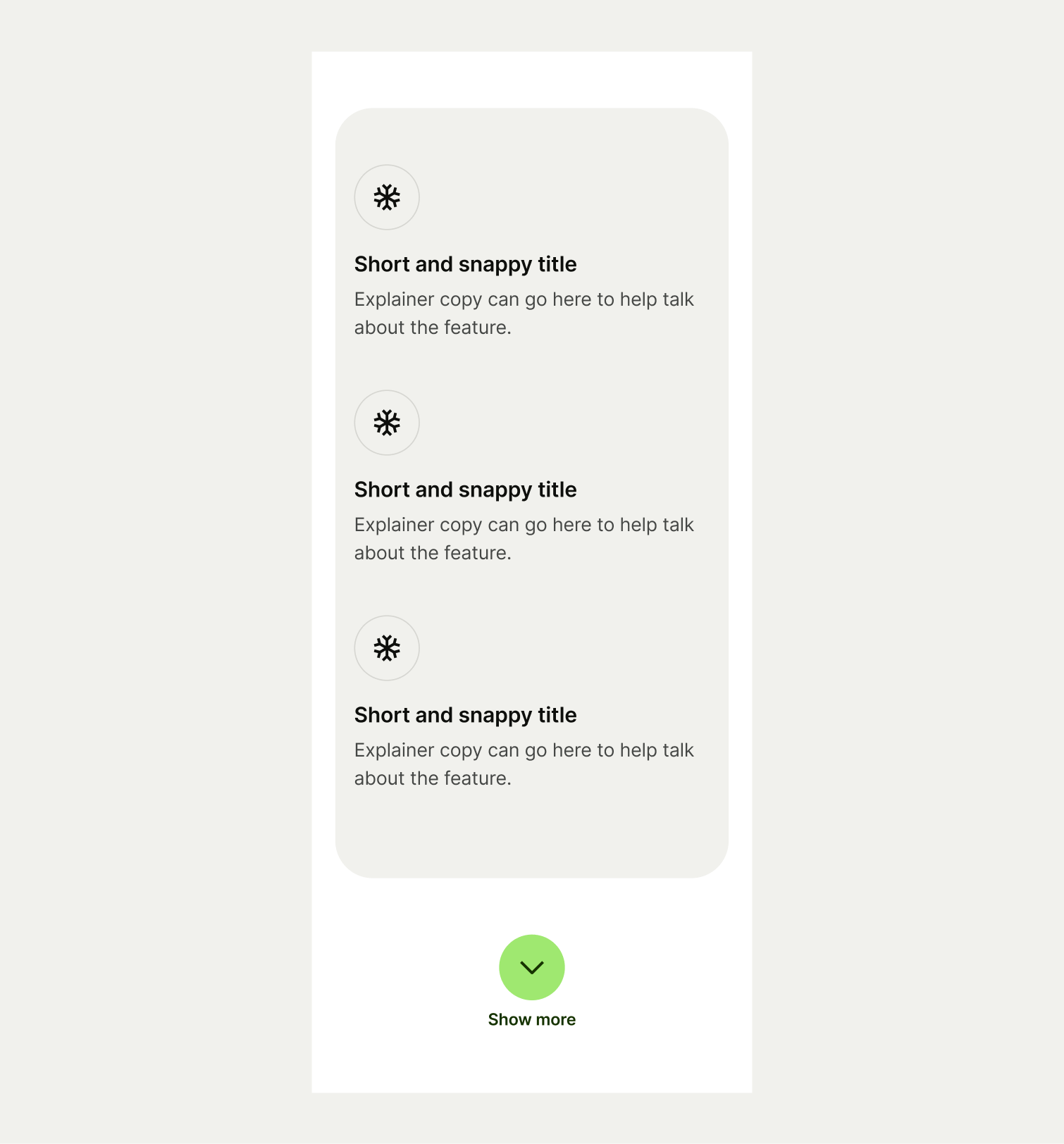
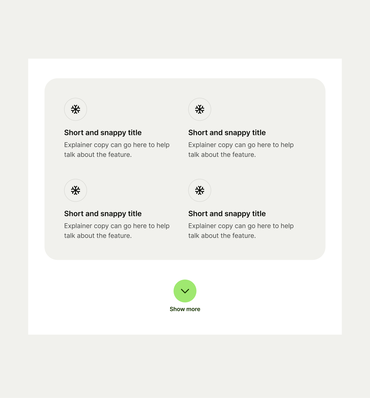
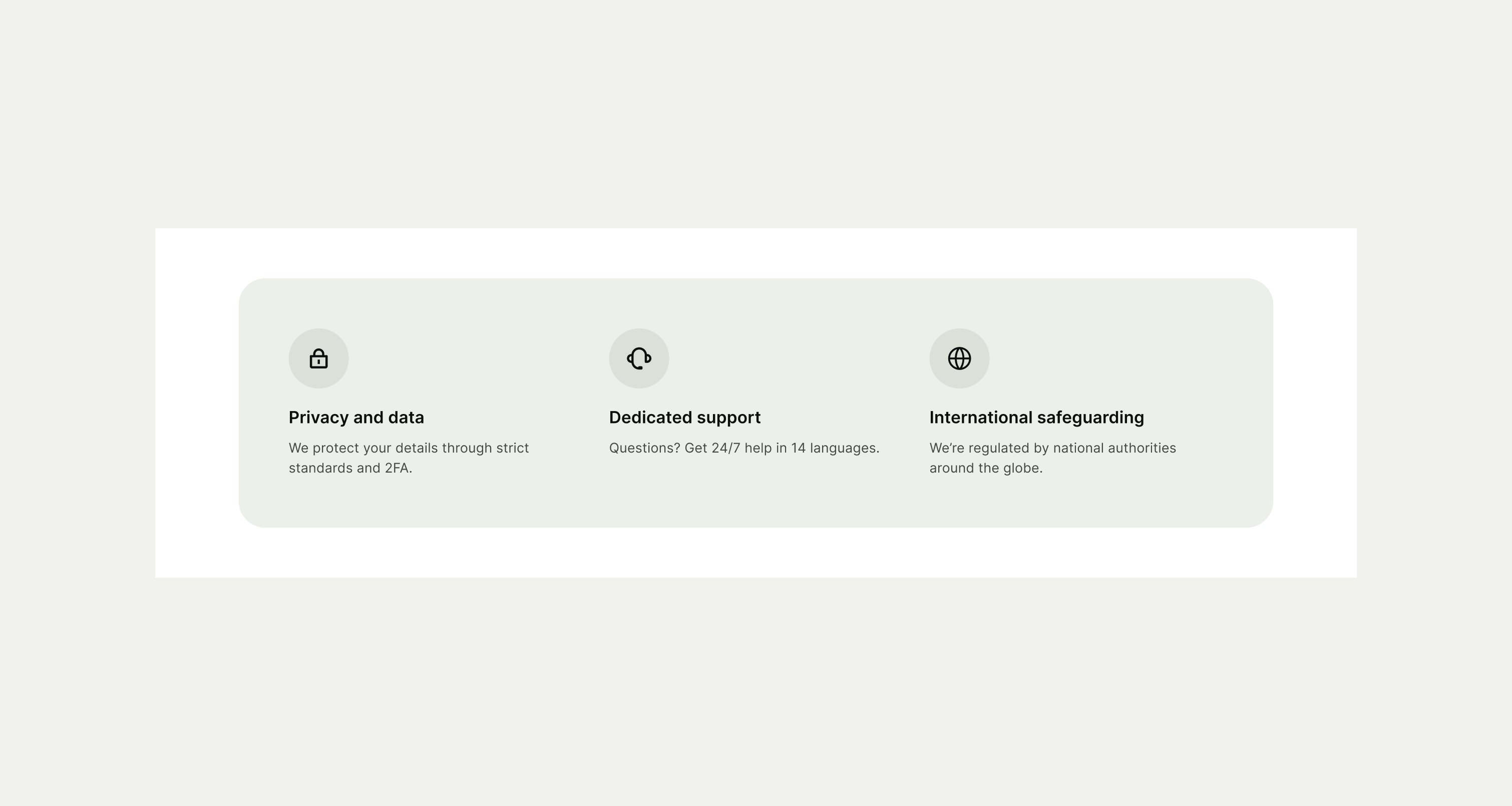
This component is ideal for presenting lists of information, features, or key points on a page paired with an icon.
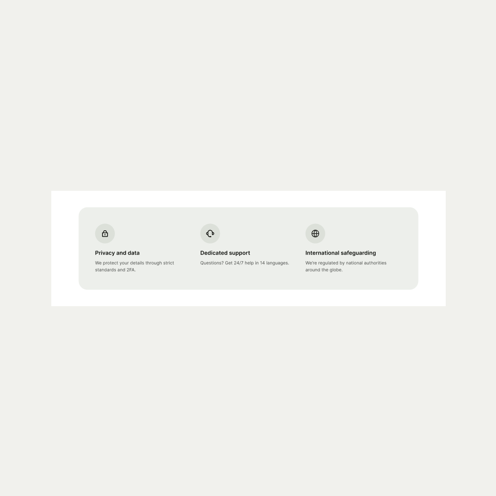
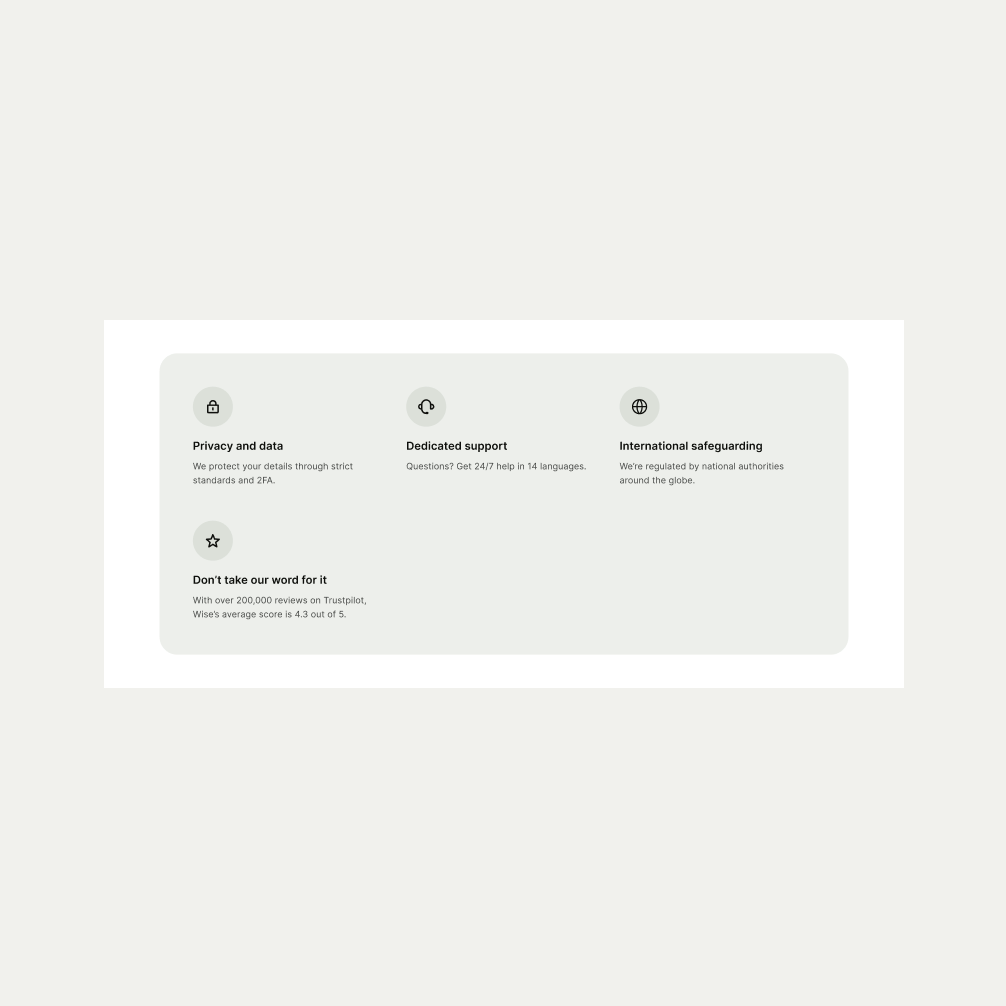
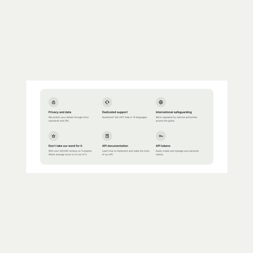
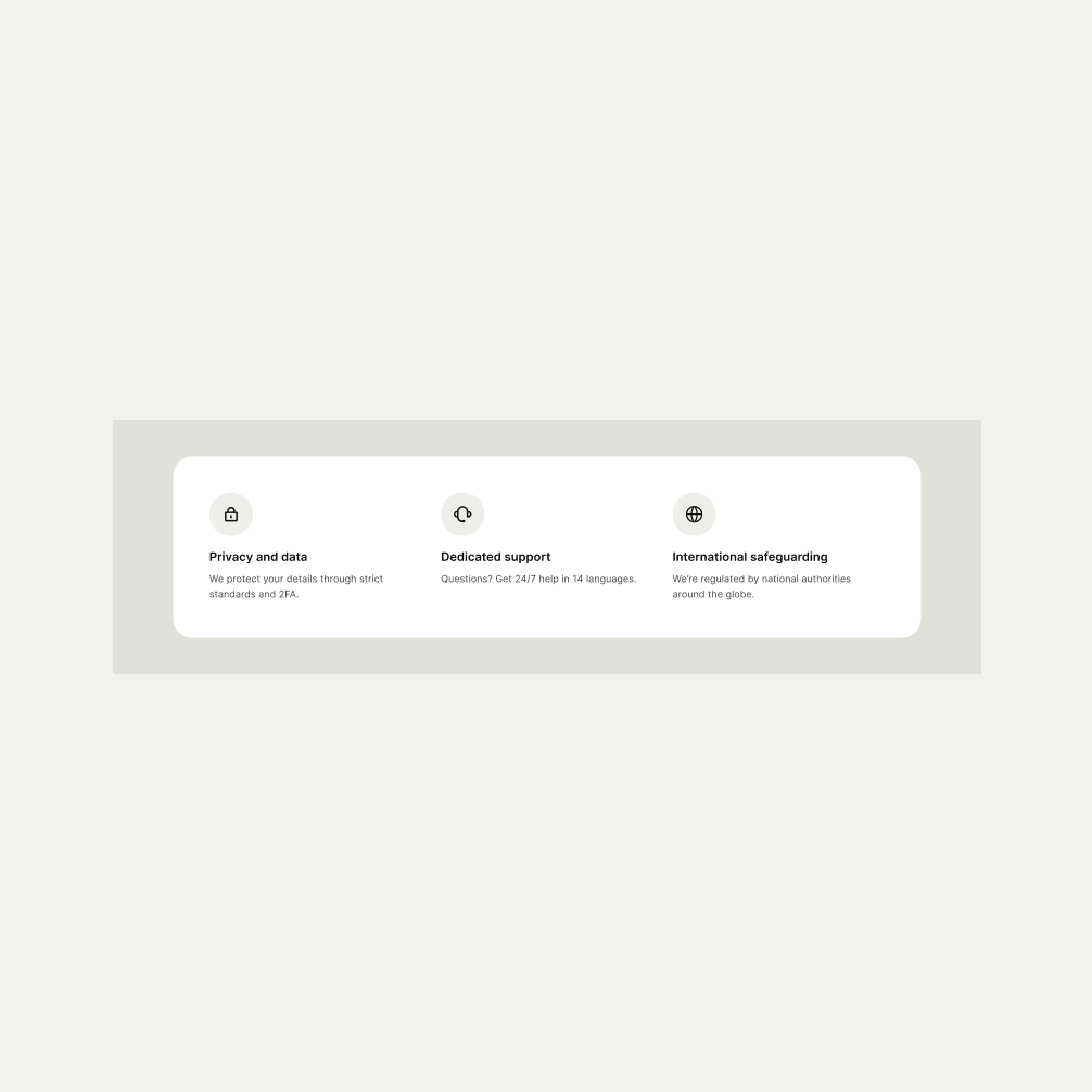
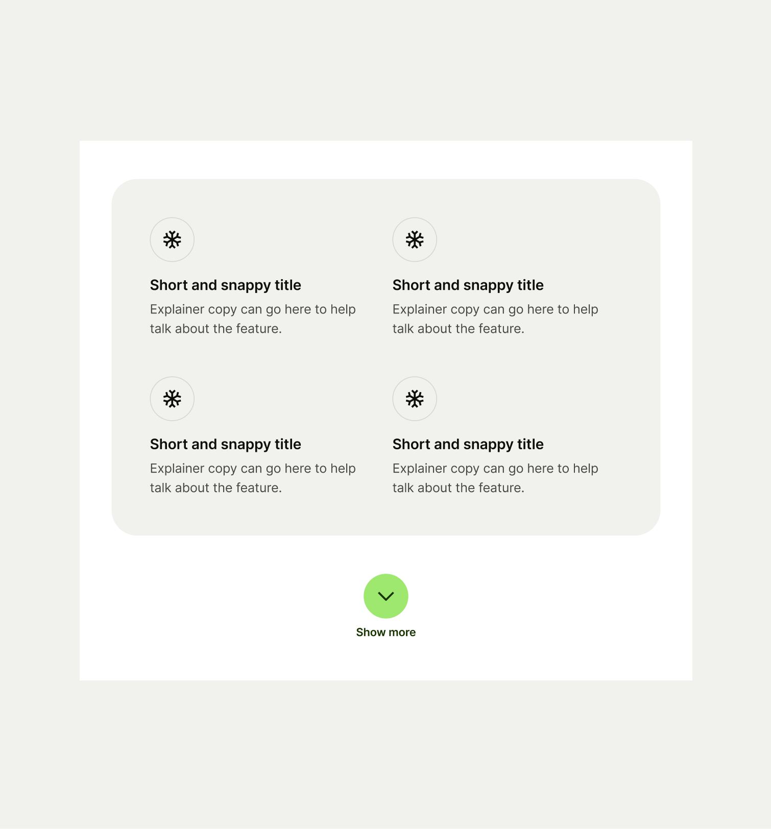
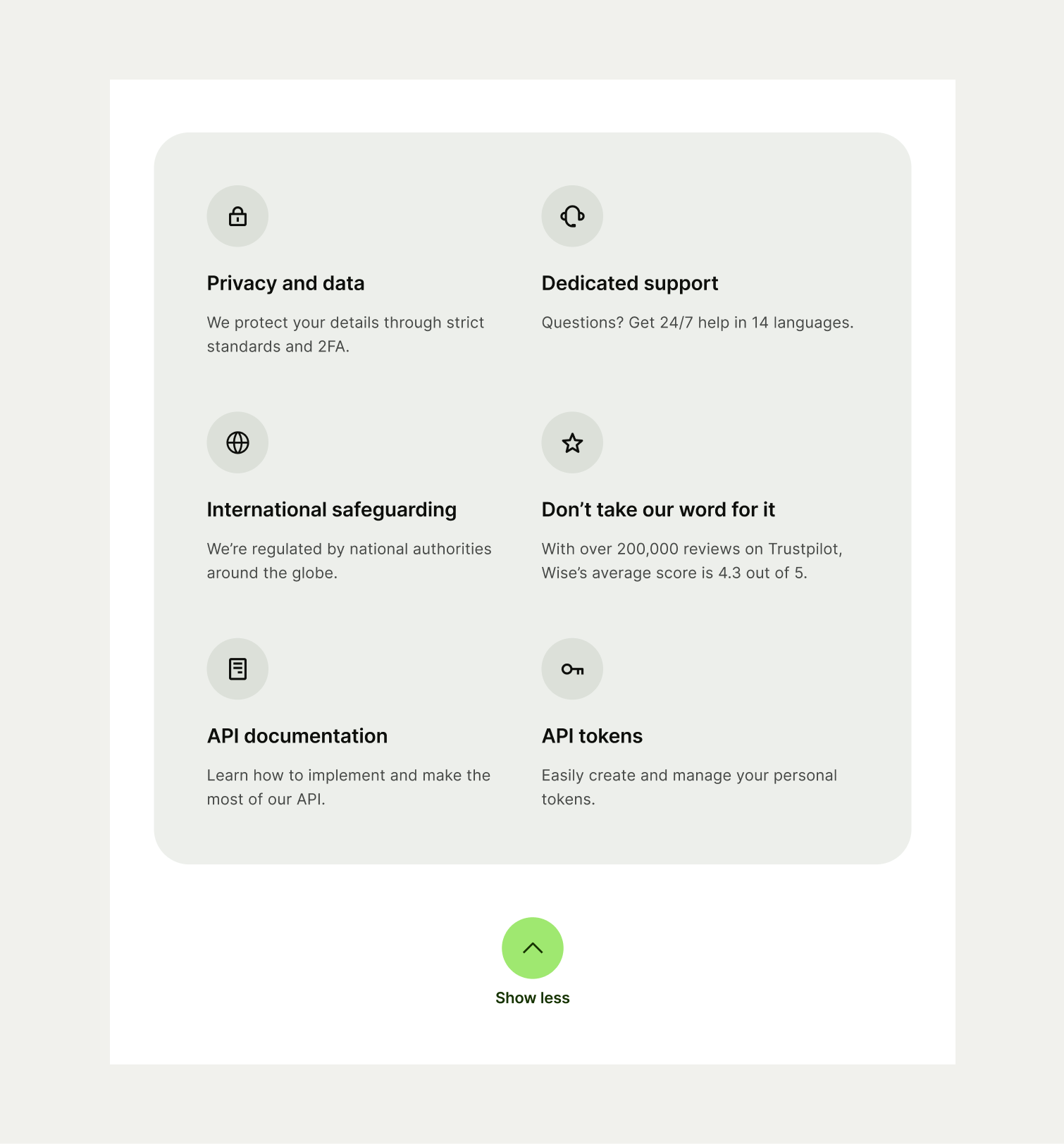
The Icon List component is commonly used in sections such as feature highlights, product benefits or service offerings. To maintain consistency within the list, keep the text concise and scannable to improve readability. Consider using the Icon List with three times for optimal visual balance but can spread up to six items when needed and comes in three themes of Light, Neutral and Forest Green. When the component has more than uses its full capacity of 6 icons, we show a maximum of 3 icons on mobile and 4 on tablet, before a ‘Show more’ button is presented to the user.


To ensure maximum accessibility for our users, use plain language in accordance with our tone of voice for an inclusive reading experience. The text should be precise and informative. Ensure that images are accompanied by appropriate alternative text (alt text) for screen readers. An ideal alt text is descriptive and concise to convey the meaning and purpose of the image to users who may not be able to see it.

To ensure that the Icon List component remains visually appealing and accommodates different languages, adhere to the following content limitations:
Headline: The headline should be short and precise. Ideally fitting across two lines.
Body Copy: The body copy should be precise and clear, keeping in line with our tone of voice. Avoid adding paragraphs of text that might overwhelm the user.
By following these guidelines, you ensure that the Icon List component can comfortably accommodate different languages while maintaining a consistent and visually pleasing design.
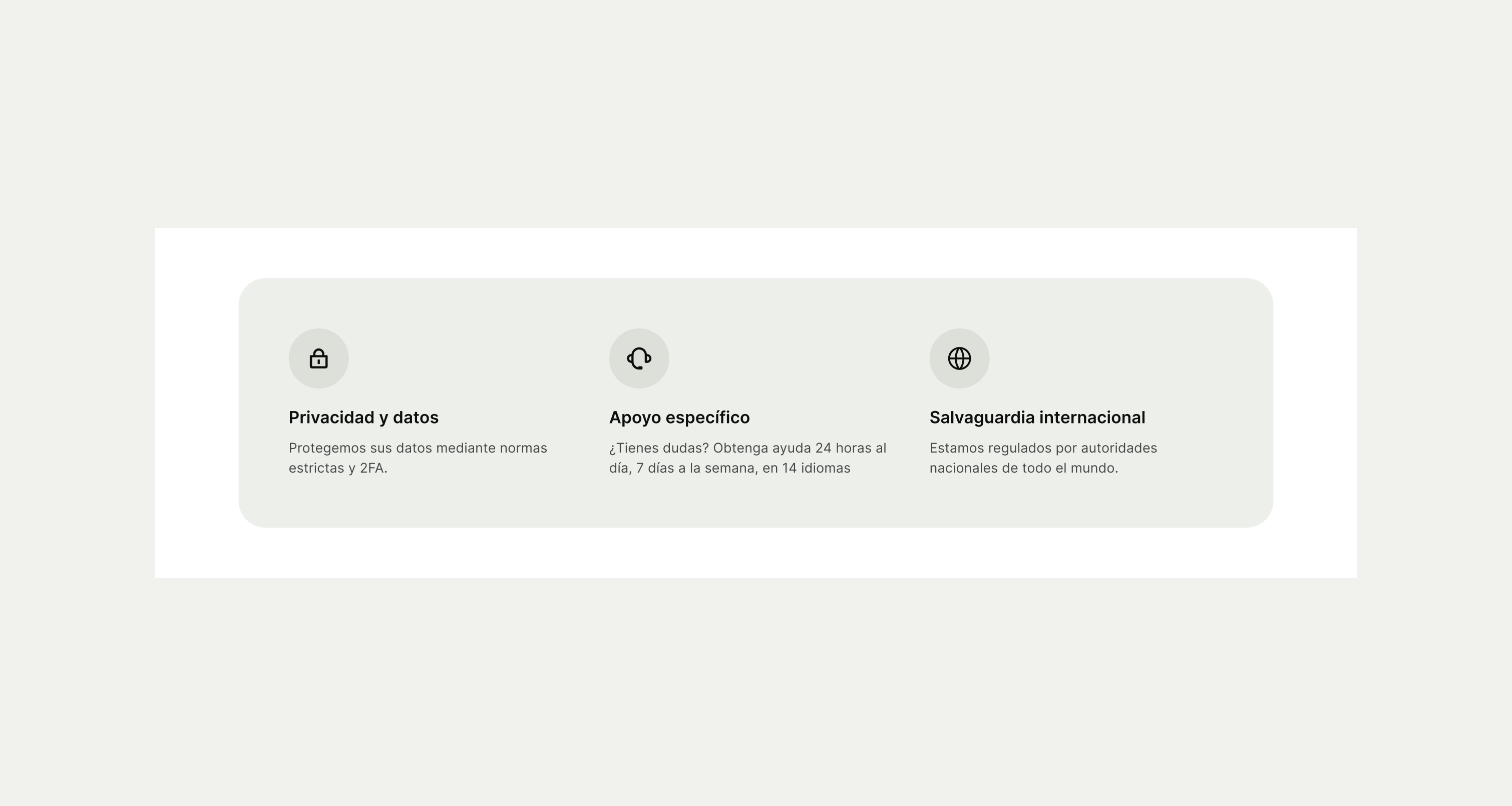
These are the examples of the Icon List component across different screen sizes.