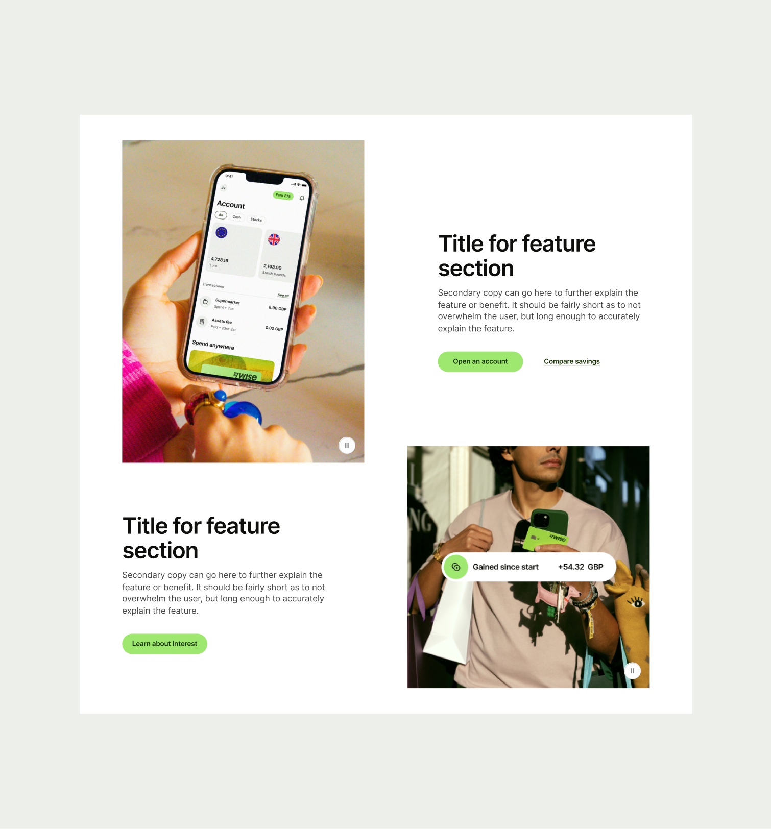
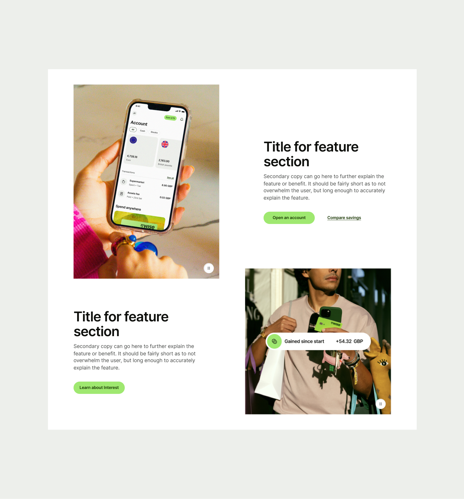
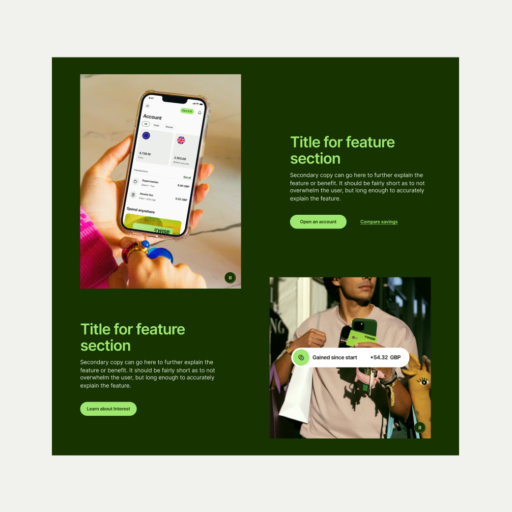
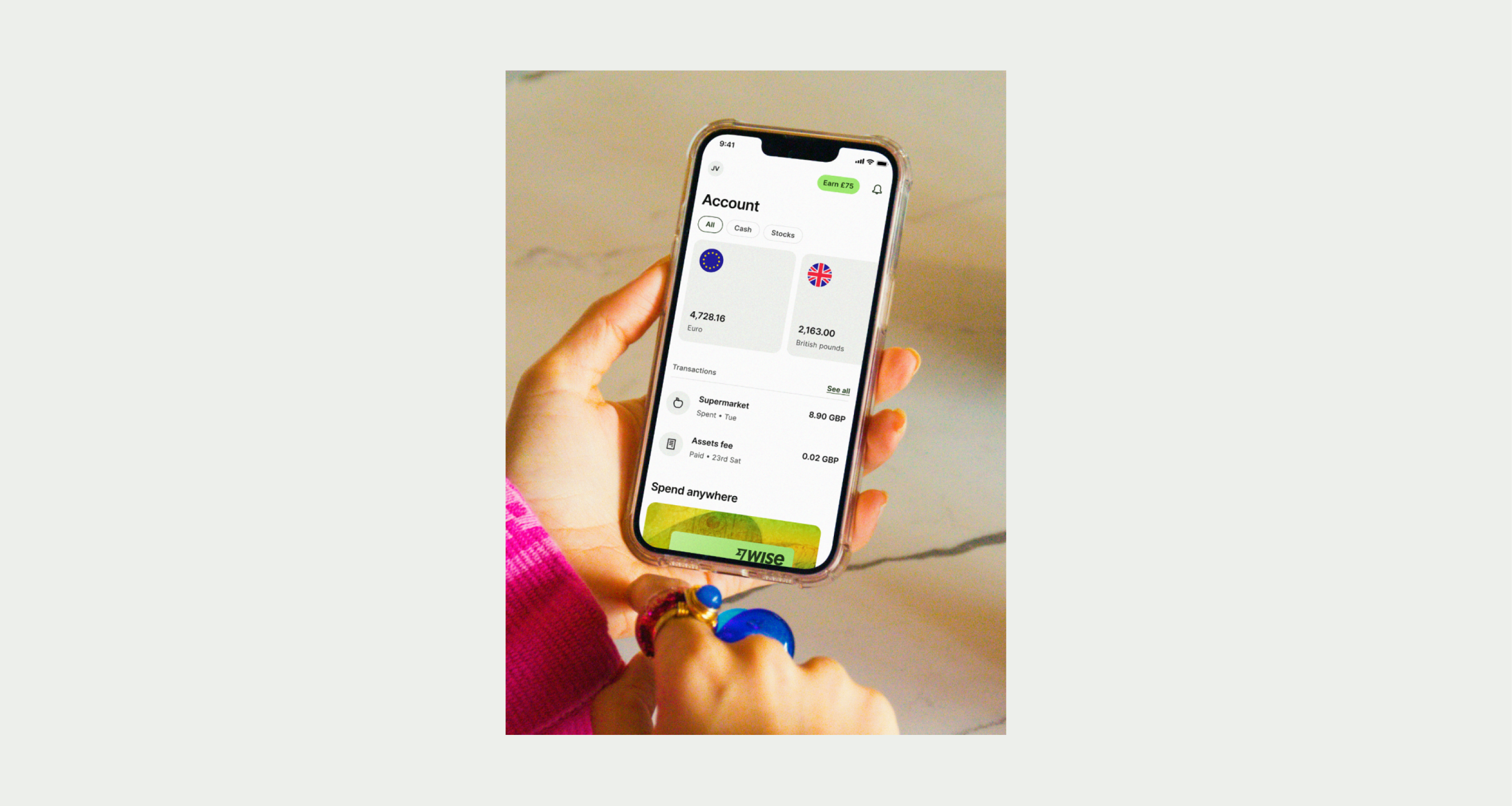
Use this component to talk about multiple features or benefits to customers whilst also showcasing lifestyle imagery or video.
The Feature Section Grid is a useful component to help talk about multiple features or benefits to Wise users. It is typically used on feature pages and allows room to showcase our lifestyle photography or promo assets.
- Craft a concise and compelling headline that clearly communicates the main feature or benefit.
- Ensure that photography or promo assets are in keeping with our guidelines.
- Do not use too much text that risks overwhelming the user.
To ensure maximum accessibility for our users, use plain language in accordance with our tone of voice for an inclusive reading experience. The text should be precise and informative. Ensure that images are accompanied by appropriate alternative text (alt text) for screen readers. An ideal alt text is descriptive and concise to convey the meaning and purpose of the image to users who may not be able to see it.
To ensure that the Feature Section Grid component remains visually appealing and accommodates different languages, adhere to the following content limitations:
Headline: The headline should be short and precise. Ideally fitting across two lines.
Body Copy: The body copy should be precise and clear, keeping in line with our tone of voice. Avoid adding paragraphs of text that might overwhelm the user.
By following these guidelines, you ensure that the Feature Section Grid component can comfortably accommodate different languages while maintaining a consistent and visually pleasing design.
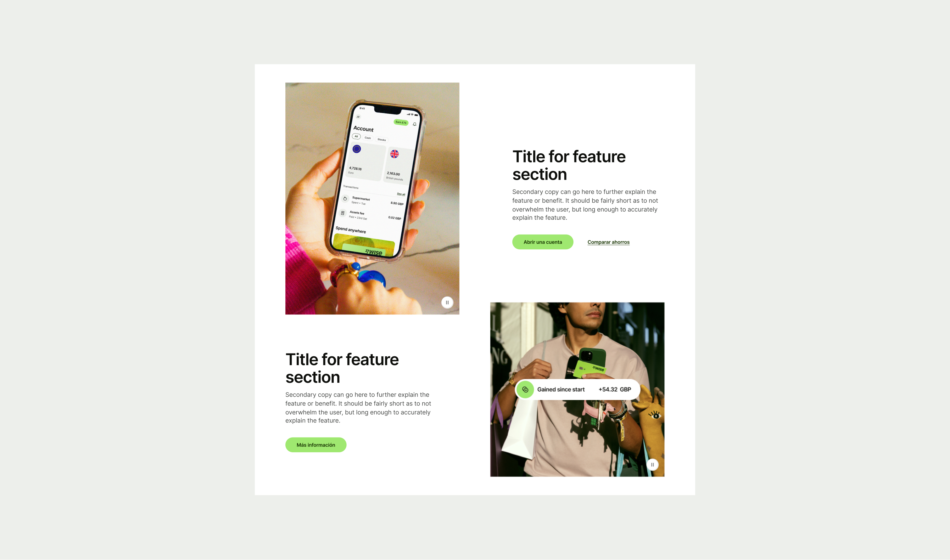
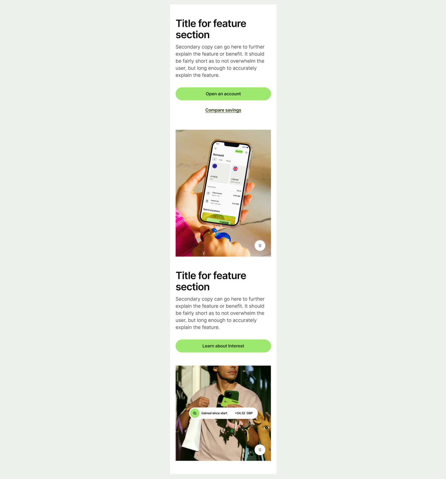
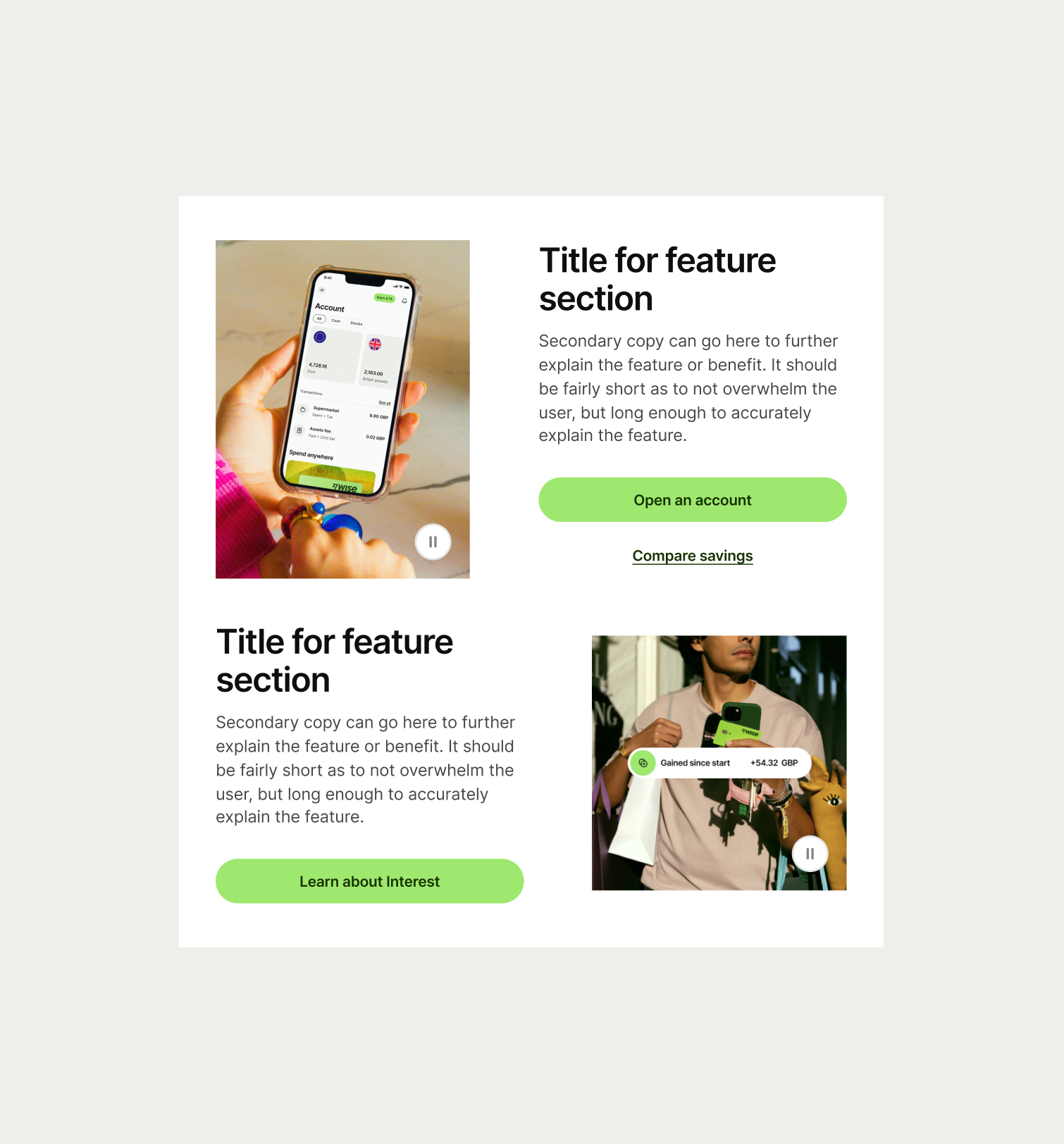
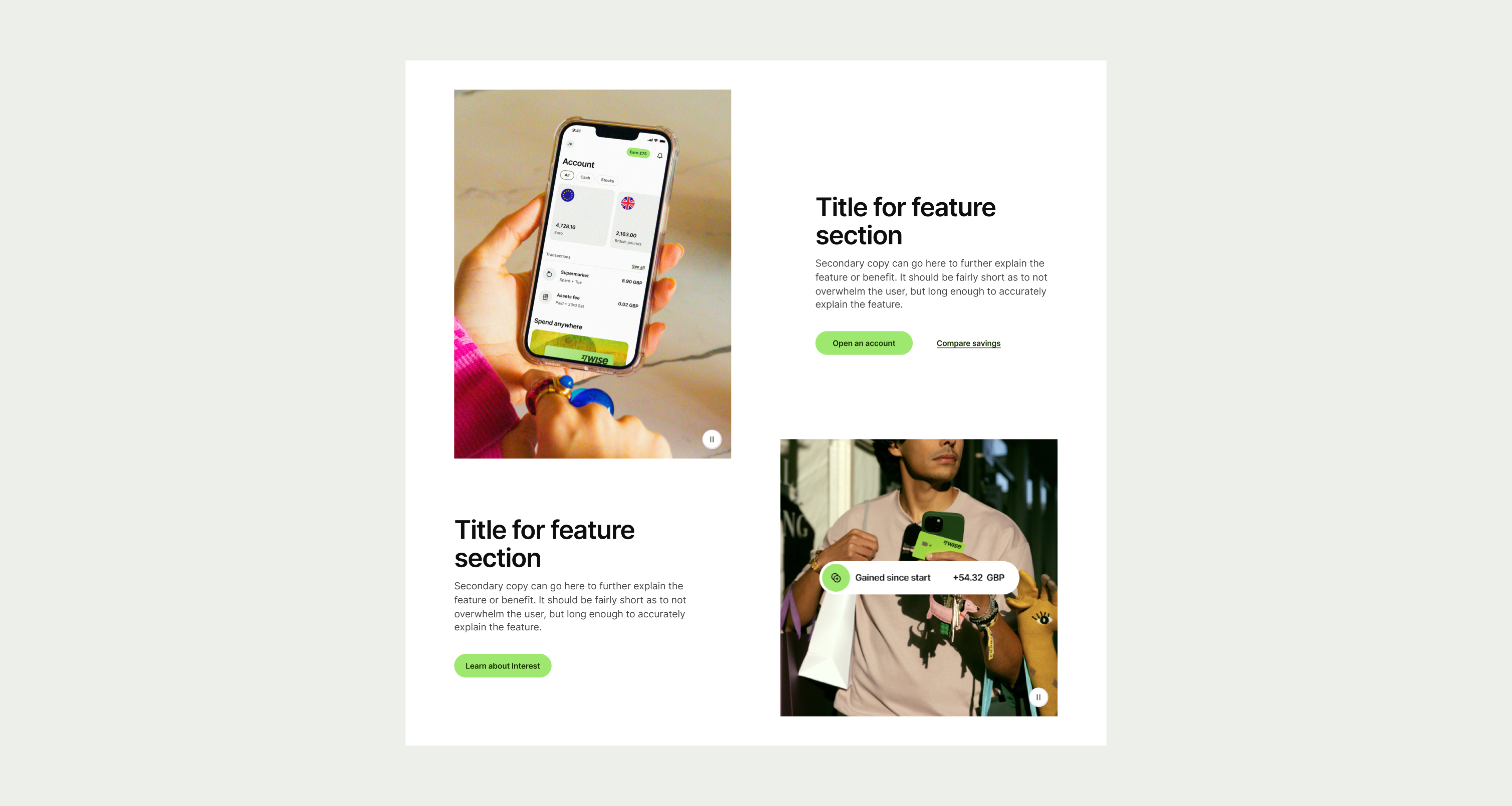
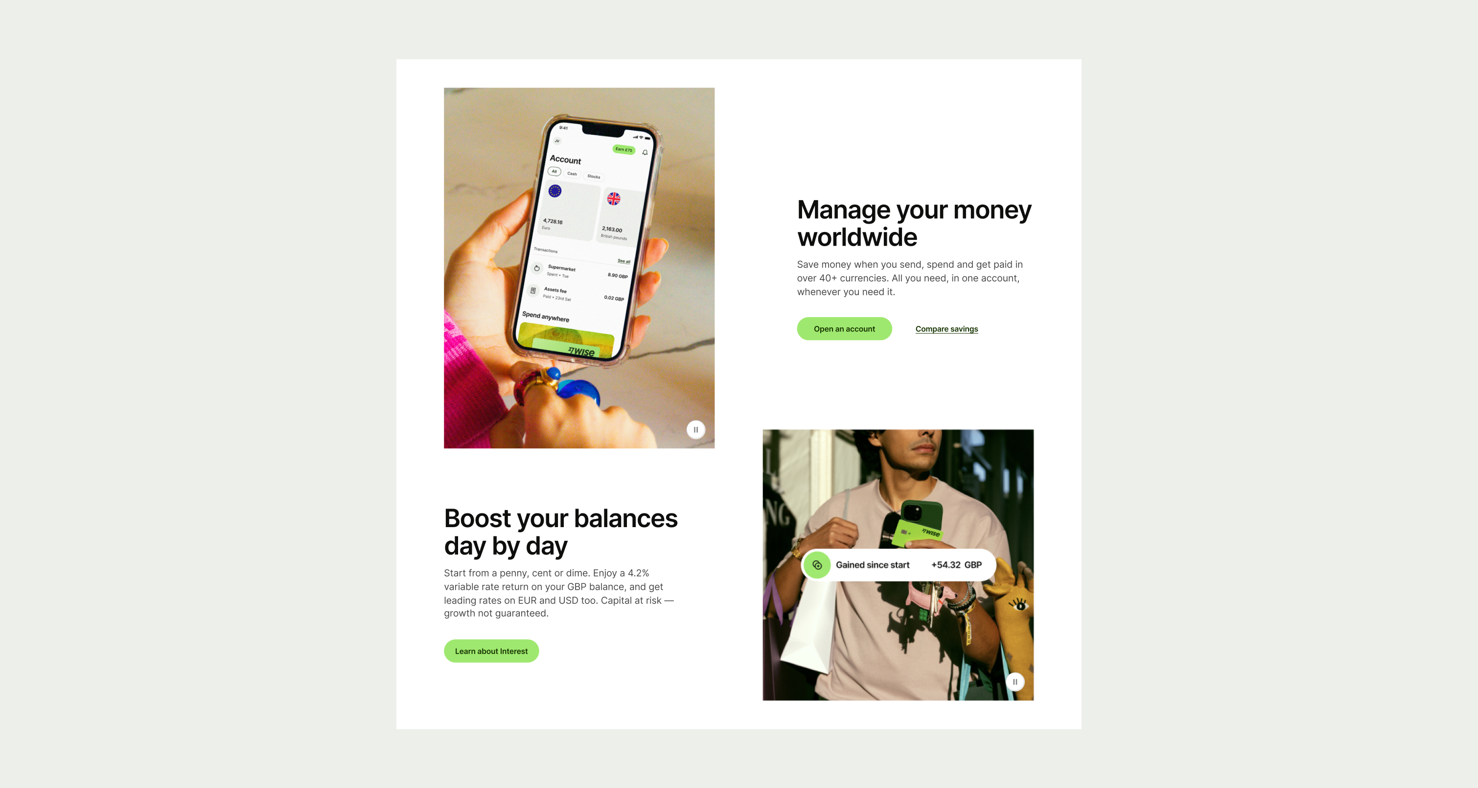
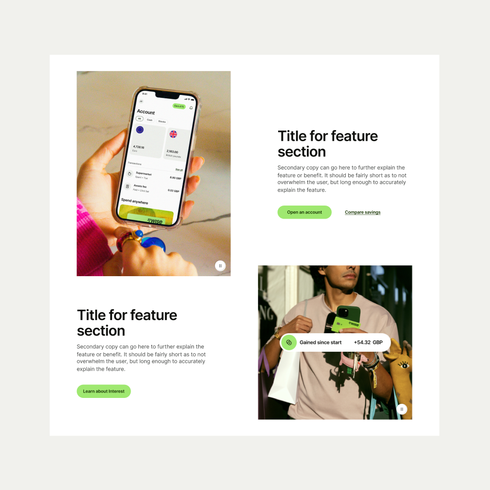
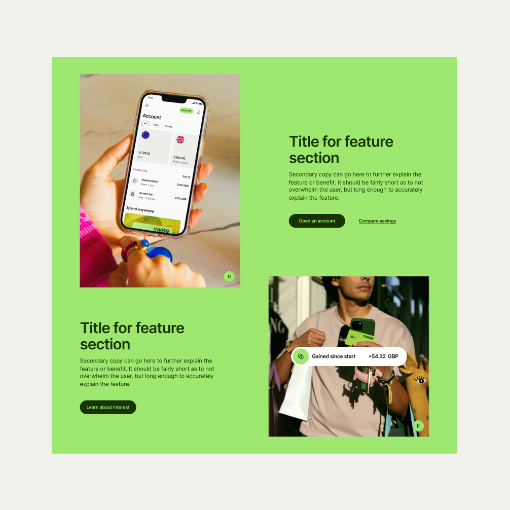
These are the examples of the Feature Section Grid component across different screen sizes.