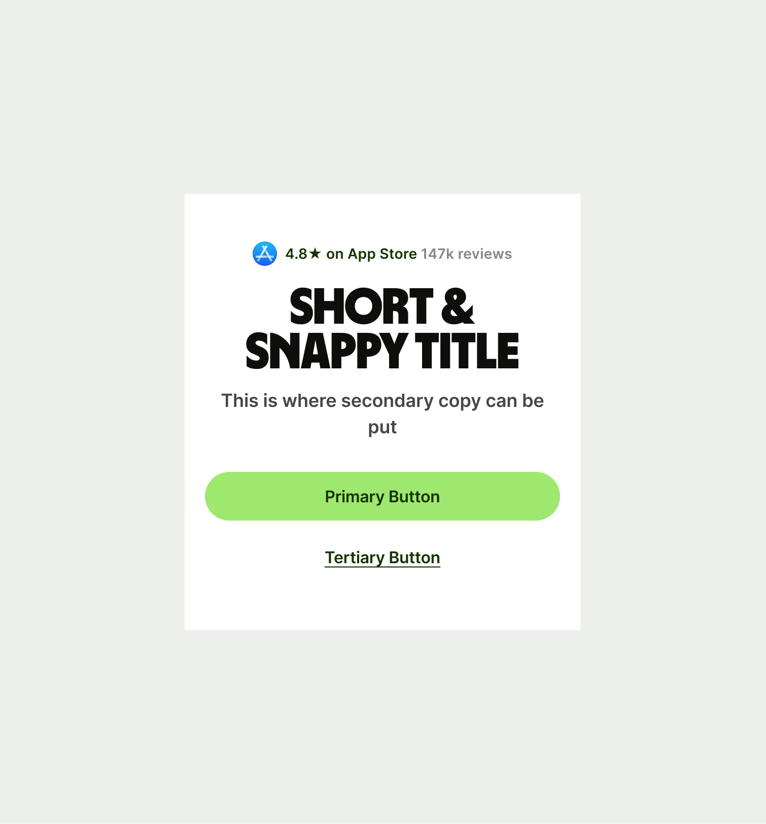
Use this component at the start of pages to introduce the content that doesn't require a graphic or interactive element.
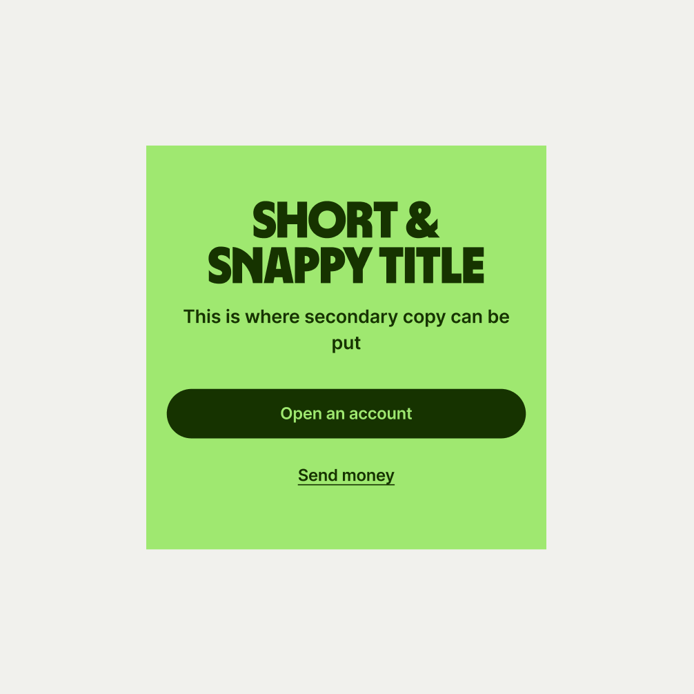
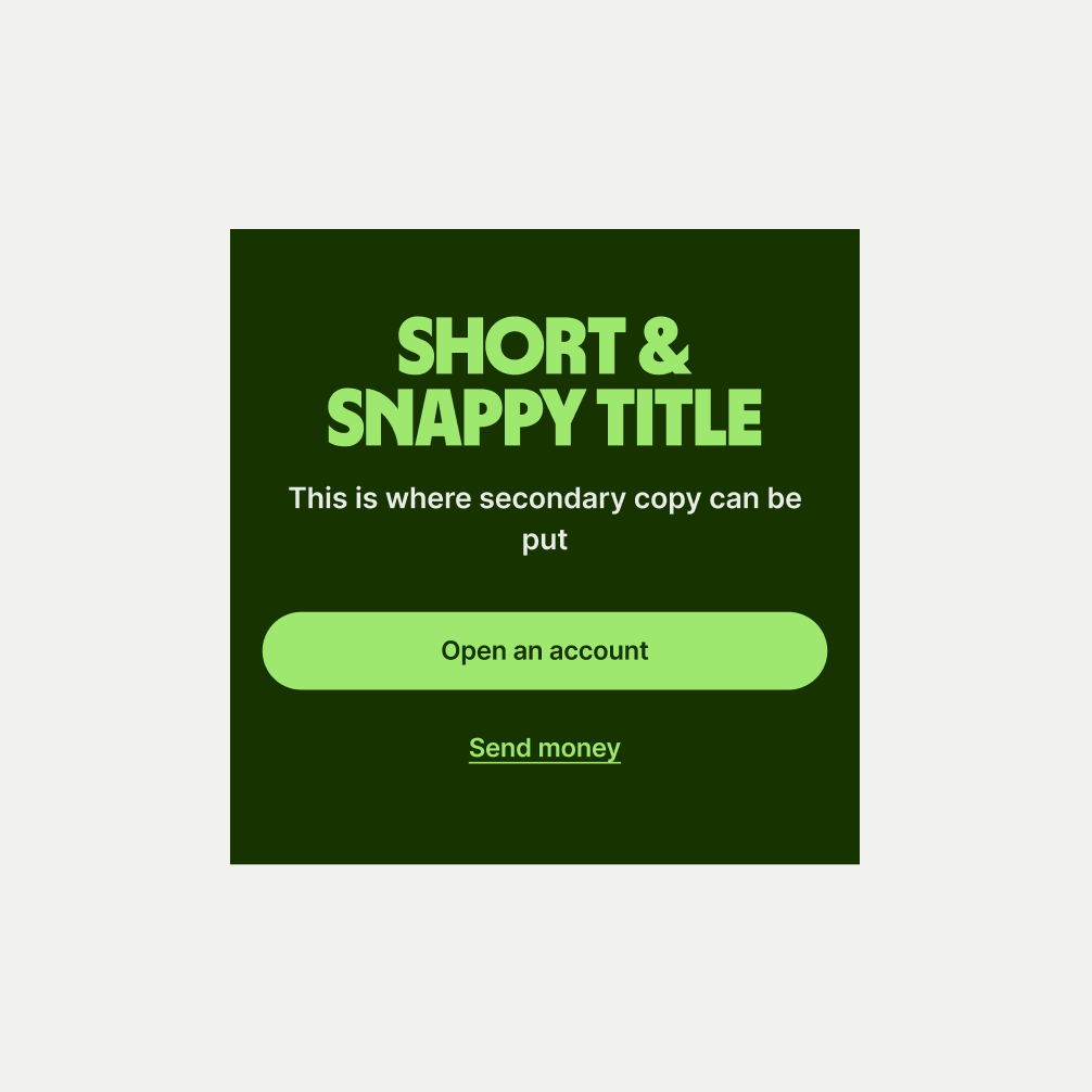
The Hero Simple component can be used at the start of pages to introduce content that doesn't require a graphic of interactive element. It comes in three themes of Light, Bright Green and Forest Green. The headline and copy should be kept concise and informative.
To ensure that the Hero Simple component remains visually appealing and accommodates different languages, adhere to the following content limitations:
Headline: The headline should be short and precise. Ideally fitting across two lines.
Body Copy: The body copy should be precise and clear, keeping in line with our tone of voice. Avoid adding paragraphs of text that might overwhelm the user.
By following these guidelines, you ensure that the Hero Simple component can comfortably accommodate different languages while maintaining a consistent and visually pleasing design.
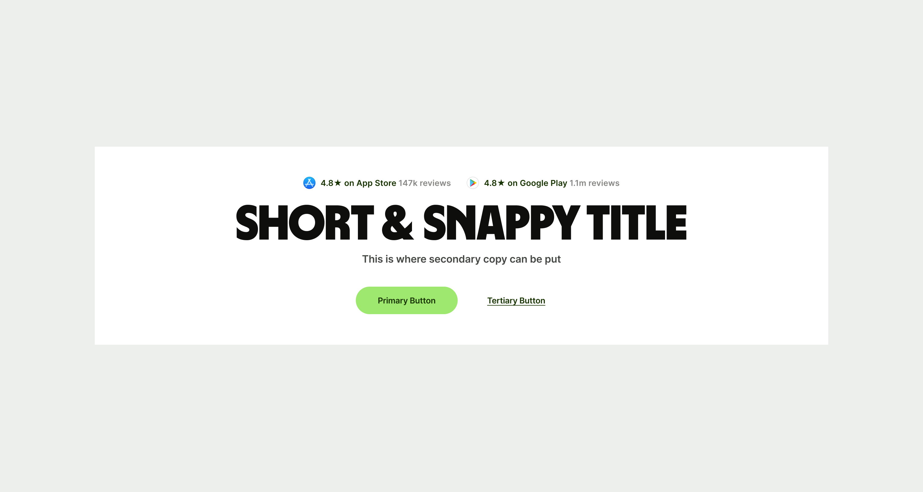
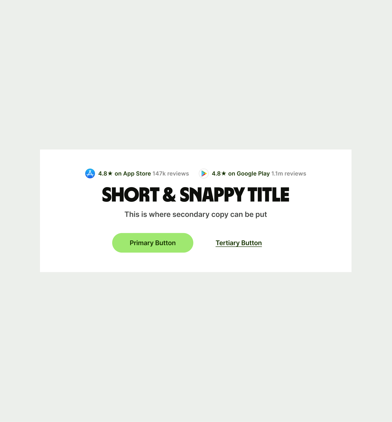
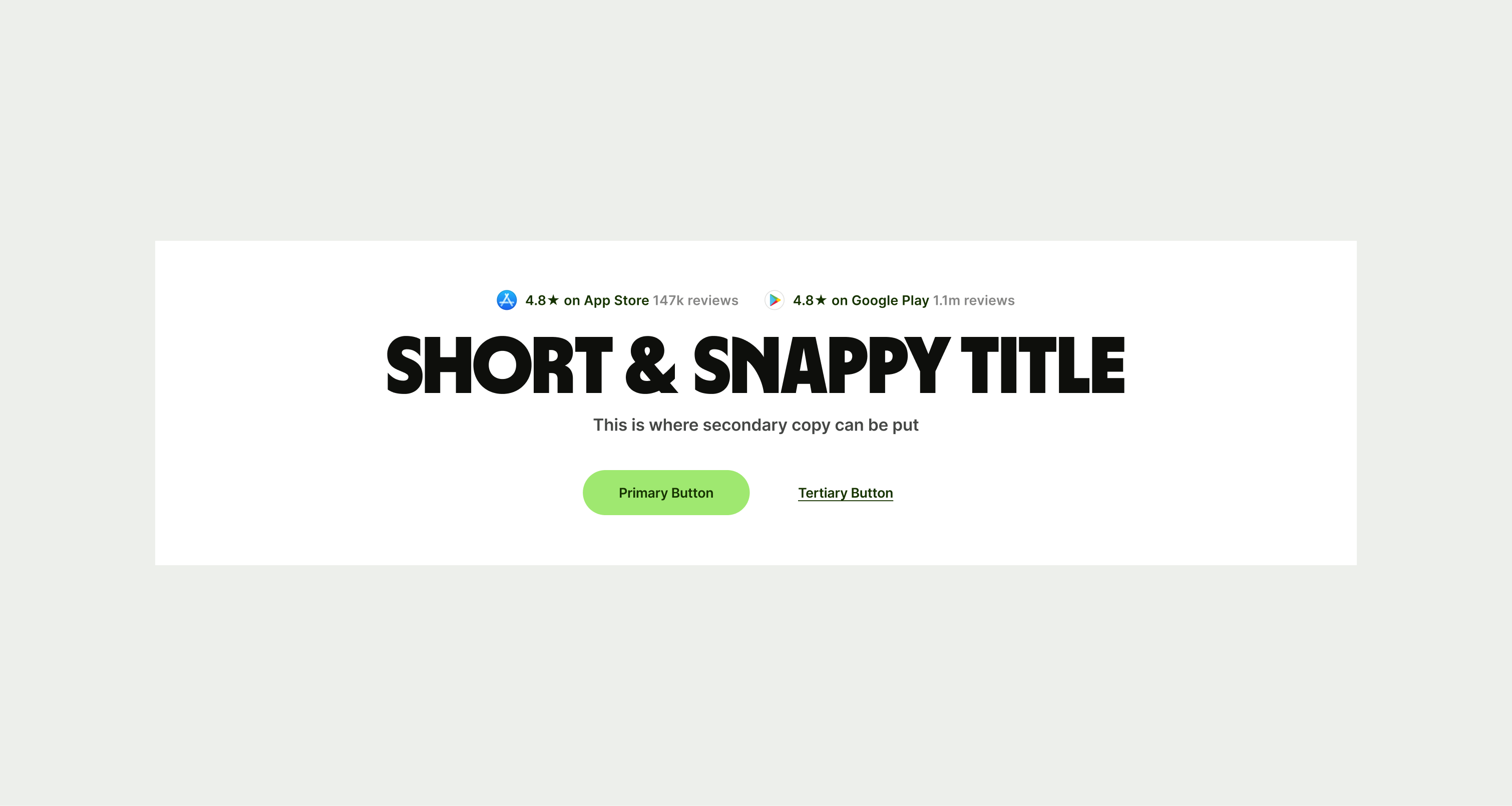
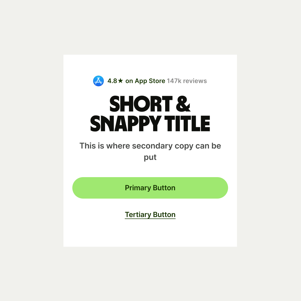
These are the examples of the Hero Simple component across different screen sizes.