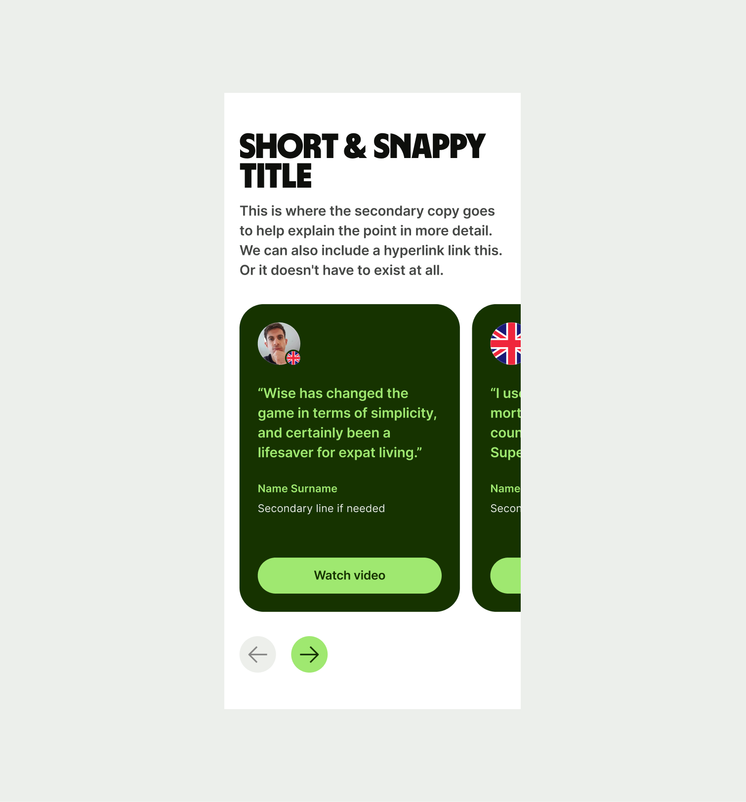
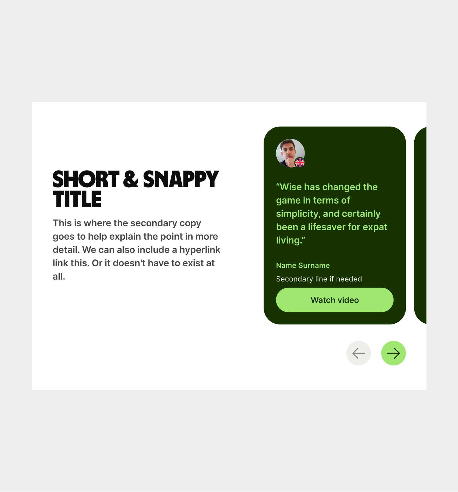
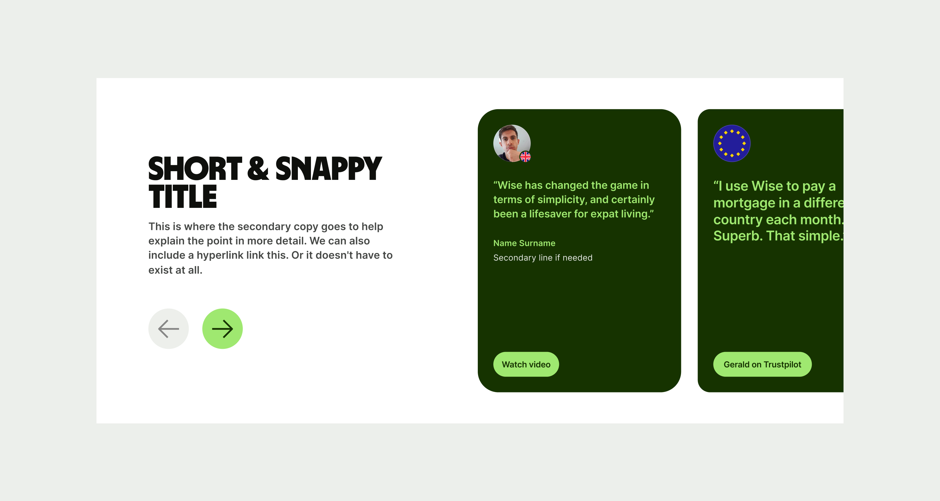
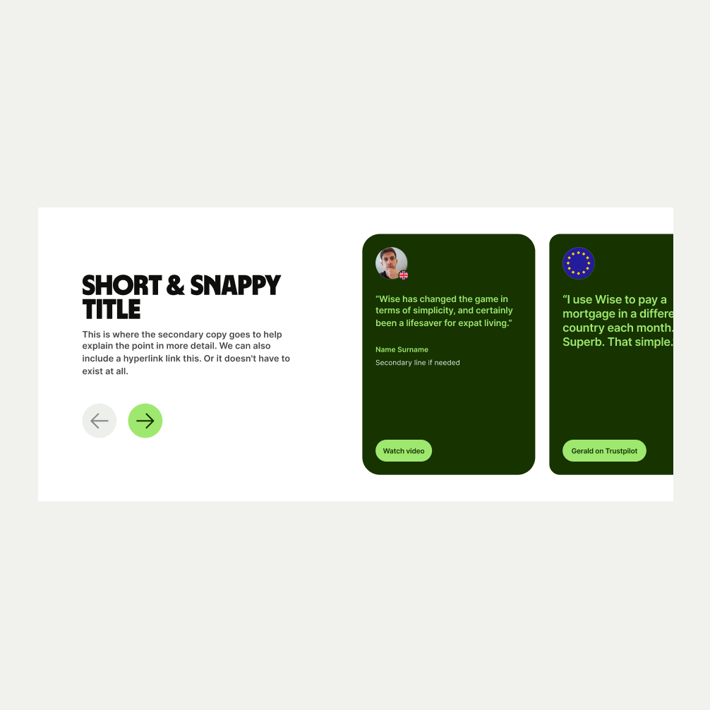
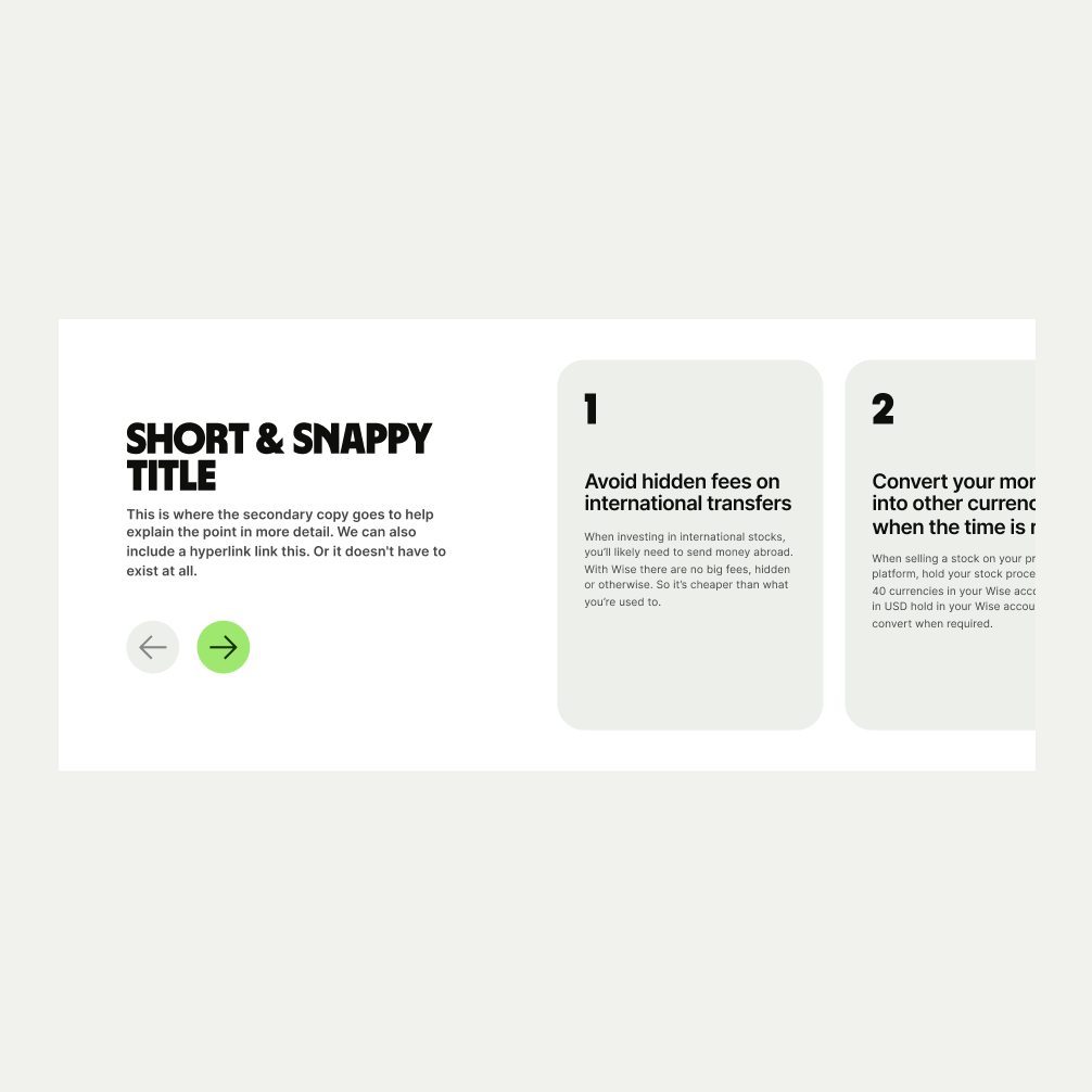
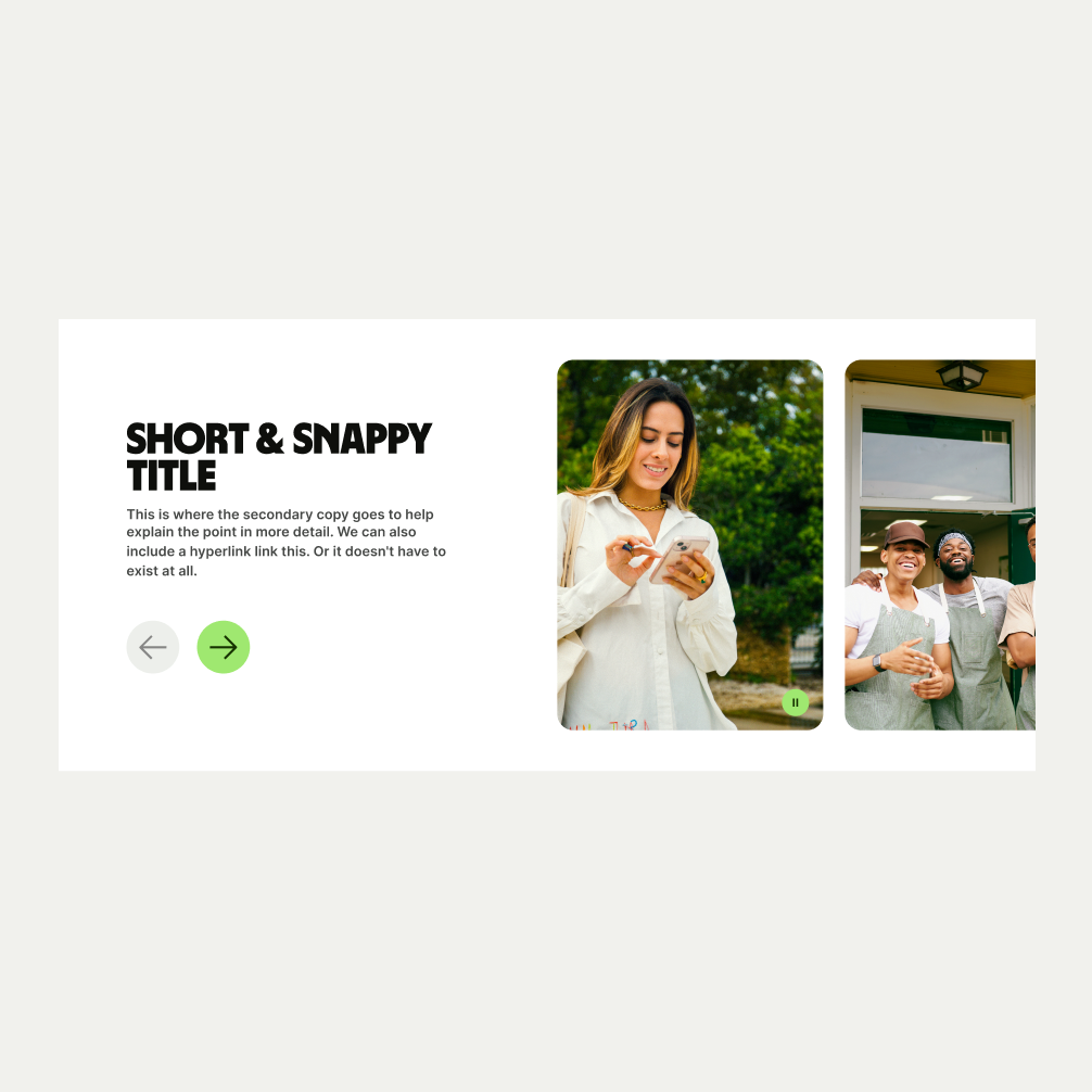
This component is a versatile element designed to display multiple images, reviews or steps in a process.
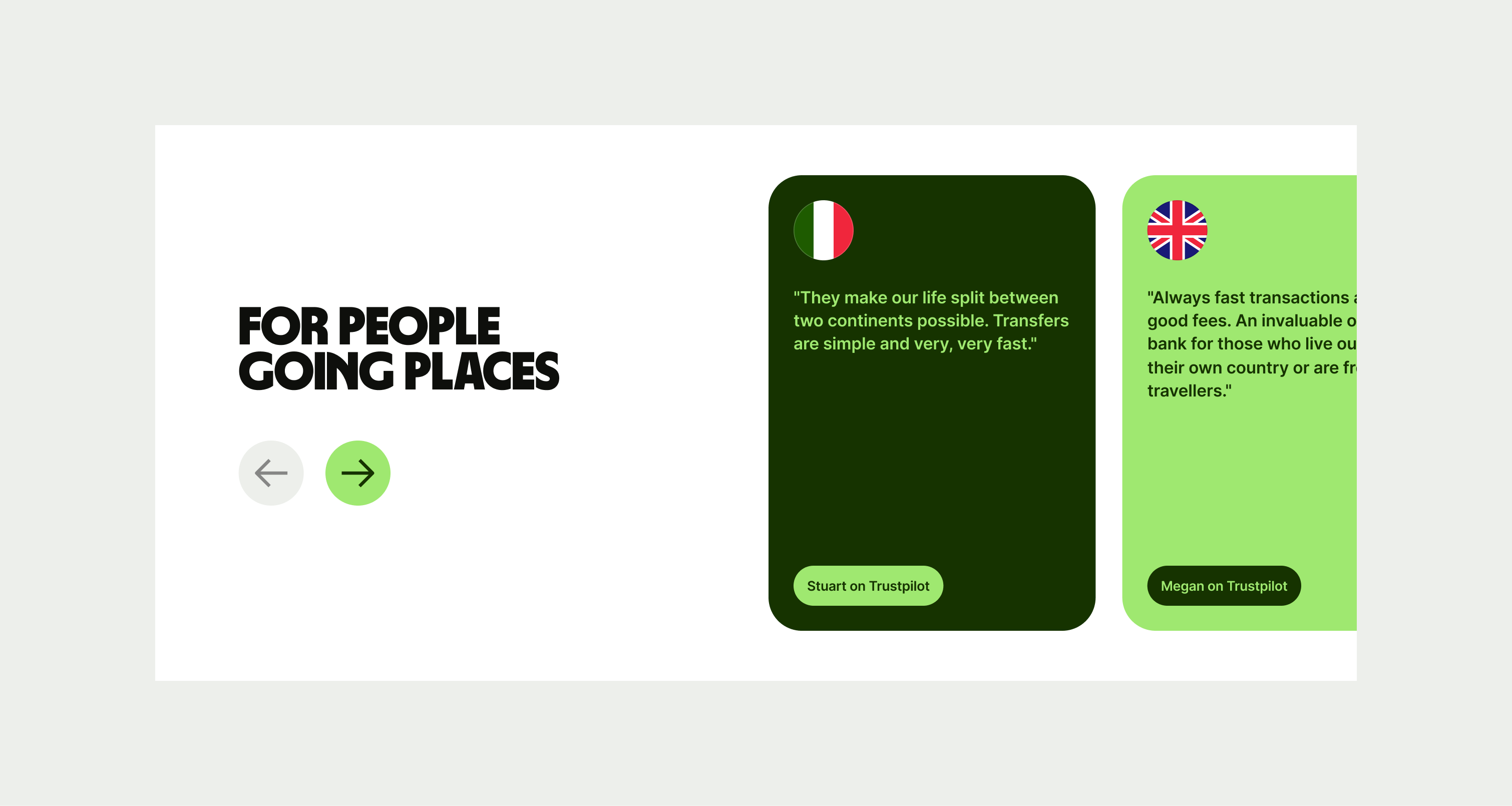
The Carousel comes in three variants that can be used in different areas around the site. These are, Image, Stepper and Reviews. The variants have different use of cards to help display their intended purpose.
- Use precise and informative language that is in keeping with our tone of voice.
- Dont mix content between stepper, quotes and images in one carousel.
To ensure maximum accessibility for our users, use plain language in accordance with our tone of voice for an inclusive reading experience. The text should be precise and informative. Ensure that images are accompanied by appropriate alternative text (alt text) for screen readers. An ideal alt text is descriptive and concise to convey the meaning and purpose of the image to users who may not be able to see it.

To ensure that the Carousel component remains visually appealing and accommodates different languages, adhere to the following content limitations:
Headline: The headline should be short and precise. Ideally fitting across two lines.
Body Copy: The body copy should be precise and clear, keeping in line with our tone of voice. Avoid adding paragraphs of text that might overwhelm the user.
By following these guidelines, you ensure that the Carousel component can comfortably accommodate different languages while maintaining a consistent and visually pleasing design.
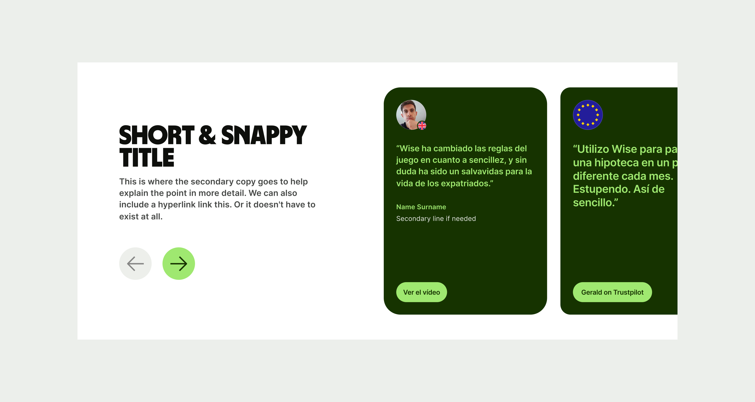
These are the examples of the Carousel component across different screen sizes.