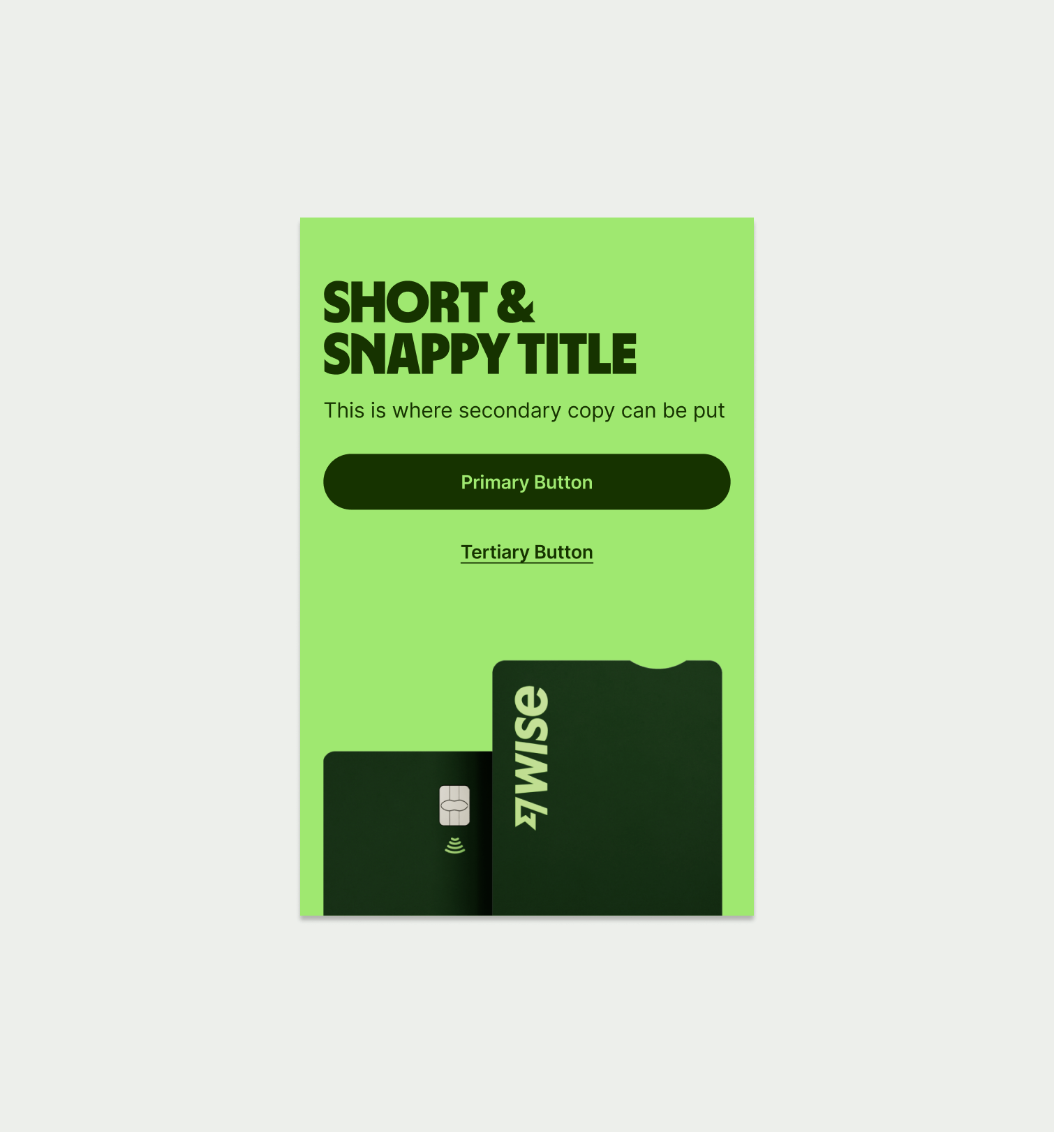
This component can is used to highlight a product offering for a specific use case.
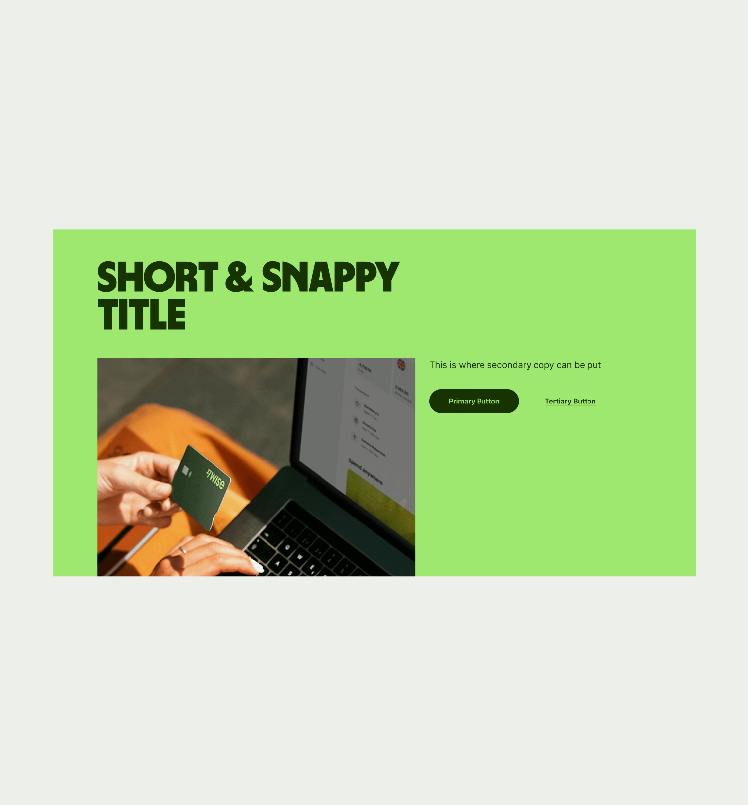
The Highlight Product can be used to showcase a product offering, usually for a specific use case such as Business accounts. It comes in one colour and should always used a product render of our cards, rather than lifestyle photography.
- Craft a concise and compelling headline that clearly communicates the main feature or benefit.
- Do not use lifestyle imagery or promotional assets.
To ensure that the Highlight Product component remains visually appealing and accommodates different languages, adhere to the following content limitations:
Headline: The headline should be short and precise. Ideally fitting across two lines.
Body Copy: The body copy should be precise and clear, keeping in line with our tone of voice. Avoid adding paragraphs of text that might overwhelm the user.
By following these guidelines, you ensure that the Highlight Product component can comfortably accommodate different languages while maintaining a consistent and visually pleasing design.

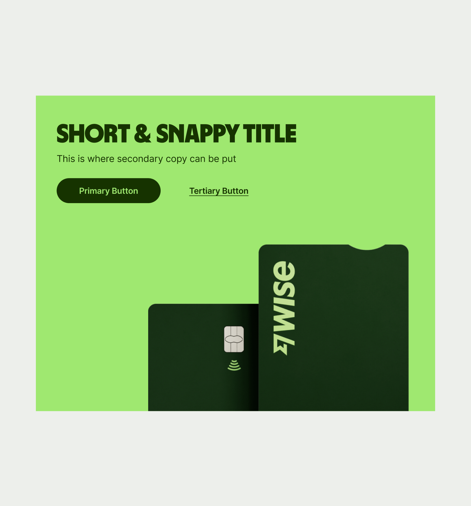
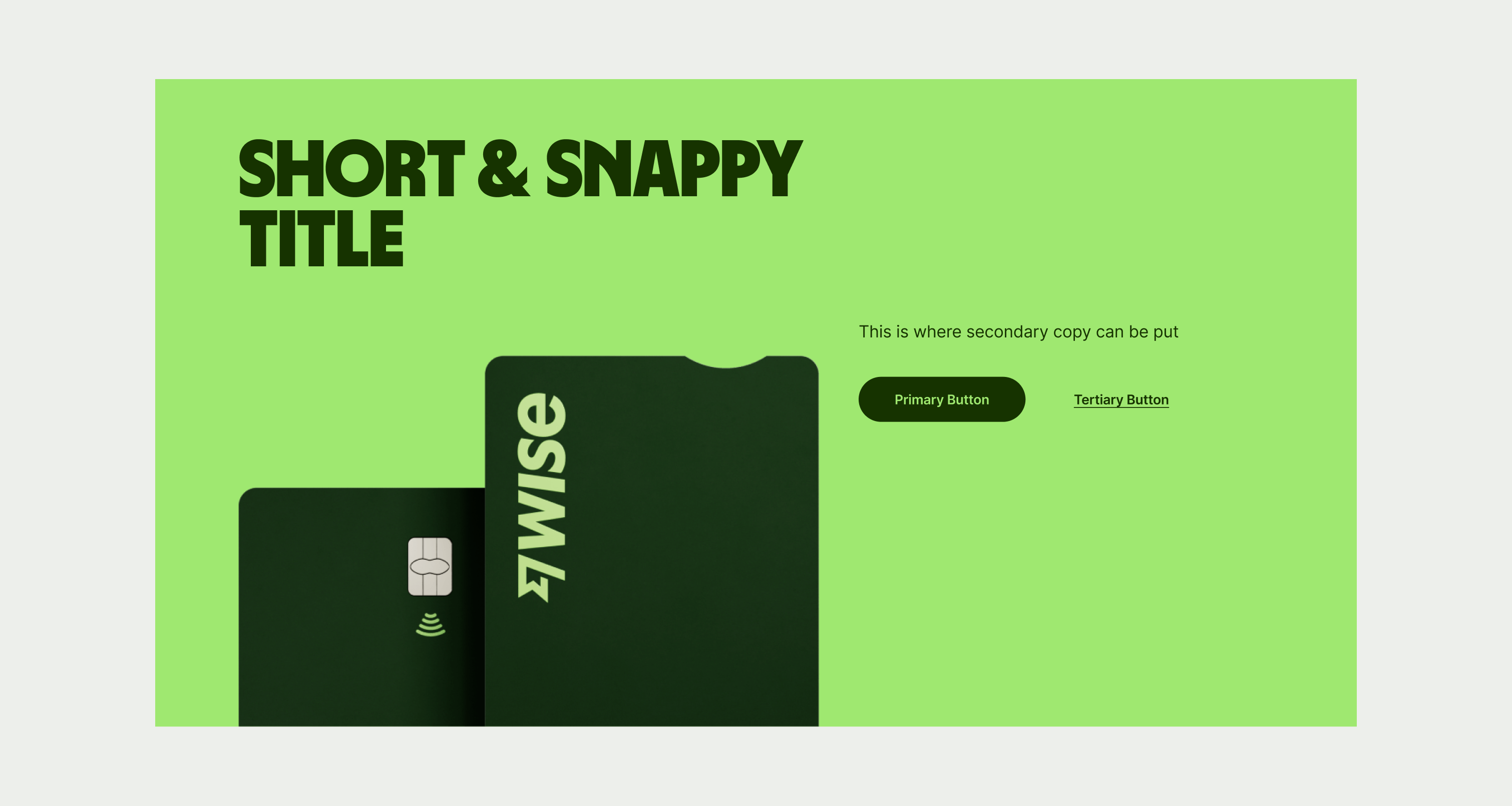
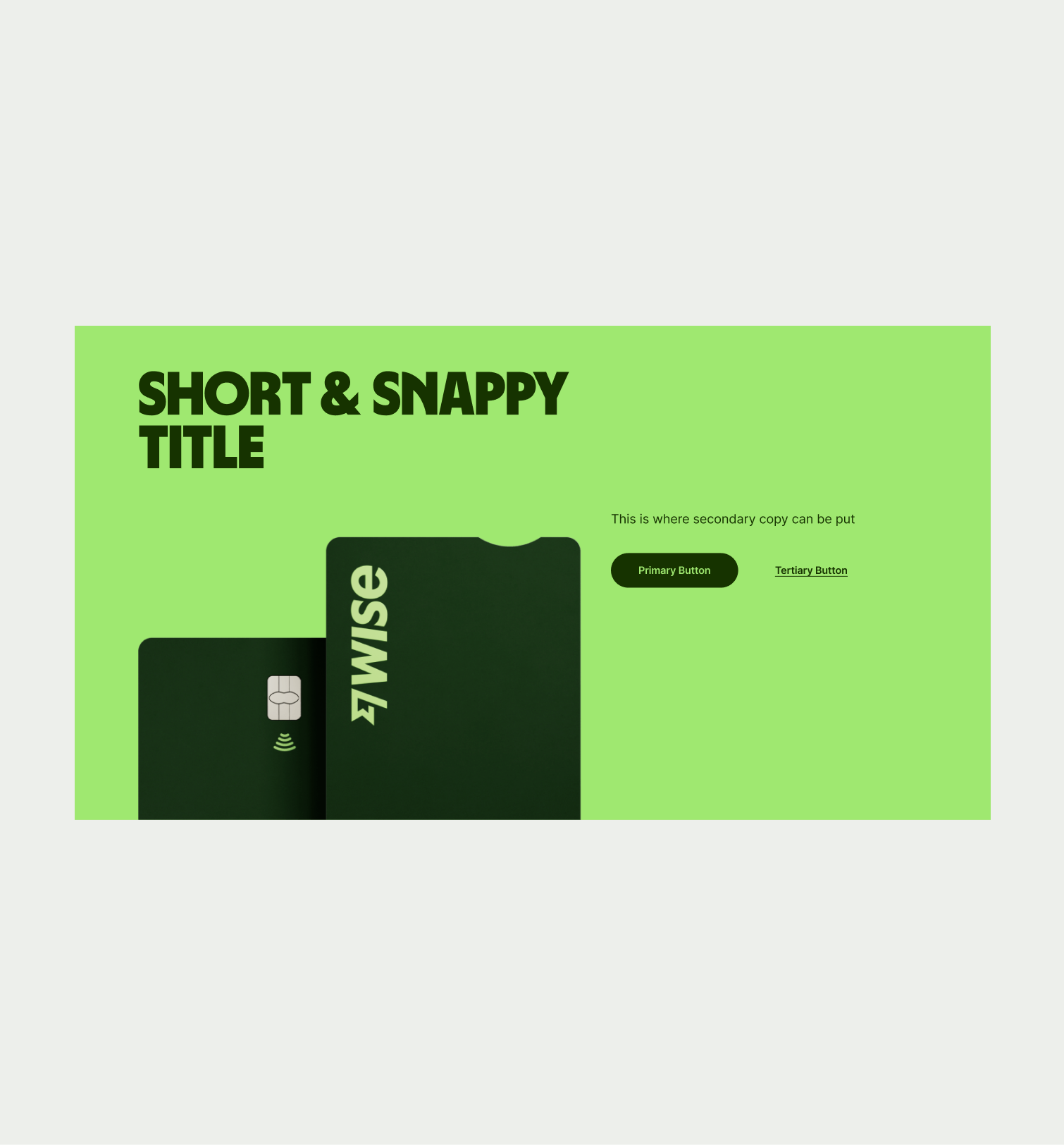
These are the examples of the Highlight Product component across different screen sizes.