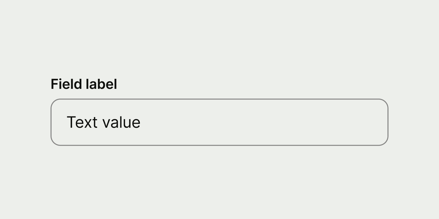
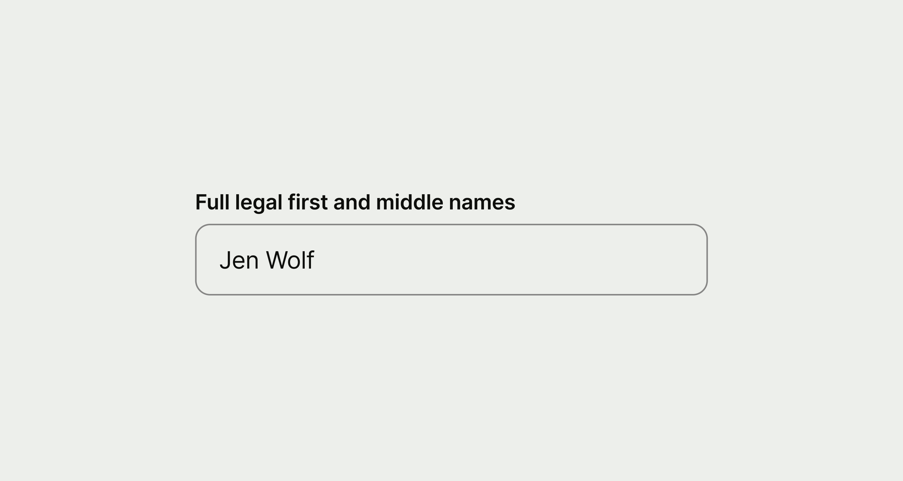
Text input

A text input lets users enter a single line of text.

Text input
When to use

Use a text input:

  • in a form, when the user needs to enter information that's unique and can’t be selected from a finite list
  • when the information is known to the user (like their name, email address, IBAN or card number)

Don't use a text input:

  • if you need users to enter text that may be more than a single line (use the text area instead)
  • if you want to predetermine the information a user must enter, and the way they enter it (use specific input components instead, like phone number input, date input or password input)

Best practice
  • Hide the text by default — users can choose to show the content of the field with the built-in action if they want to.
  • Only use the information message if you have evidence that users need more context.

Content

Label

Label copy should:

  • be no more than 3 words

  • be a noun that describes the information the user needs to enter (and not a verb)

A text input with a short, single word label.
A text input with an instruction as the label

Information message (optional)

Information message copy should:

  • be a single sentence

  • give some extra context to help the user enter the right information

Placeholders

Placeholders are not supported in most of our components, since (according to our research):

  • people may confuse the content with real values

  • lack of contrast make them usually difficult to read

  • they are often used with dummy values, so aren’t helpful to our users

Information messages offer a good alternative when you need to provide help on how to fill an input.

Availability

Platform

Available

Developer documentation

Android

iOS