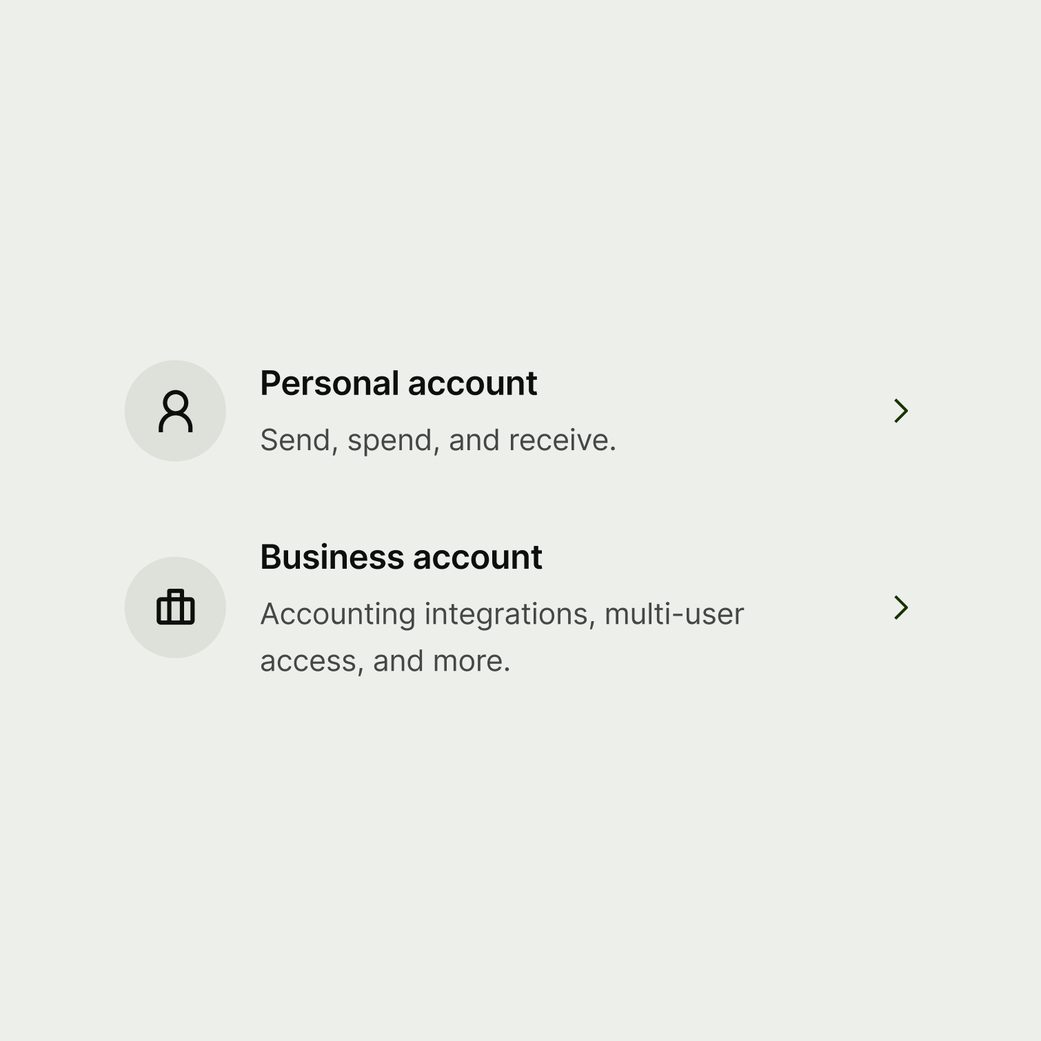
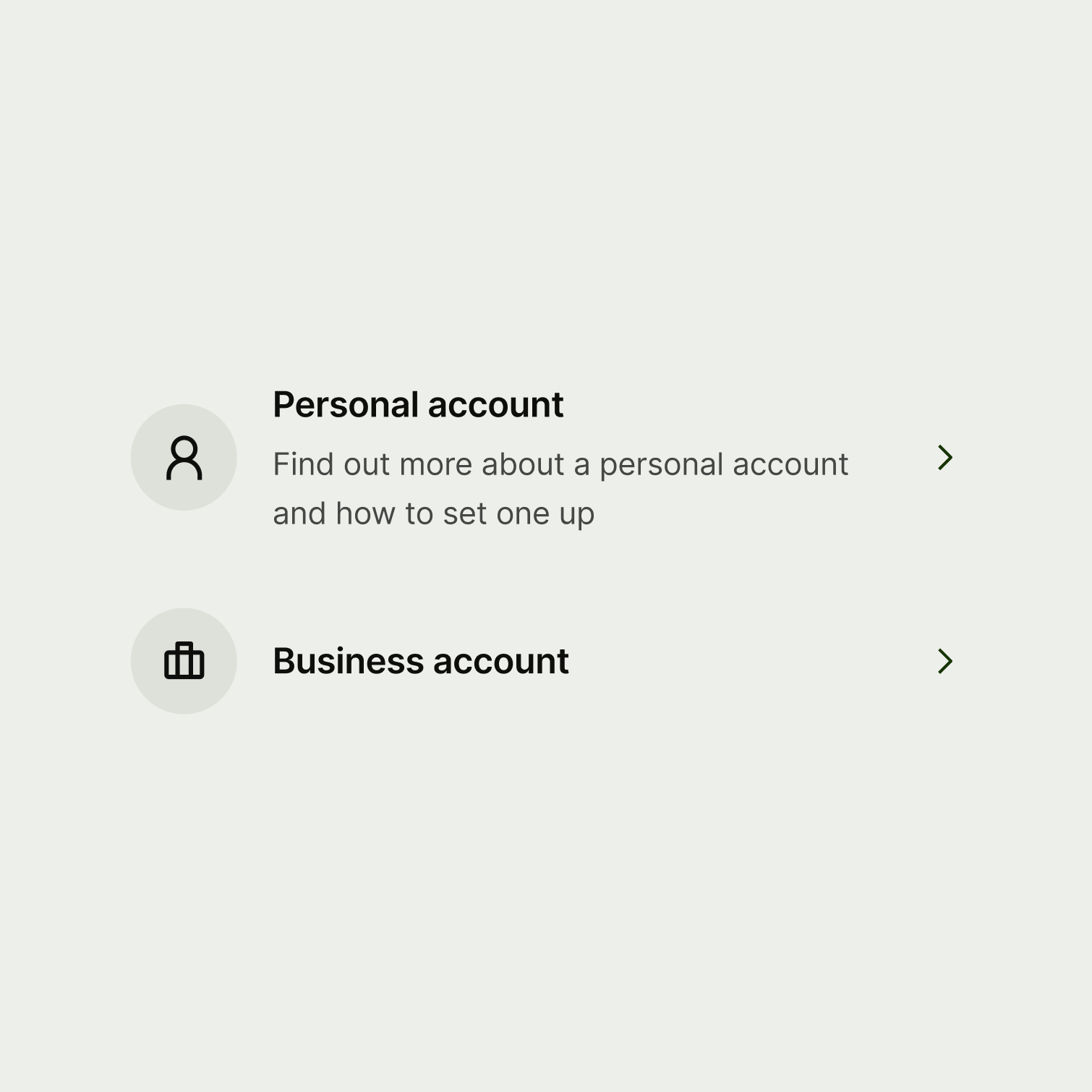
Navigation option

A navigation option gives users a rich way to choose between options and navigate to another screen or step in a flow. Navigation options are presented in a list or as tiles (tiles are web only).

Navigation option
When to use

Use a navigation option:

  • if there are multiple options that the user can choose from
  • if making a choice is the primary action on the screen
  • if you want to give the user a rich way to make a choice and navigate to another screen or step in a flow
  • if Some extra context — such as an icon, image or description — would help the user understand where they'll navigate to if they select that option

Don't use a navigation option:

  • when there's no action attached to the content (use a summary intead)
  • to display temporary information such as contextual upsells (use a nudge instead)
  • to ask the user to choose options within a form (use radio or checkbox instead)
  • when there is just one primary option, and perhaps an alternative secondary option (use a button instead)
  • when the user needs to complete all the options on a screen, rather than choose one

Best practice
  • Always use navigation options in a set.
  • Don't mix and match images and avatars, and don't include a description for some navigation options in a set, and not for others.

Presentation

Navigation options are presented in a list or as tiles.

List

List presentation shows the navigation options stacked vertically on top of one another. This is well suited to small screen widths, or if you have more than 4 options.

Tiles (web only)

Tile presentation shows the navigation options arranged horizontally on the screen. This is well suited to large screens, where you have 4 options or less.

Because the tiles will not wrap on to new lines, they will be forced to display as a list at small screen widths.

With tiles, you can use different media for a single navigation option — one to be displayed when the option is presented as a tile, and one when it's presented in a list.

Tiles can also be rendered at 2 sizes: medium and small.

Interaction

When a user selects a navigation option, it should navigate them straight to a new screen or step in a flow.

The whole component should be tappable on mobile, and clickable on web.

Navigation options can be disabled, in which case the user will not be able to select them.

Accessibility

On web, the available area for displaying the media changes between the list and tile views. Make sure the media works at both the small and medium sizes, or provide one for each.

Content

Title

Title copy should:

  • be just a few words

  • put the most important words first

  • summarise or introduce the content it relates to (imagine the user only reads the title)

  • be a statement rather than a question (unless the content is asking the user something)

  • be in sentence case (only capitalise the first letter of the first word)

  • have no full stop

Two navigation options with succinct, consistent titles.
Two navigation options with long and inconsistent titles.

Description (optional)

Include a description if you have evidence that users need a little more context in order to understand where the navigation option with navigate them. If you include a description for one option in a set, then include it for all of them.

Description copy should:

  • be short — aim for a maximum of 2 sentences and remember that content might expand when translated and look different in a list vs tiles

  • be plain text — that means no bold text, links, or other fancy formatting

  • use sentence case — only capitalise the first letter of the first word

  • include a full stop

Two navigation options with short and succinct descriptions.
Two navigation options with long and inconsistent descriptions.
Availability

Platform

Available

Developer documentation

Web

Web documentation