Tabs

Tabs organise content into sections that users can alternate between.

Tabs
When to use

Use tabs:

  • to let users navigate between related, but distinct groups of content at the same level of hierarchy

Don’t use tabs:

  • To change views of content
  • To filter between content
  • To select between options within forms

Teams selection page with tabs

Use tabs to categorise content groups.

Availability

Platform

Available

Developer documentation

Android

iOS

Web

Web documentation

Best practice
  • Keep the tabs text short and relevant to the content in the section
  • Initial focus should begin on the left for left-to-right languages and on the right for right-to-left languages
  • Use at the top of a page or section
  • Group content into helpful categories
  • Use for filtering content

Placement

Place tabs at the top of a page or section to categorise content.

Tabs are used for navigating between different available groups of content, it remains at the top of the page so users can see all available content groups.

Content

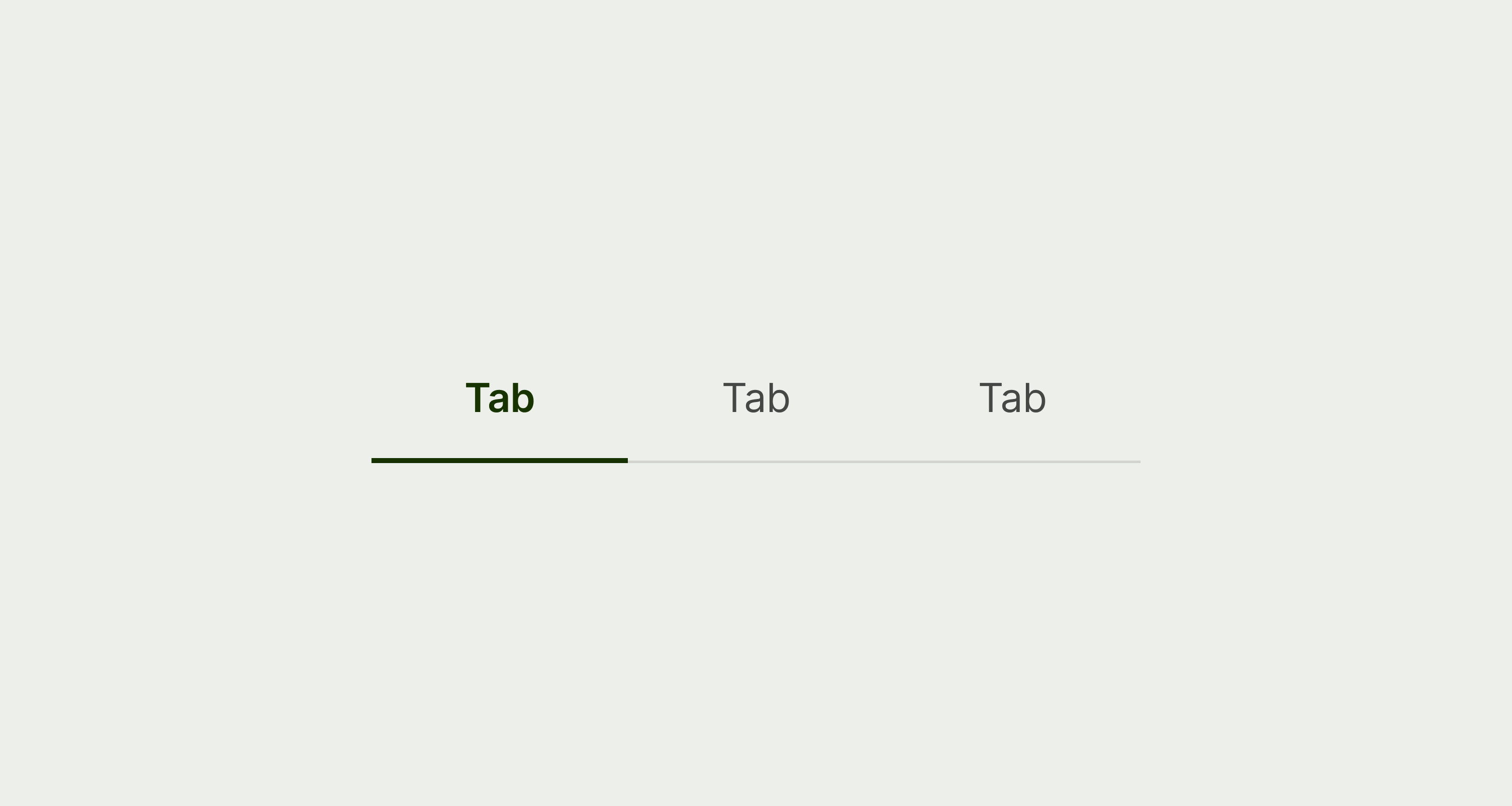
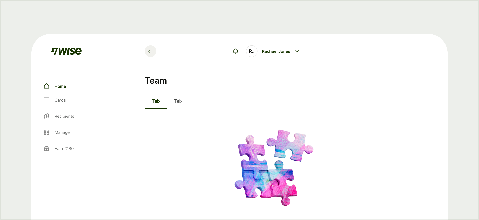
Tab labels should describe the content within. They appear in a single row, and are horizontally scrollable if the tab group overflows on the screen.

Options should:

  • Be at the top of the hierarchy for the section

  • Be short (1–3 words)

  • Capitalise the first letter of the first word

  • Not have any punctuation

Tabs with related content

Related content

Tabs with sequential content

Sequential content

Tabs with content groups

Navigational groups of content

Tabs with alike options

Selecting between alike switches/options

Tabs with related content

Related content

Tabs with filtering options

Filtering