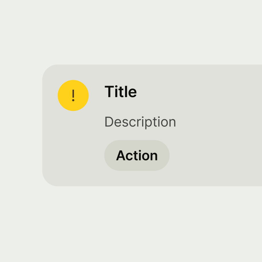
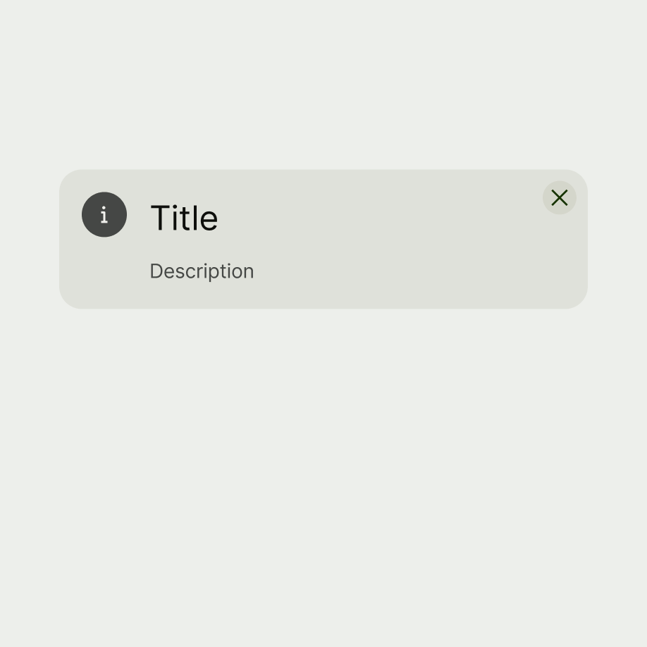
Card is a container that groups related content.

There are 2 different types of card — Small and large.


The card component is ideal for highlighting content whilst still keeping structure. It is primarily used for promotions or conveying crucial information.
It's also useful for presenting related details about a specific topic.
- Use multiple cards as part of a heterogeneous collection to display a variety of content types at the same time on the same page.
- Don’t use cards for listed content or components.
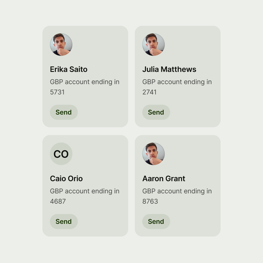
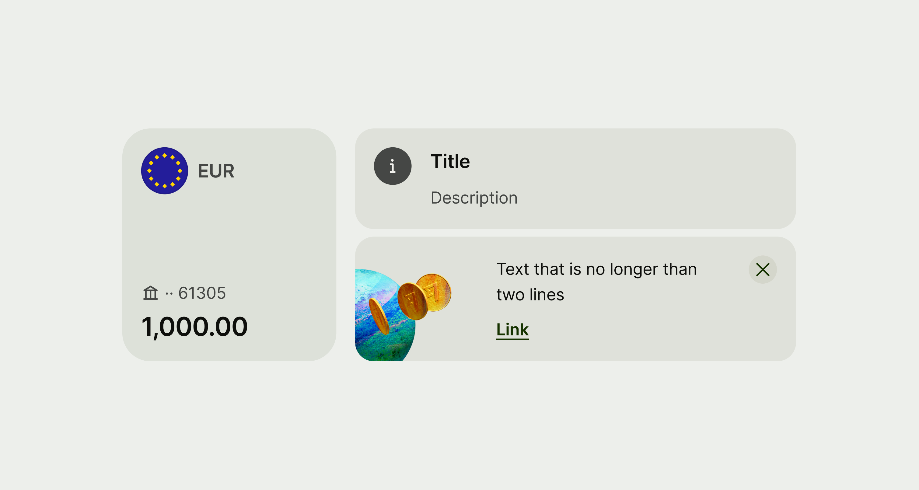
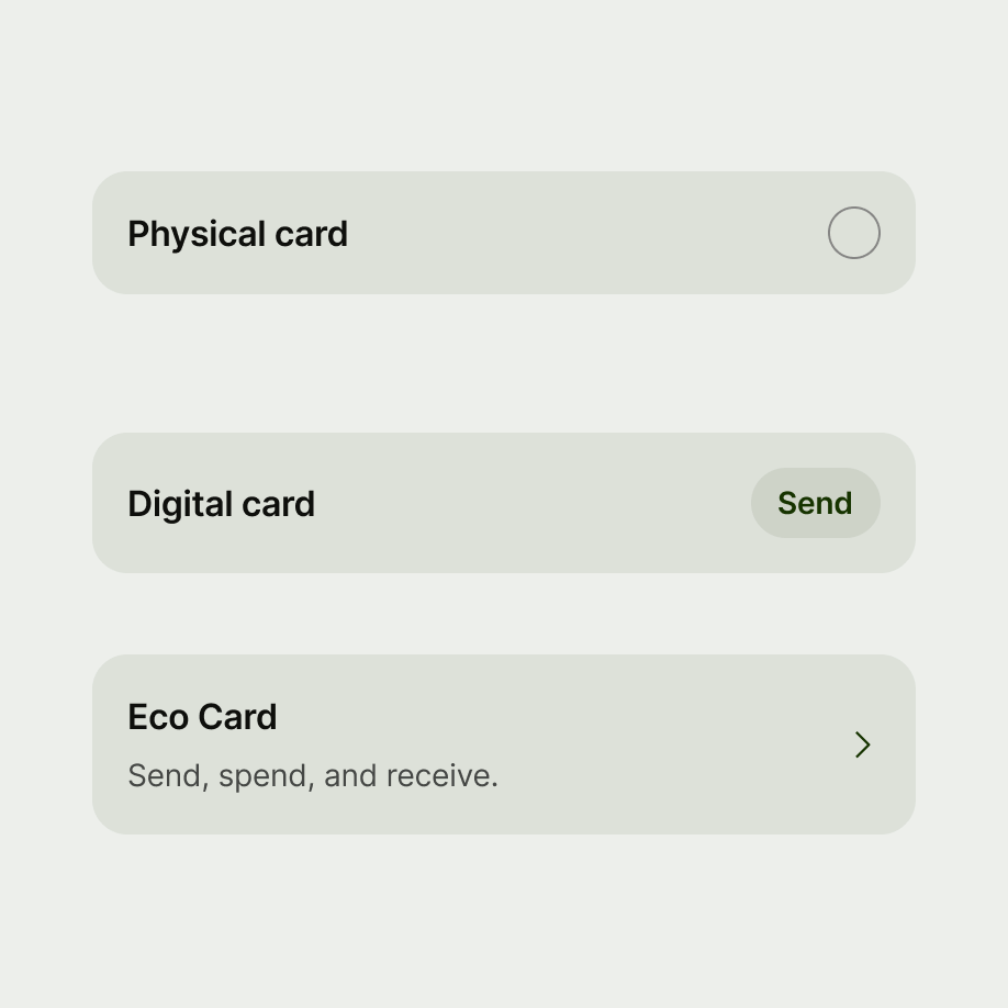
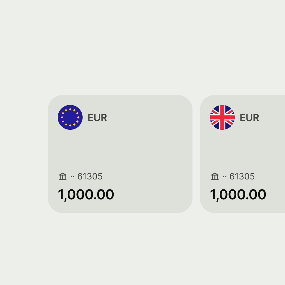
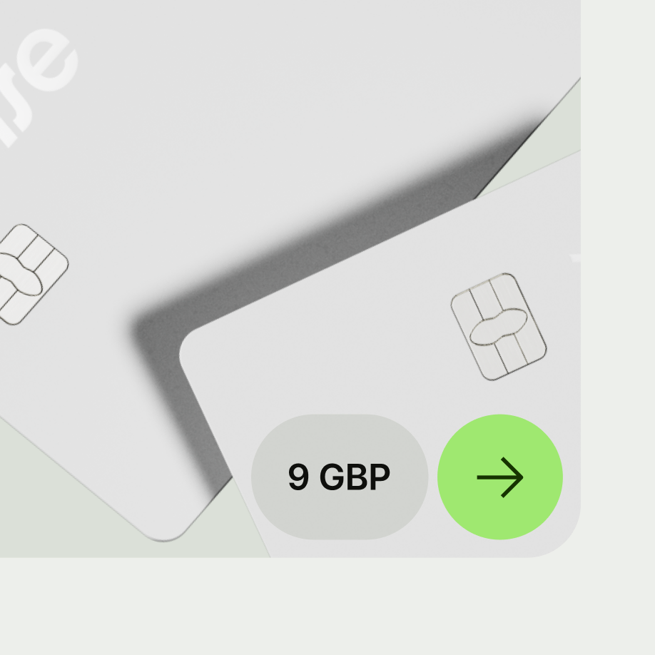
Small card
Use to display related information on a single subject.
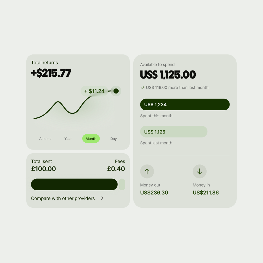
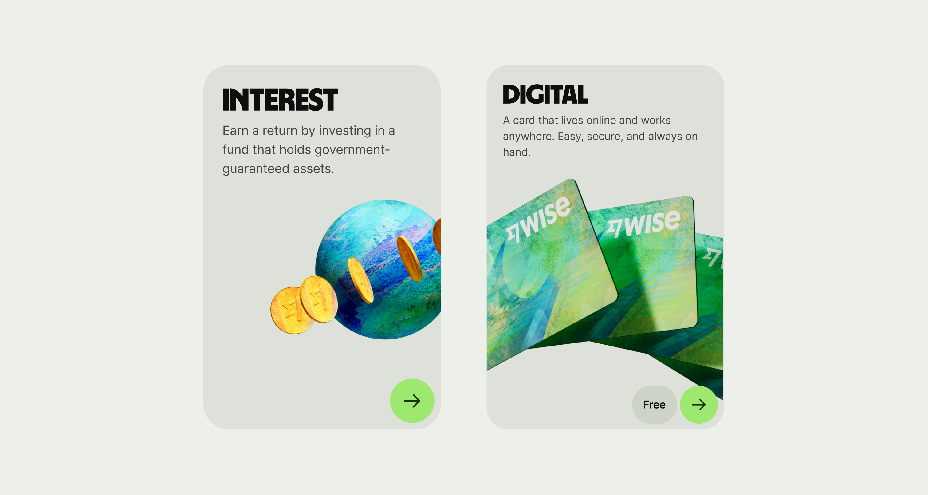
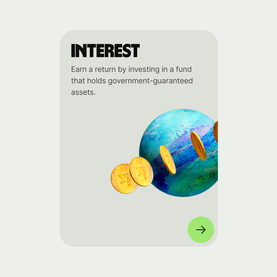
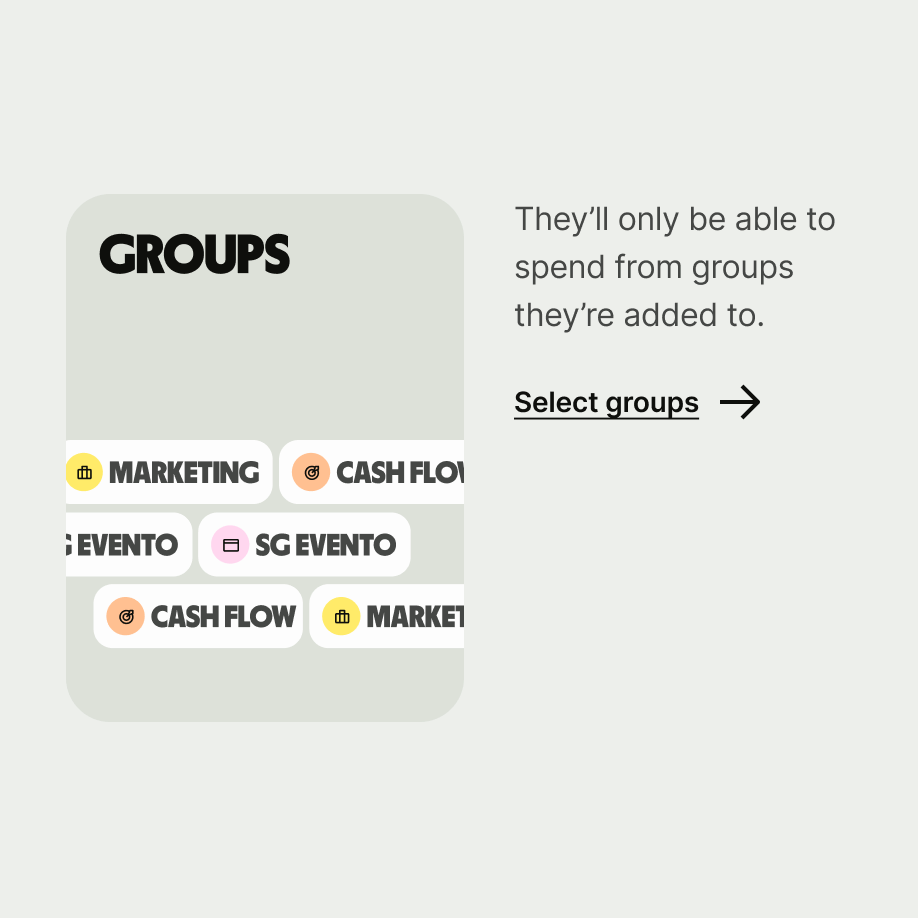
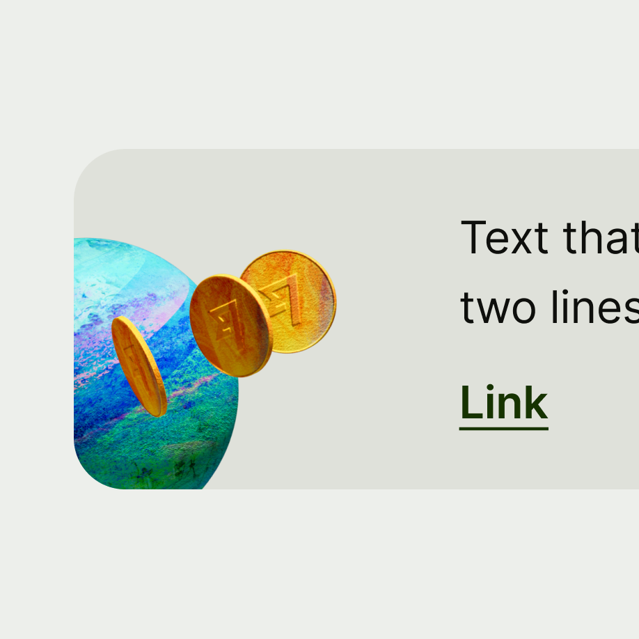
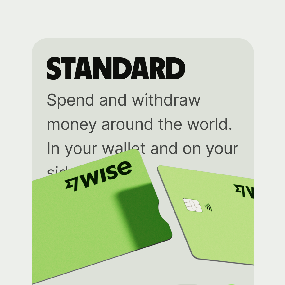
Large card
Large cards are best suited for situations where you need to clearly highlight content, like in the case of promotions.
Utilise cards for presenting both content and actions related to a specific topic. Ensure that cards are designed for effortless scanning of pertinent and actionable details.
Arrange elements such as text and images on the cards in a manner that effectively communicates their hierarchy.
- Cards can be showcased collectively in a grid, vertical list, or carousel format.
- Can be positioned at the top, middle or bottom of a screen paired with a heading.
- Don’t place in a carousel if the cards have different height values.
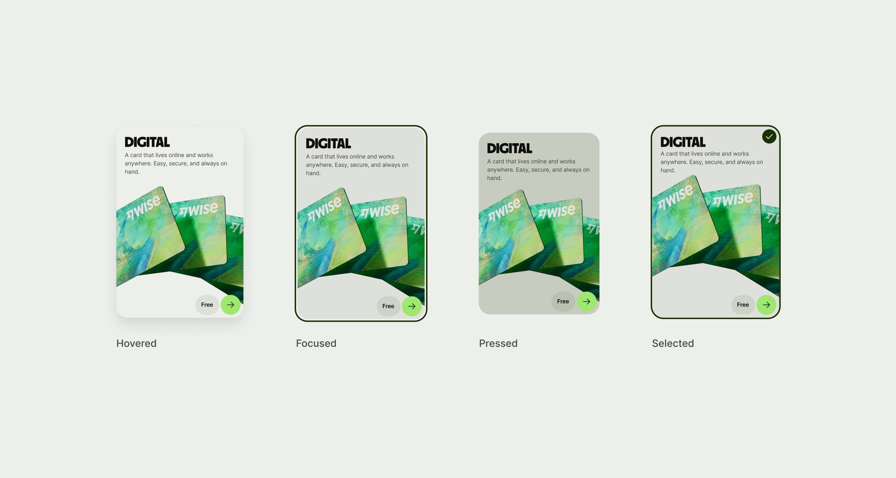
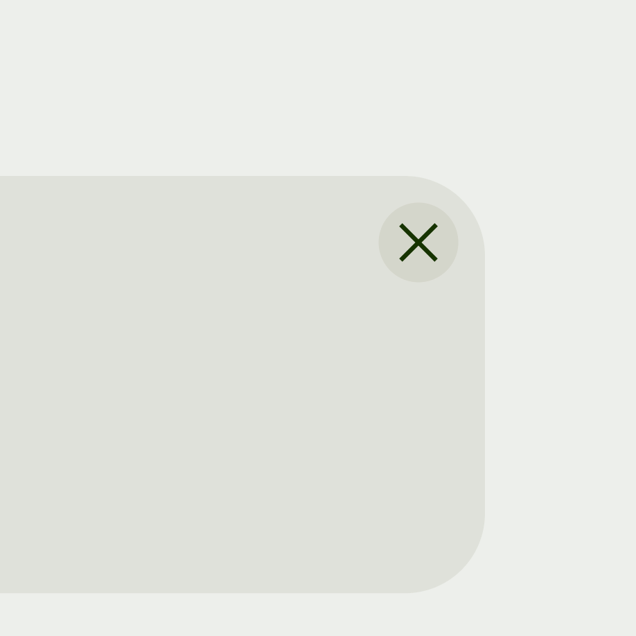
The card component has optional states based on if the card is clickable or static. As well as buttons and dismiss icons.
The card component scales in height with scaled text.
Platform | Available | Developer documentation |
|---|---|---|
Android | ||
iOS | ||
Web |