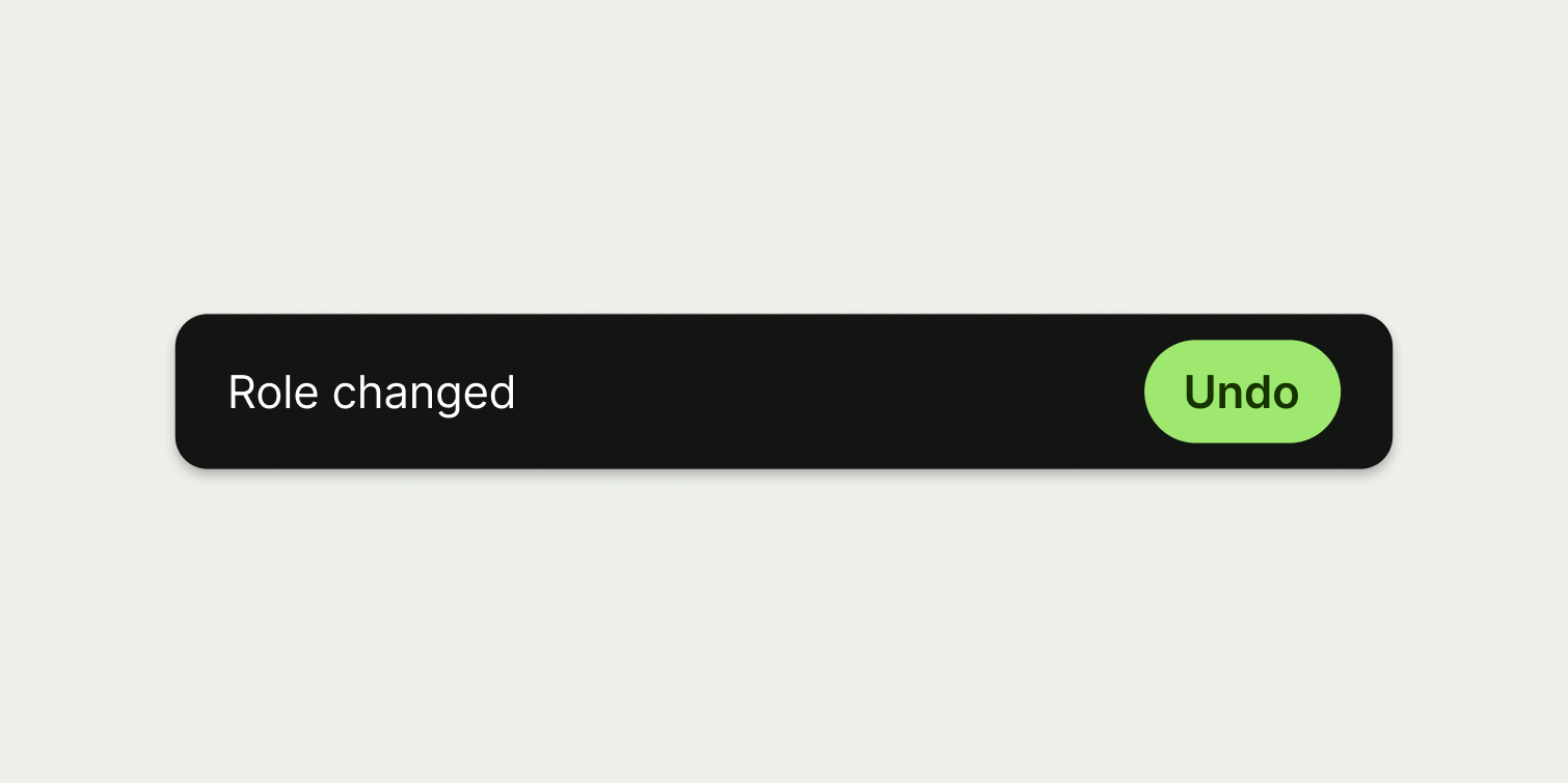
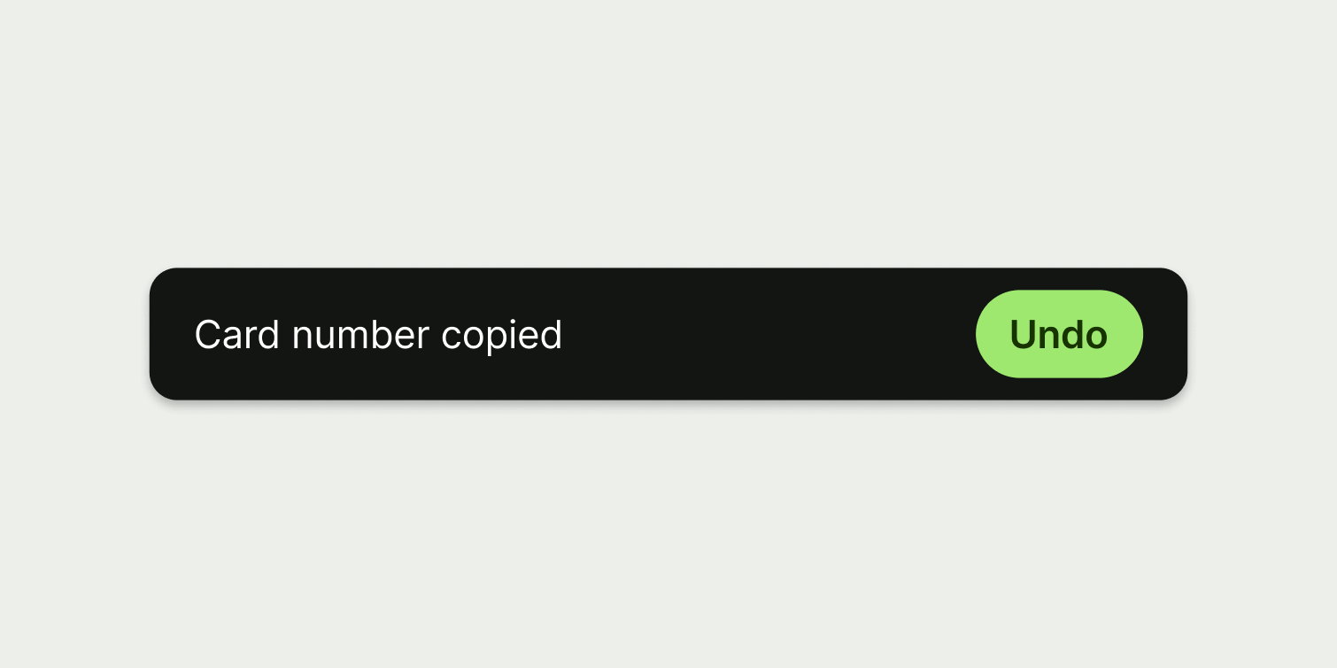
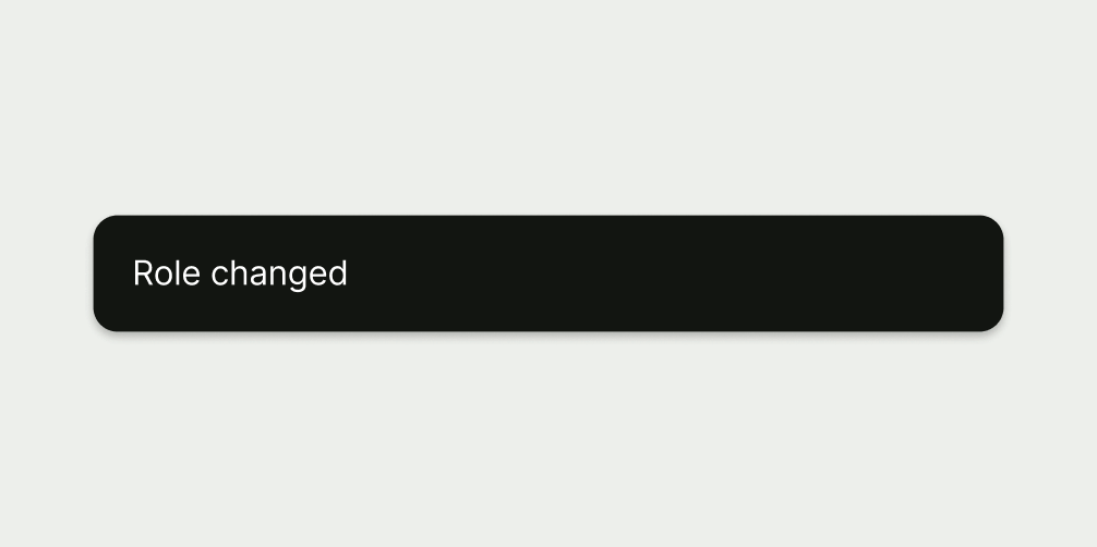
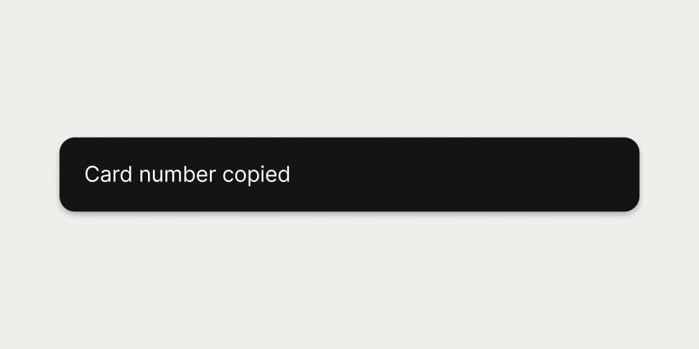
Snackbar

A snackbar is a brief, temporary notification that confirms the outcome of an action or process that’s just happened.

Snackbar
When to use

Use a snackbar:

  • to give users immediate, non-critical feedback on the outcome of an action or process (without disrupting their experience)

Don't use a snackbar:

  • if the message is critical, or requires the user to do something

Best practice
  • Only show information that the user can find somewhere else on the screen (if they don't see the snackbar).
  • Never use snackbars for critical information — some users may not notice it, or might not have time to read the text before it fades out.
  • Only include a button if really necessary, and made sure the user can perform the same action somewhere else on the screen.

Placement

Place the snackbar at the bottom centre of the screen. On mobile, make sure it sits just above the bottom navigation.

Only use one snackbar on a screen at once.

Interaction

Snackbars are temporary, and fade out automatically. The user doesn’t need to interact with them or dismiss them.

The only part of a snackbar that is clickable is the optional button. But don’t include a button unless you really have to. They’re rarely needed.

There should never be more than one button on a snackbar. And the user should still be able to perform the same action somewhere else on the screen.

Accessibility

Don’t trigger snackbars too often — frequent interruptions are disruptive for people with cognitive and visual impairments.

Content

Text

The text should:

  • confirm what just happened

  • use the pattern noun + verb

  • be 3 words or less

  • have no full stop

A snackbar with a short title
A snackbar with a short and succinct title.
A snackbar with a long title.

Button

Button copy should:

  • start with a verb, like ‘Pay’ or ‘Send’

  • be just a few words (ideally 1 or 2)

  • describe the action (if someone only reads the button, they should know what will happen next)

  • connect to the content around it — for example, it might use the same words as the title

  • avoid using first person pronouns like ‘me’, ‘my’ and ‘I’

  • be in sentence case (only capitalise the first letter of the first word)

  • have no full stop

A snackbar with a single verb as the button text.
A snackbar with a single verb as the button copy.
A snackbar with 'Cancel' as the button copy.

Snackbars confirm actions that have already happened, so it’s too late to cancel.

A snackbar with 'Close' as the button copy.

This is redundant as snackbars fade out automatically.

A snackbar with 'Confirm' as the button copy.

There’s no need for the user to confirm they’ve understood a snackbar.

A snackbar with 'Go' as the button copy.

Navigating to an area is not specific enough. What will the user do there?

Availability

Platform

Available

Developer documentation

Android

iOS

Web

Web documentation