Alert

An alert gives users an important message about their current task within the context of a screen.

Alert
When to use

Use an alert:

  • to tell users about something that relates to what they're currently doing
  • to let users know that something needs their attention
  • when the message is temporary (and not a permanent part of the screen)

Don't use an alert:

  • if the message needs to be permanently on the screen (use normal copy instead)
  • if the message relates to a single form field
  • for network or system errors (use an error screen or error state instead)

Types of alert

There are 4 different types of alert — neutral, positive, warning, and negative.


Each has a different use case.

A neutral alert
Neutral alert

Use a neutral alert to give users contextual hints or general information.

A positive alert
Positive alert

Use a positive alert to tell a user about something that’s resolved, or now available due to their action.

A negative alert
Negative alert

Use a negative alert to tell a user about something that will or already has negatively affected their experience.

A warning alert
Warning alert

Use a warning alert to warn a user about something that could negatively impact their experience.

Best practice
  • Keep the message short and succinct.
  • Mind your tone with negative and warning alerts.
  • Don’t make an alert dismissible if the message is critical.
  • Don’t have more than one alert on the screen.
  • Only include an action when the user needs to go somewhere to fix the issue or find out more.

Placement

Alerts are contextual, so place them in close proximity to the issue or task they relate to.

If you’re using the alert to communicate information about the application as whole, place it in the top section of the screen.

Interaction

Users can only interact with alerts that include an action, or that they can dismiss.

Action

The action lets users navigate to another screen where they can perform a task or get more information.

If the alert includes an action, it makes the whole component tappable on Android and iOS, as well as on desktop and mobile web touchscreen devices. 


On web, the action text is also clickable and underlined, so it works for click-based interactions too — like using a mouse or keyboard.

Dismiss

Most alerts don’t need to be dismissible. But this functionality can be useful if we know that a user has seen the information before and may want to dismiss it.

If you choose to make an alert dismissible, you’ll need to consider what happens after it’s been dismissed.

Should the alert stay dismissed indefinitely, or reappear next time the user logs in or revisits the same screen?

Does the alert dismiss across all platforms? For example, if the user dismisses the alert on desktop, but then logs in using one of our apps, should it already be dismissed there too?

Content

Writing for different alert types

Each alert type has a different use case — sometimes you might be giving the user good news, and sometimes it might be a warning, or bad news. Depending on the alert type, you'll need to adapt our tone of voice to suit the scenario and message.
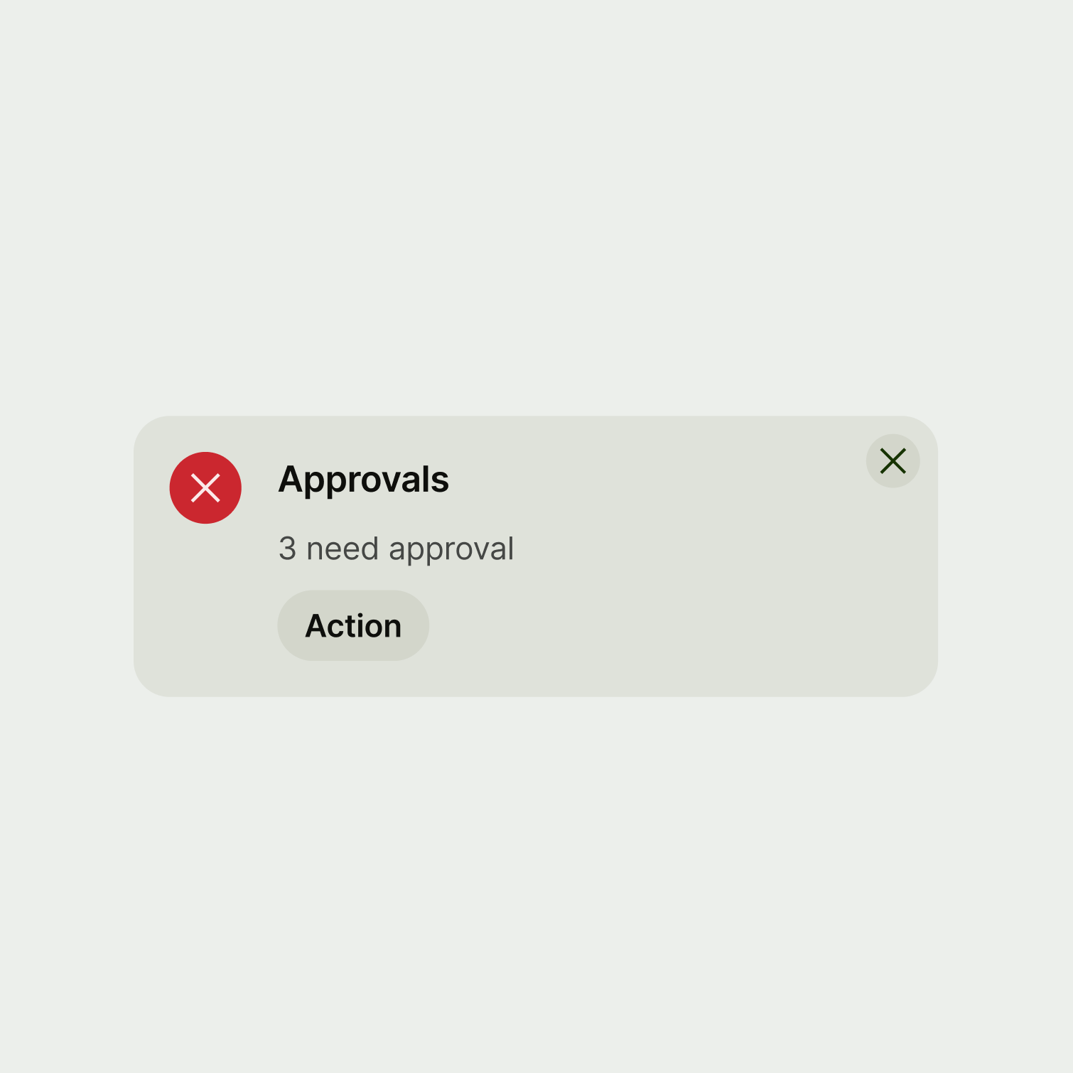
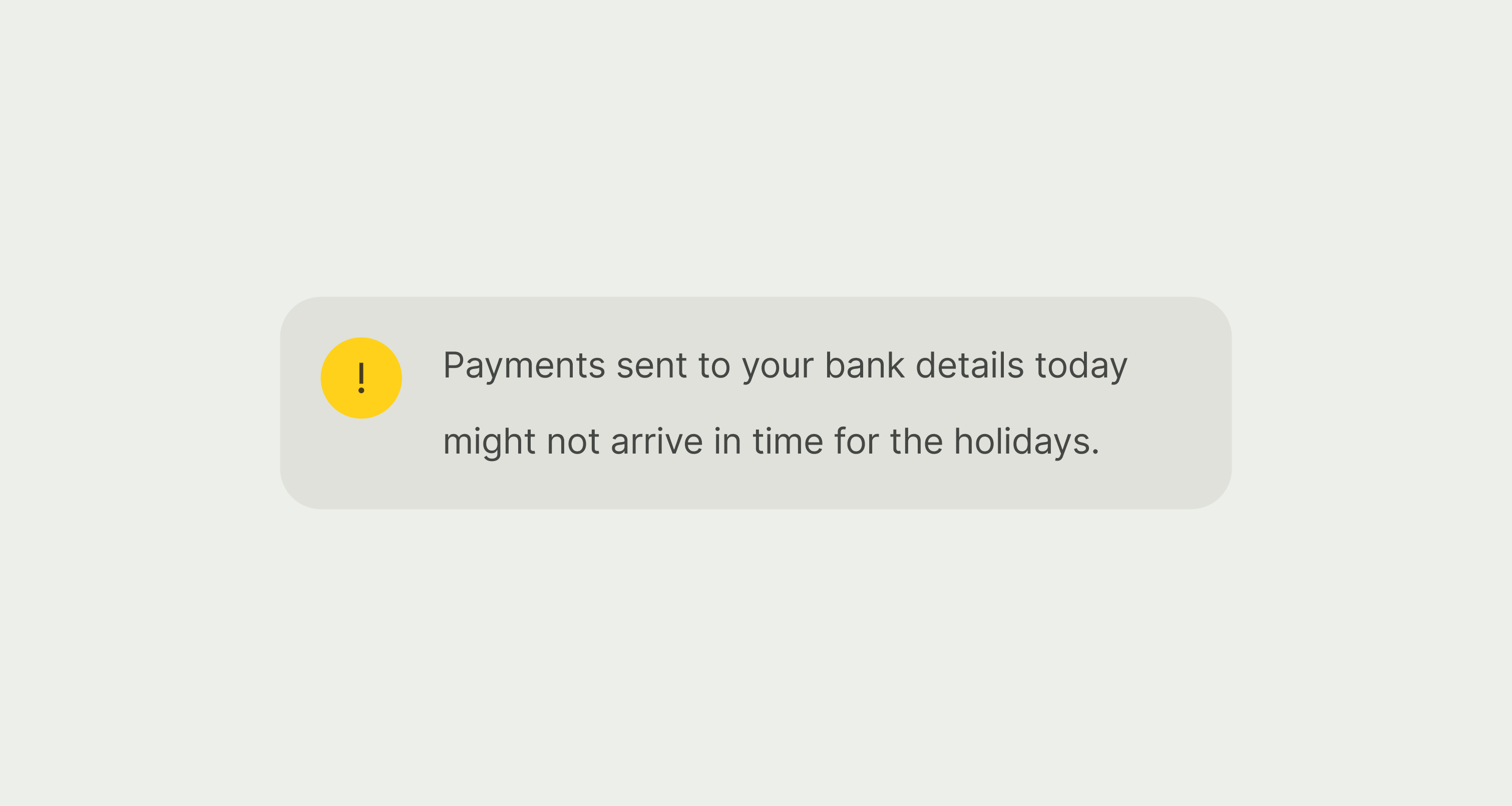
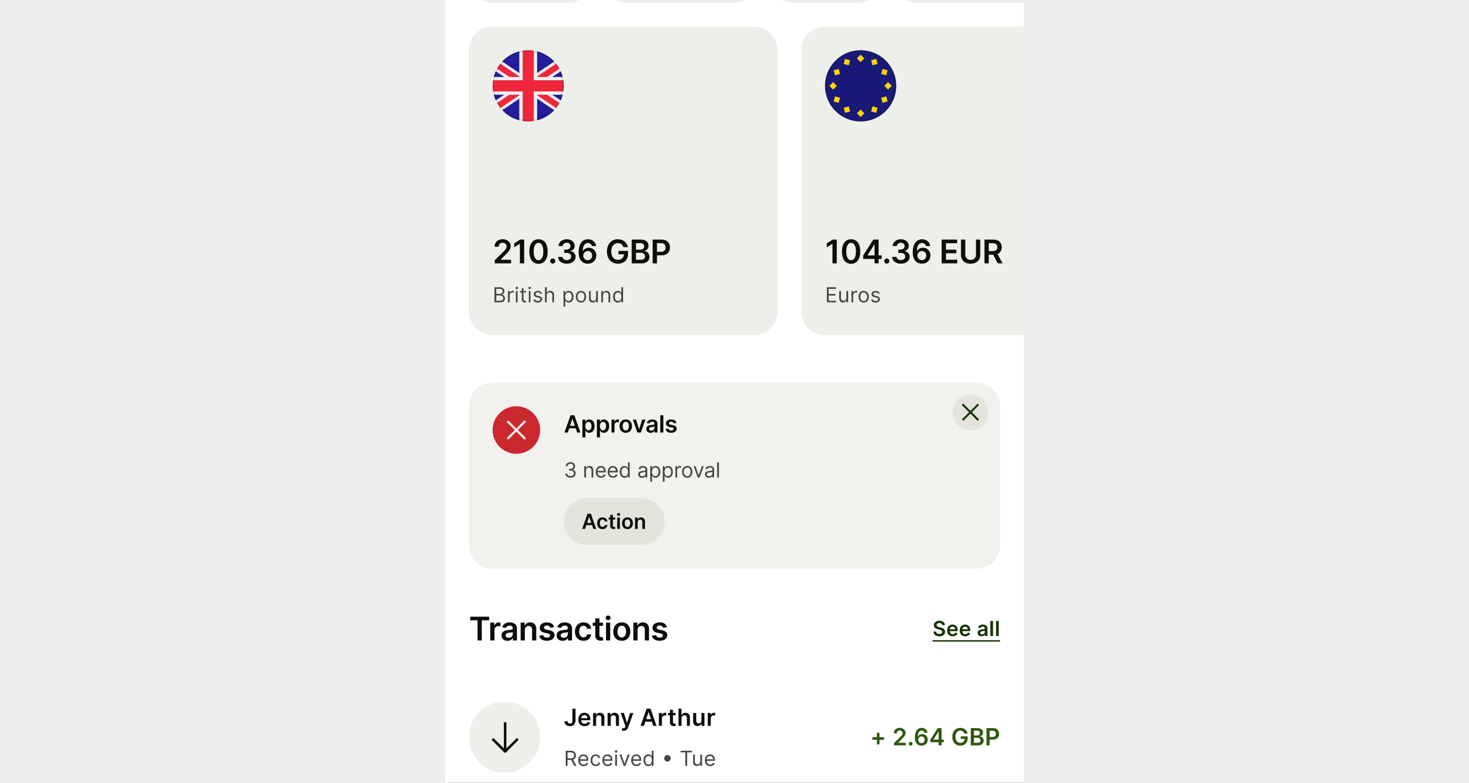
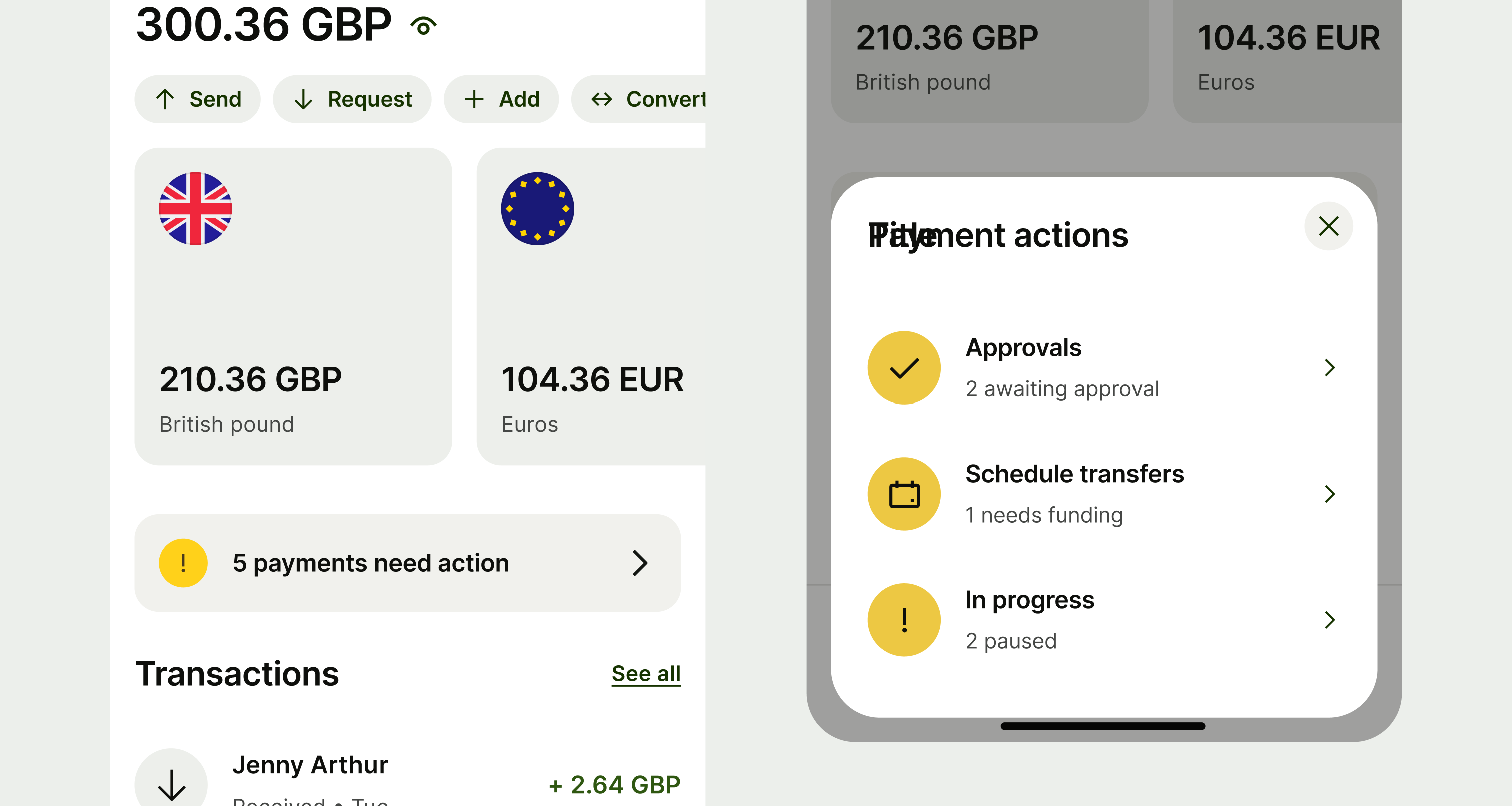
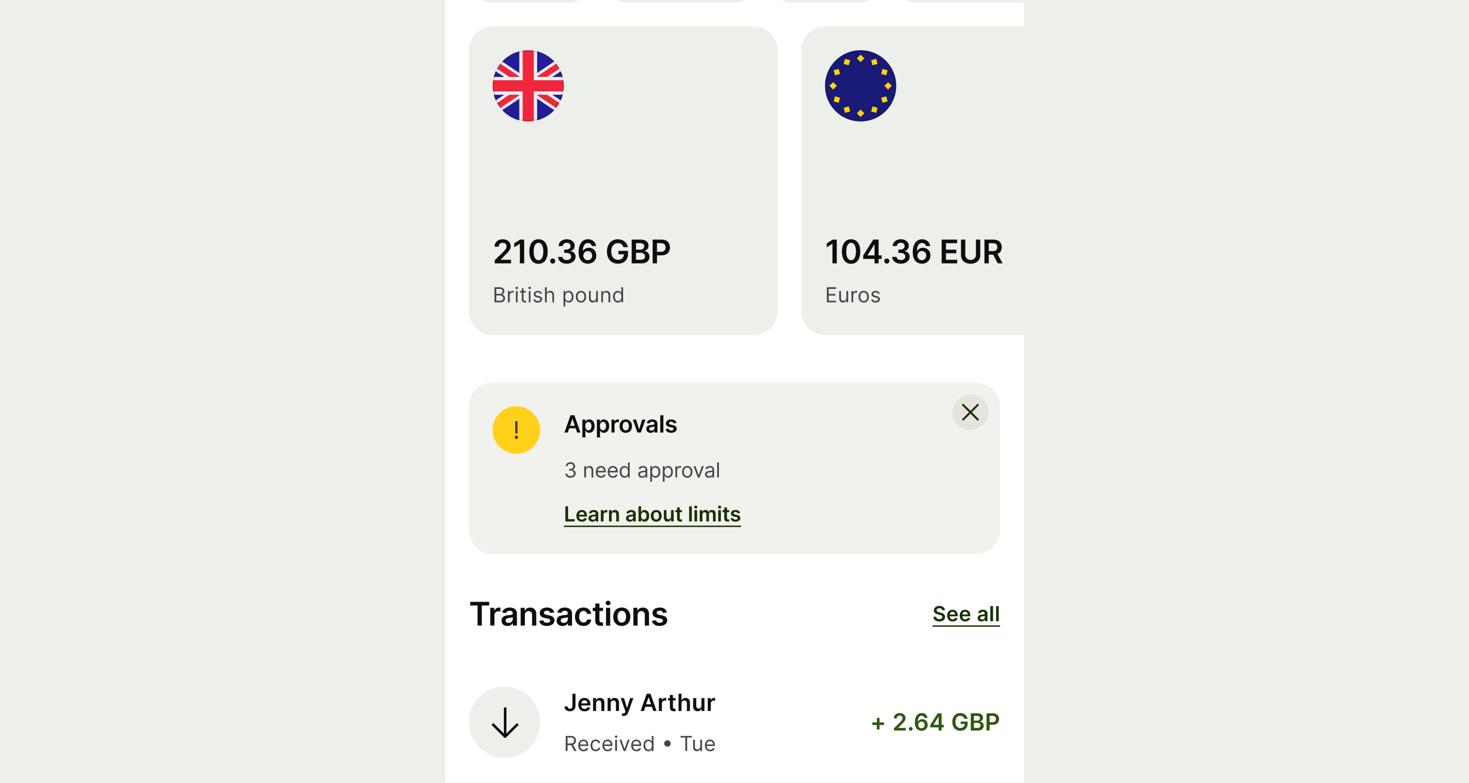
A neutral alert.
Neutral alert

Neutral alerts can be more upbeat, especially if the message is positive. Think how you can draw on the mission pillars, and add energy to the copy.

A positive alert with an upbeat message.
Positive alert

You've got good news, so don't be afraid to add some energy and colour to the copy. Keep it concise and punchy though — people don't have all day.

A negative alert with a clear, straightforward message.
Negative alert

With negative alerts, clarity is key. Explain the situation as clearly and concisely as possible. And use everyday language that everyone will understand.

A warning alert.
Warning alert

As with negative alerts, warning alerts need to be clear and concise. This isn't the time to be positive and playful.

Message

Message copy should:

  • clearly explain what the user needs to know and do

  • be brief — 1 or 2 short sentences is ideal, but 3 is ok if it makes the message clearer

  • be plain text — that means no links or other formatting (but small bits of bold are ok for

  • highlighting important details like dates or names)

  • have no title or paragraph breaks

  • be written in full sentences

  • have a full stop at the end

A warning alert with a short and clear message.

Action (optional)

Action copy should:

  • make it clear what will happen if the user taps or clicks

  • start with a verb — like ‘See’, ‘Add’, ‘Enable’

  • be around 1-3 words long

  • be in sentence case

  • have no full stop

Avoid using the phrase ‘Learn more’. It’s vague and doesn’t tell the user anything about where they’ll go if.

If you need to say ‘Learn more’ — like when linking to a help article — provide an aria-label on web. This gives more context to people using screenreaders.

An alert with long action copy
An alert with succinct action copy.
Availability

Platform

Available

Android

iOS

Web

Web documentation