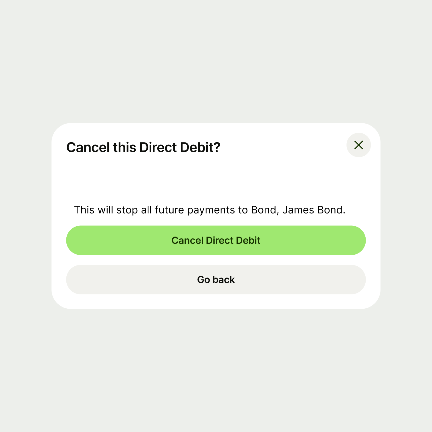
You can use modals for many different purposes, so the content within them may vary. But there are some general guidelines you should follow.
Title
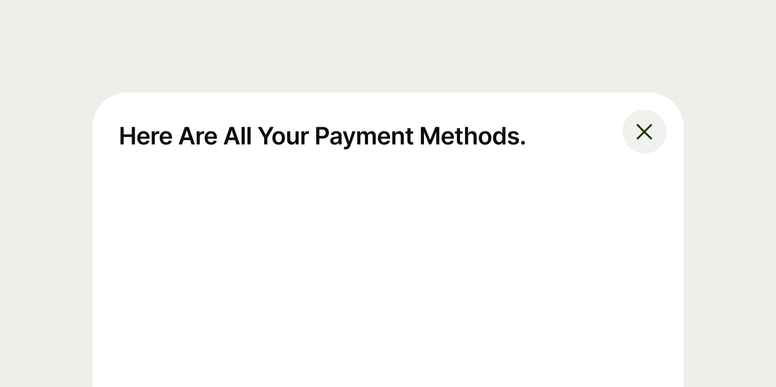
Title copy should:
be just a few words
put the most important words first
summarise or introduce the content it relates to (imagine the user only reads the title)
be a statement rather than a question (unless the content is asking the user something)
be in sentence case (only capitalise the first letter of the first word)
have no full stop
Main content
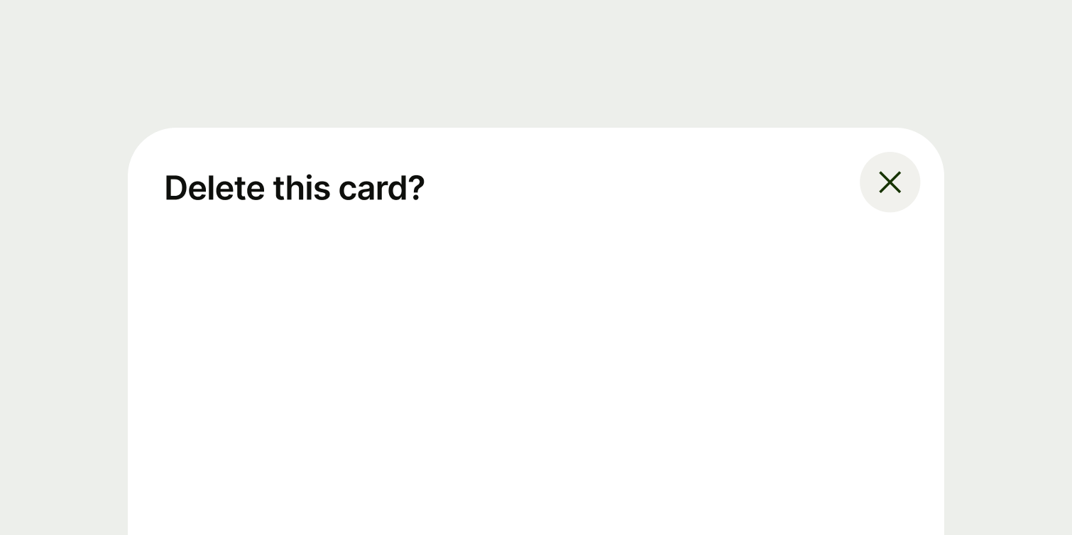
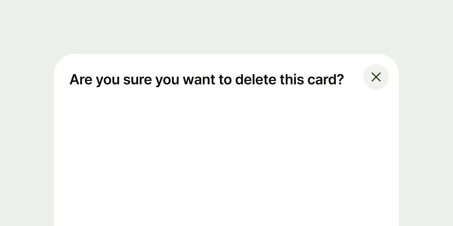
Warnings
With modals that are warning the user — where the action is destructive or irreversible — include vital information in the title and action, and not just in the main content. This is because users might skip the main content and only read the title and the action.
Actions
If you're using a button for the modal action, the button copy should:
summarise the purpose of the modal — if the user skips the title and the main content, the button should be enough for them to understand what they are about to do
describe the action in as few words as possible — ideally one or two
start with a strong, imperative verb, like 'Pay', 'Send' or 'Log in'
connect to the rest of the copy in the modal — for example, with a primary button it can be good to use the same verb that's in the title
avoid using first person pronouns like 'me', 'my' and 'I'
be in sentence case — only capitalise the first letter of the first word
have no full stop
If you have two buttons on a modal, be careful that the copy doesn't confuse the user. It should be competely clear what each button does. A user shouldn't have to second guess what the result of their actions will be.
An example would be if the modal is asking the user to confirm a cancellation.