Popover

A popover is a short, floating message that gives the user some non-critical, extra context.

Popover
When to use

Use a popover:

  • to give optional, supplementary information that might be useful for the user
  • to give short definitions of terms or phrases, or to provide some extra context

Don't use a popover:

  • if the information is critical, and the user needs the information to complete a task (make it visible on the screen or in the flow)

Best practice
  • Use popovers for non-critical information.
  • Keep the content short and succinct.
  • Don't have lots of popovers on the same screen.
  • Add a link to more content if you need to.
  • Include a title if you're using the popover to define a term or phrase.

Placement

Only use popovers on web. On mobile and mobile web, show the content in a bottom sheet instead.

Popovers can sit above, below, to the left, or to the right of the button that triggers them.

The component will adjust its placement automatically depending on its position and the space available on the screen.

The four different placement options for popovers.
Interaction

A popover should always be triggered by a button. The popover appears when the user taps or clicks on the button. It doesn’t appear on hover.

Once a popover has been triggered, it will stay open until the user dismisses it, which they can do by clicking anywhere outside of it.

You can include links in the content, but no other interactive elements.

Accessibility

Add an aria-label to the icon button that triggers the popover, to hint at the content for those using screen readers.

You can include an image within the content as an extra visual cue, but you should never rely on the image alone to give the user an explanation.

If you include an image, it must be:

  • an illustration that has no text within it

  • accompanied by a description or some instruction text that's not part of the image

Content

Content

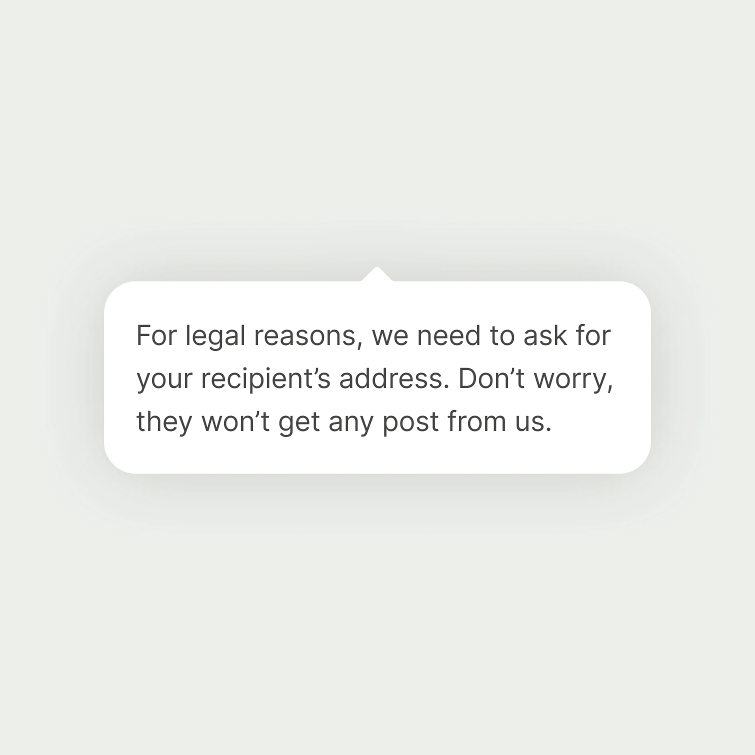
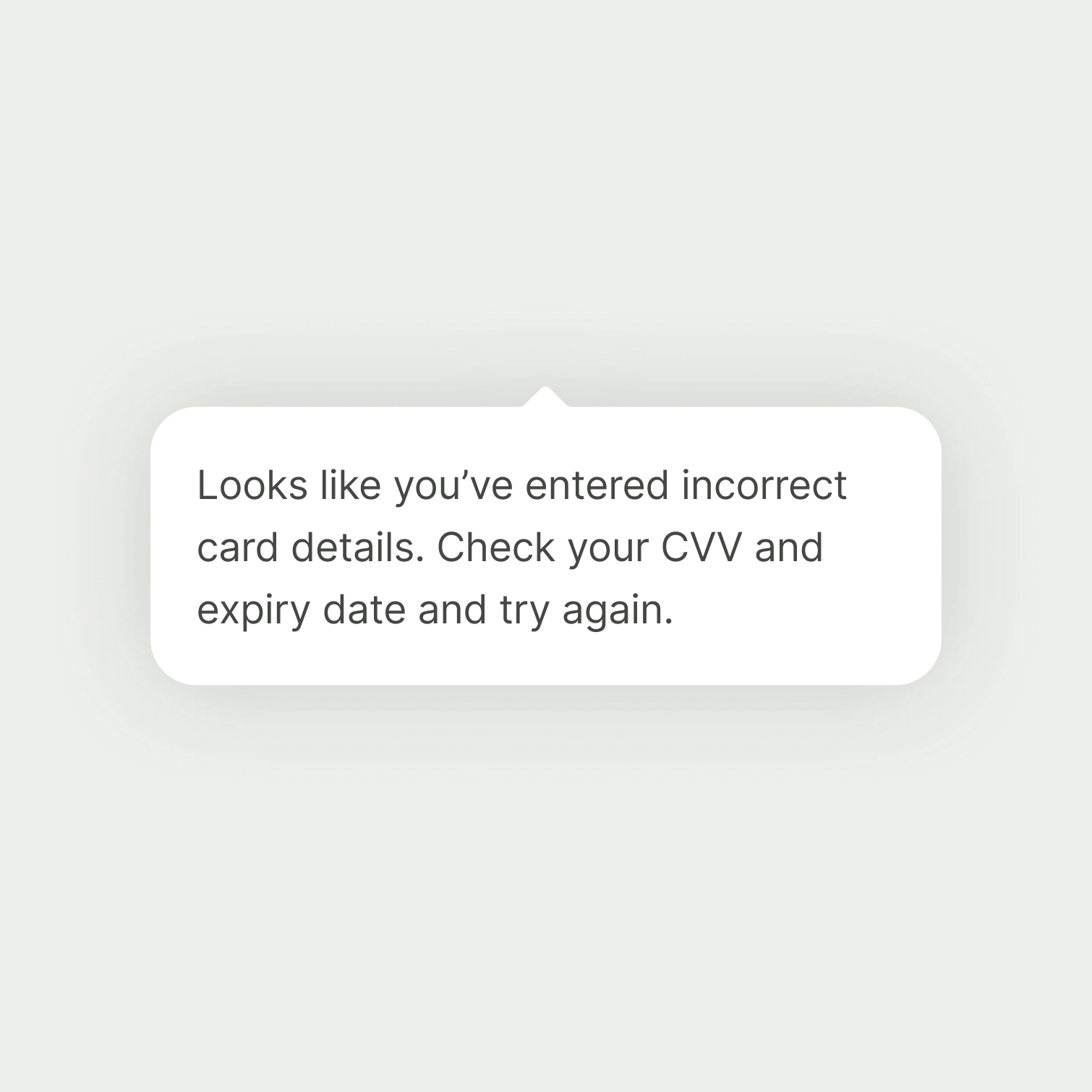
Content copy should:

  • define a term or phrase, or give some extra context

  • only communicate non-critical information that not every user needs

  • be concise — 100 characters or fewer is ideal, but try not to go over 250

  • be mostly plain text, but can include links, bold, bullets, and images

  • not include any other text styles or interactive elements
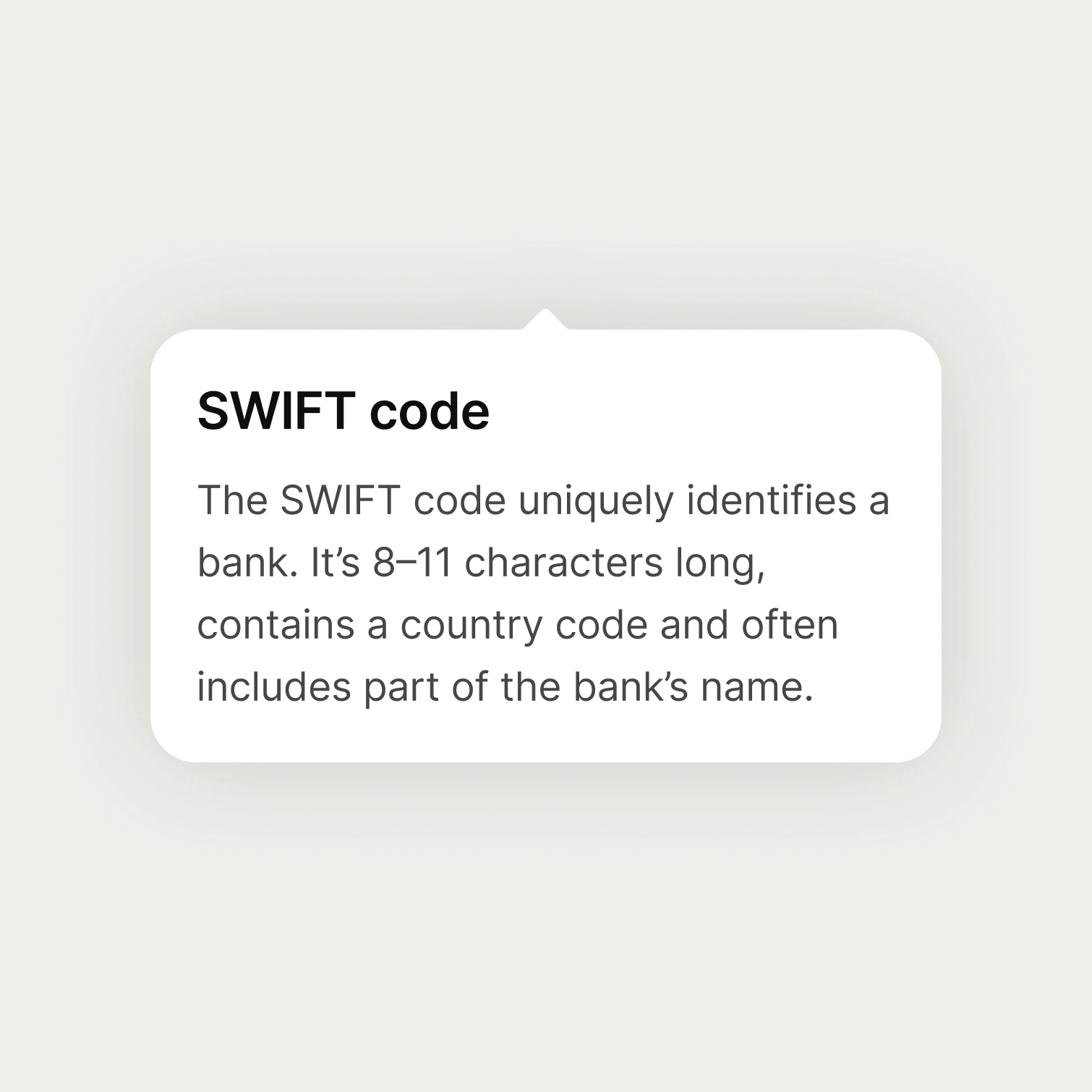
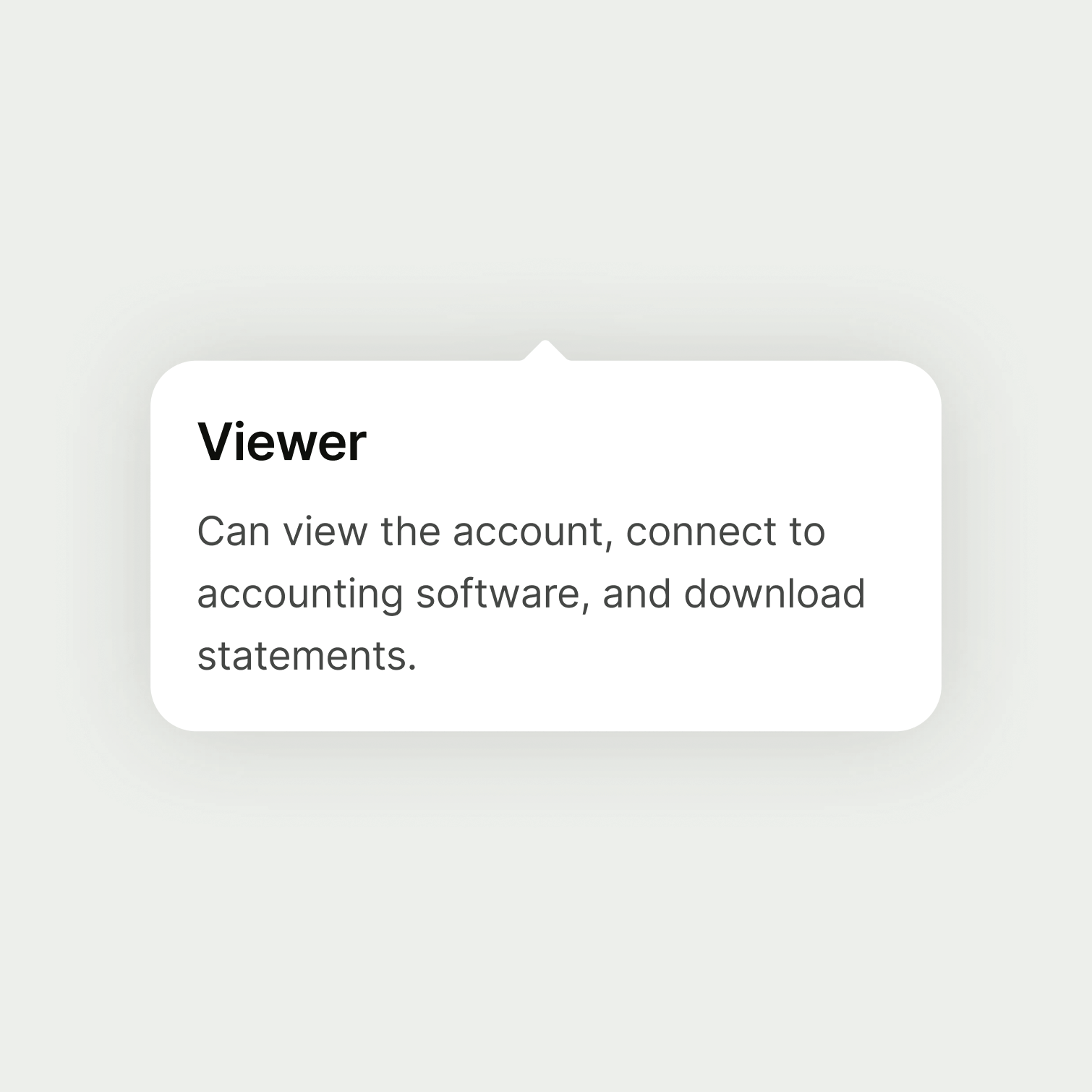
A popover which defines a term.

This content defines a term some users might not know. And those who already know what a SWIFT code is don’t need to read it.

A popover that contains crucial information for the user.

This content shouldn’t be in a popover because it’s essential for the user to complete their task.

Title (optional)

Don’t include a title unless you are using the popover to define a term or phrase.

Title copy should:

  • be the same as the term or phrase you’re defining

  • be sentence case, unless the term has its own capitalisation rules — for example, Direct Debit always has a capital D for Debit because it’s a scheme name

  • have no full stop

A popover with a title, as the content defines a term.

Include a title for definitions.

A popover without a title, as it doesn't define a term.

Don't include a title for other messages.

Availability

Platform

Available

Developer documentation

Web

Web documentation