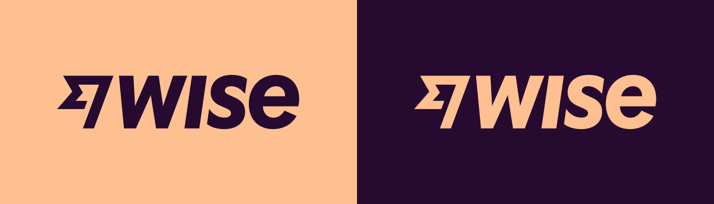
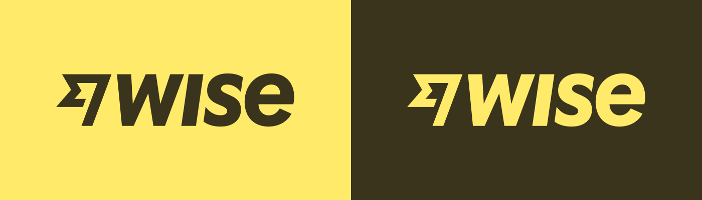
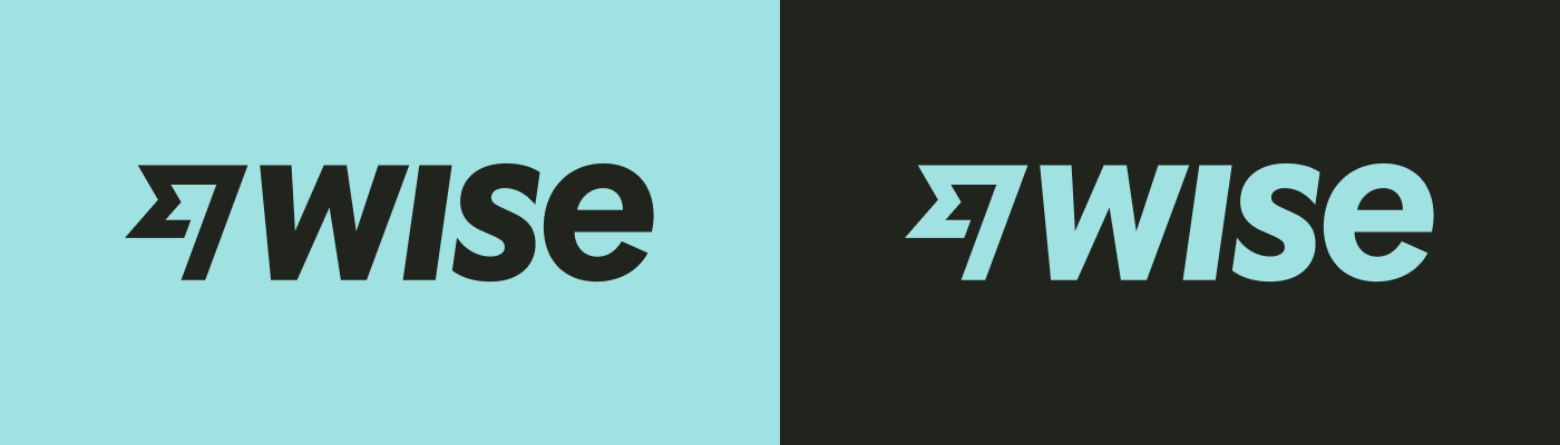
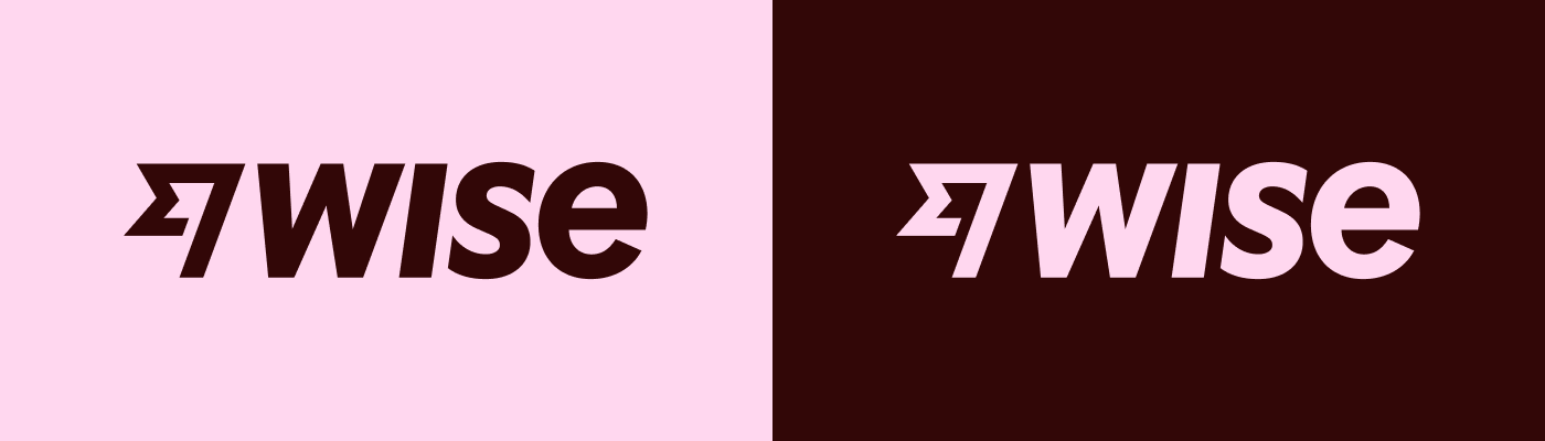
Primary colour versions
Colour is the first visual thing we remember, and a powerful asset in building brand recognition. Our colour is green. We use it first, last, and for nearly everything in between.
Go to colour guidance.
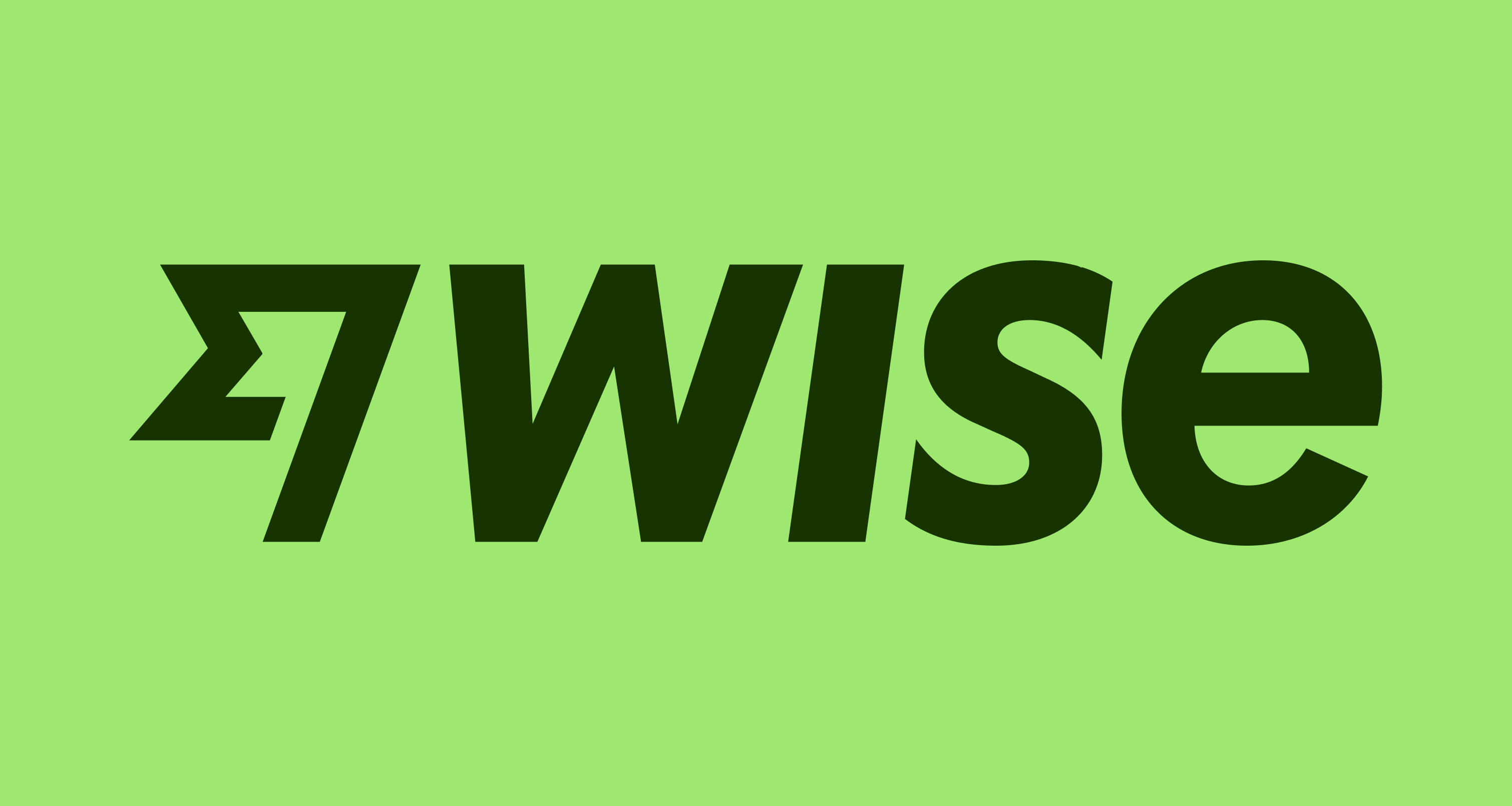
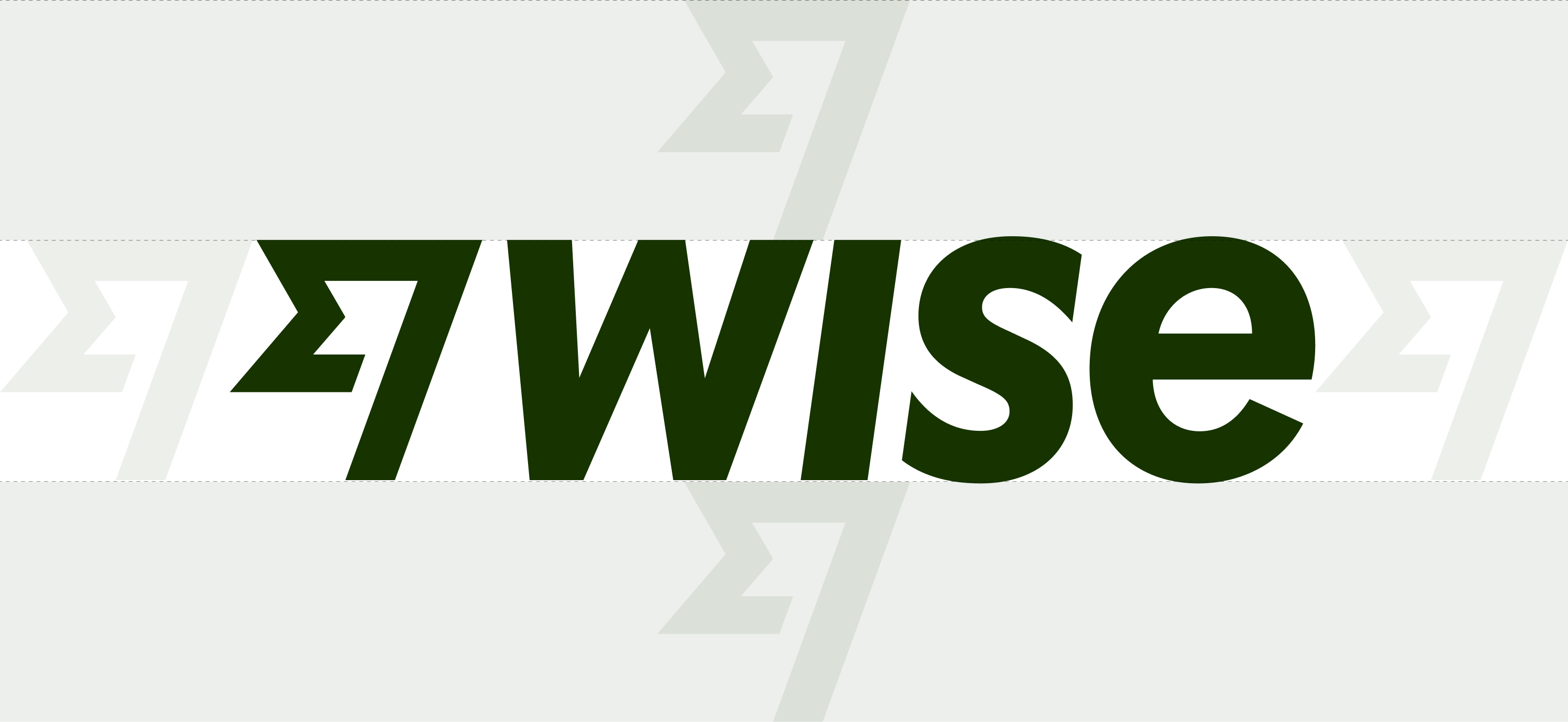
Our logo comprises the Wise wordmark and our Fast Flag. We can fly it just about anywhere. A mark of constant progress, it isn’t stuck to the borders that separate people. It brings us closer together.
Colour is the first visual thing we remember, and a powerful asset in building brand recognition. Our colour is green. We use it first, last, and for nearly everything in between.
Go to colour guidance.
When deep into a marketing application, you can also apply our secondary palette to our logo. If it feels appropriate.
When people see our Fast Flag, they know whoever they are, wherever they are, they can use money. To make sure it stays that way, we use it wisely in the right places.
There's been a lot of discussion about how big our Fast Flag should be. Here, it sits larger and more to the left than in any other context.
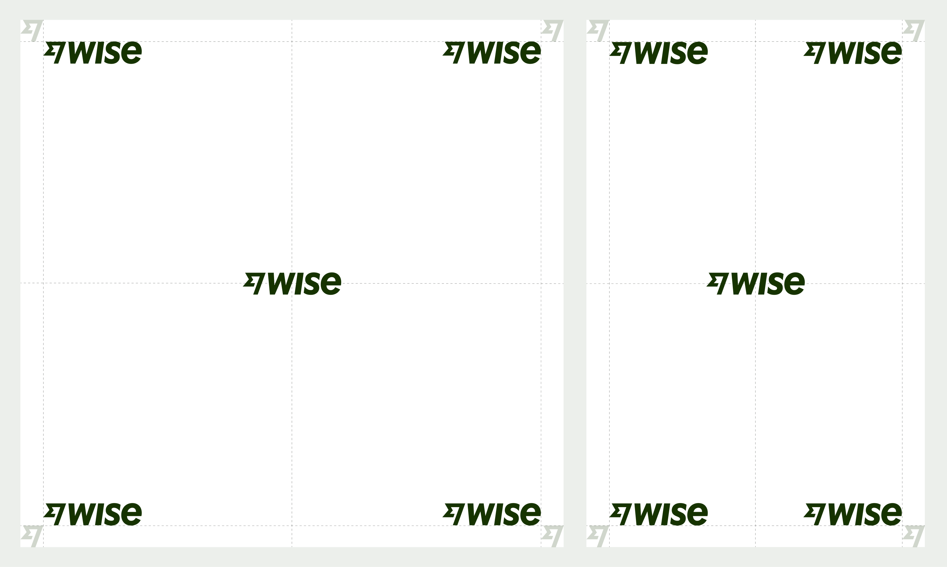
Money doesn’t need borders. Logos do. Ours requires one flag’s worth of clear space in all directions.
Minimum logo sizes
Print — 6mm high
Digital — 35px high
Placing our logo in the corner makes it nice and visible without taking up too much room, especially digitally. It can fly centrally though — just give it plenty of space and make sure it sits slightly to the left.
If you want to get somewhere fast, go alone. If you want to go far, go together. Our mission takes us around the world, so some strong partnerships are going to come in handy. Here’s how to let the world know who we work with.
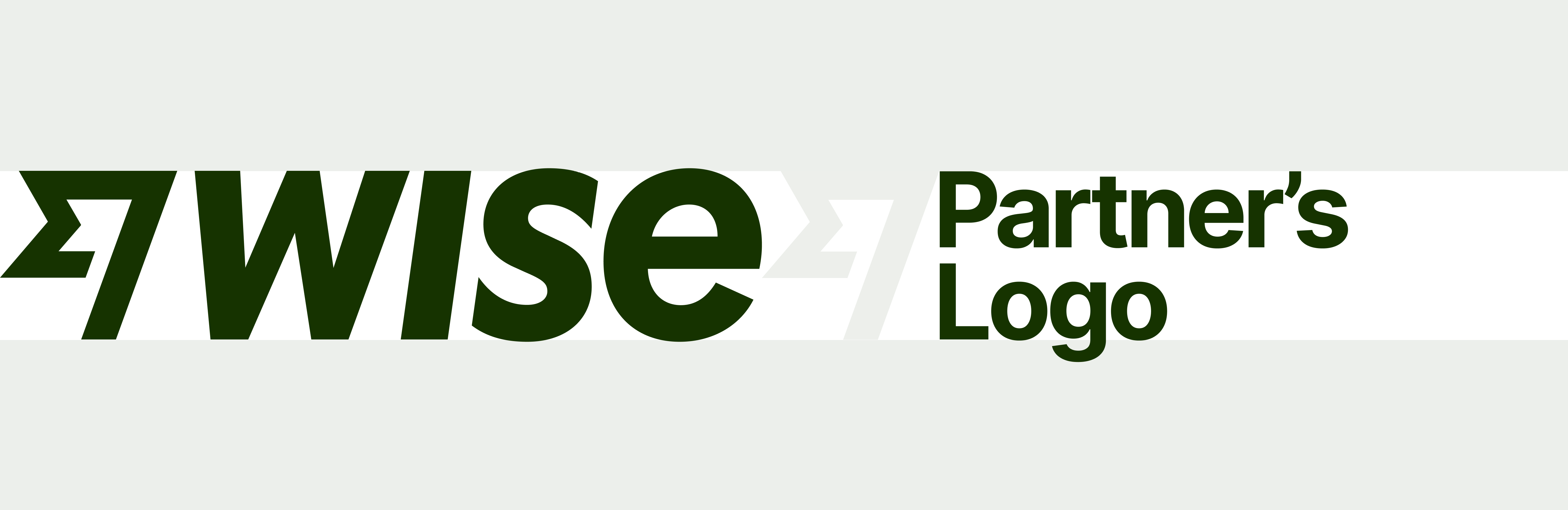
When we display a partner’s logo alongside ours, we set it at the same height as our Fast Flag so it’s nice and consistent. And we use its width to create a good amount of space between the two.
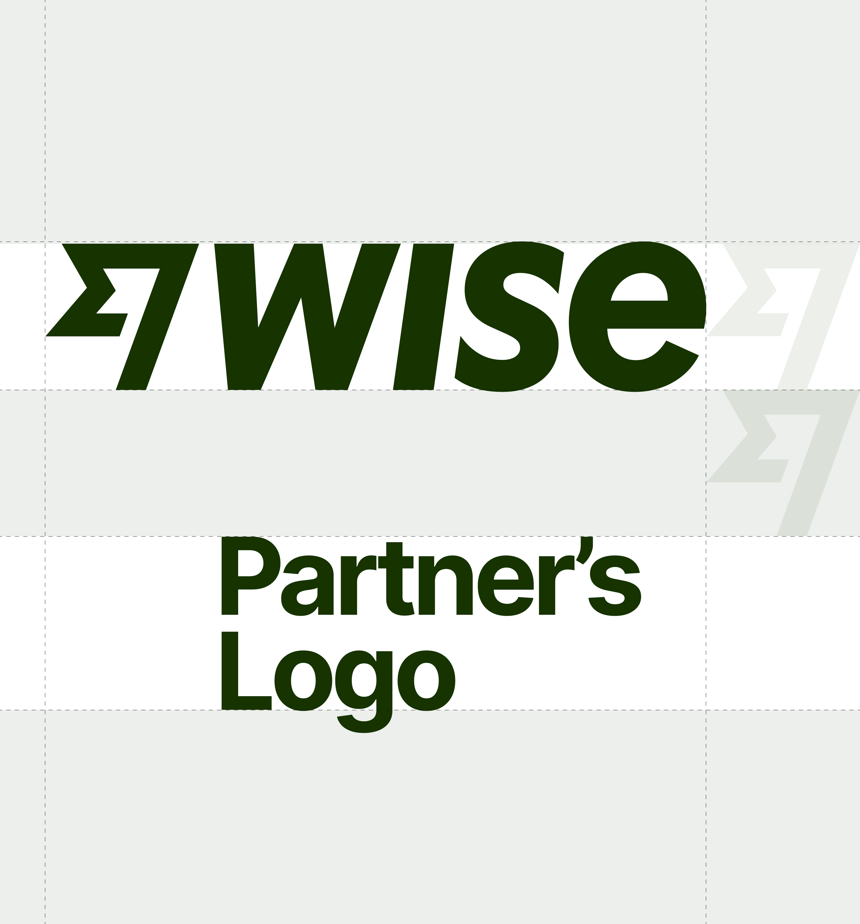
When we vertically stack a partner’s logo, they always go below us. We set their logo at the same width as ours. And we use the height of our Fast Flag to create the right amount of space between the two.
When it comes to type on tapestries, the first rule is always ensuring our logo is visible. To do that, we stick to white or Bright Green, and always make sure there’s plenty of contrast.
Go to tapestries guidelines.
Social avatar
In social situations, we never shout. So here the Fast Flag is a little smaller, while still sitting slightly to the left to make it optically central. It looks best that way.