When banks say no, green says go. It’s energetic and vibrant, just like the world we live in. And it’s our primary colour, supported by a lively secondary palette that’s as at home on buttons, as it is on billboards.
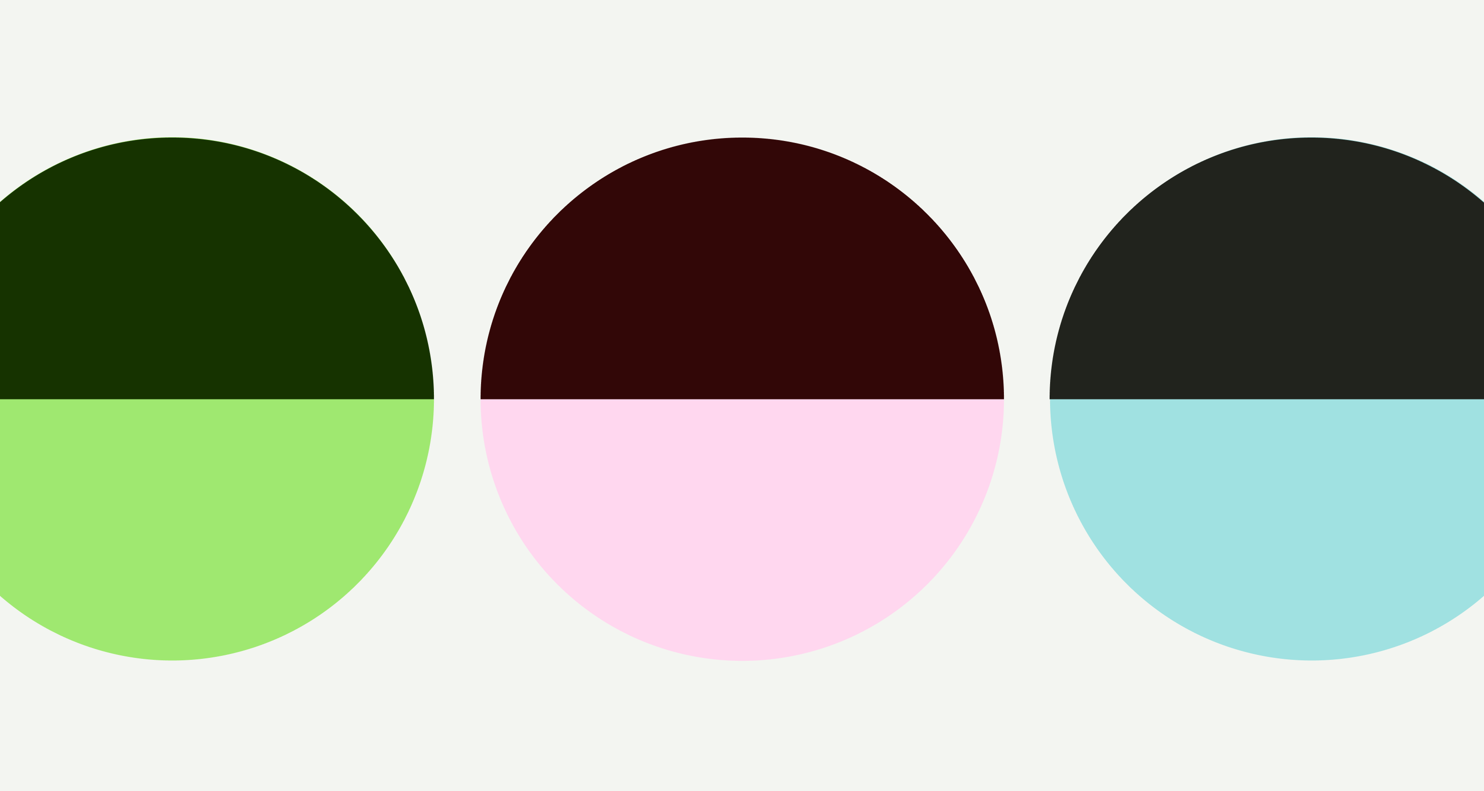
As far as the public’s concerned, Wise is green. But to us, it’s Bright Green, Forest Green, and white with an 8% Forest Green tint thrown in.
Being the global business that we are, our secondary palette is inspired by the vibrant and energetic colours found around the world.
The more we get to know people, the more we show our secondary palette. Think of it as a visual metaphor for getting closer, and more comfortable.
Using secondary colours
Always start and end with green. It’s our first impression and our bye for now.
But introduce the secondary palette when green is nicely established. So the further someone gets through say, an Instagram story, the more you can dial it up.
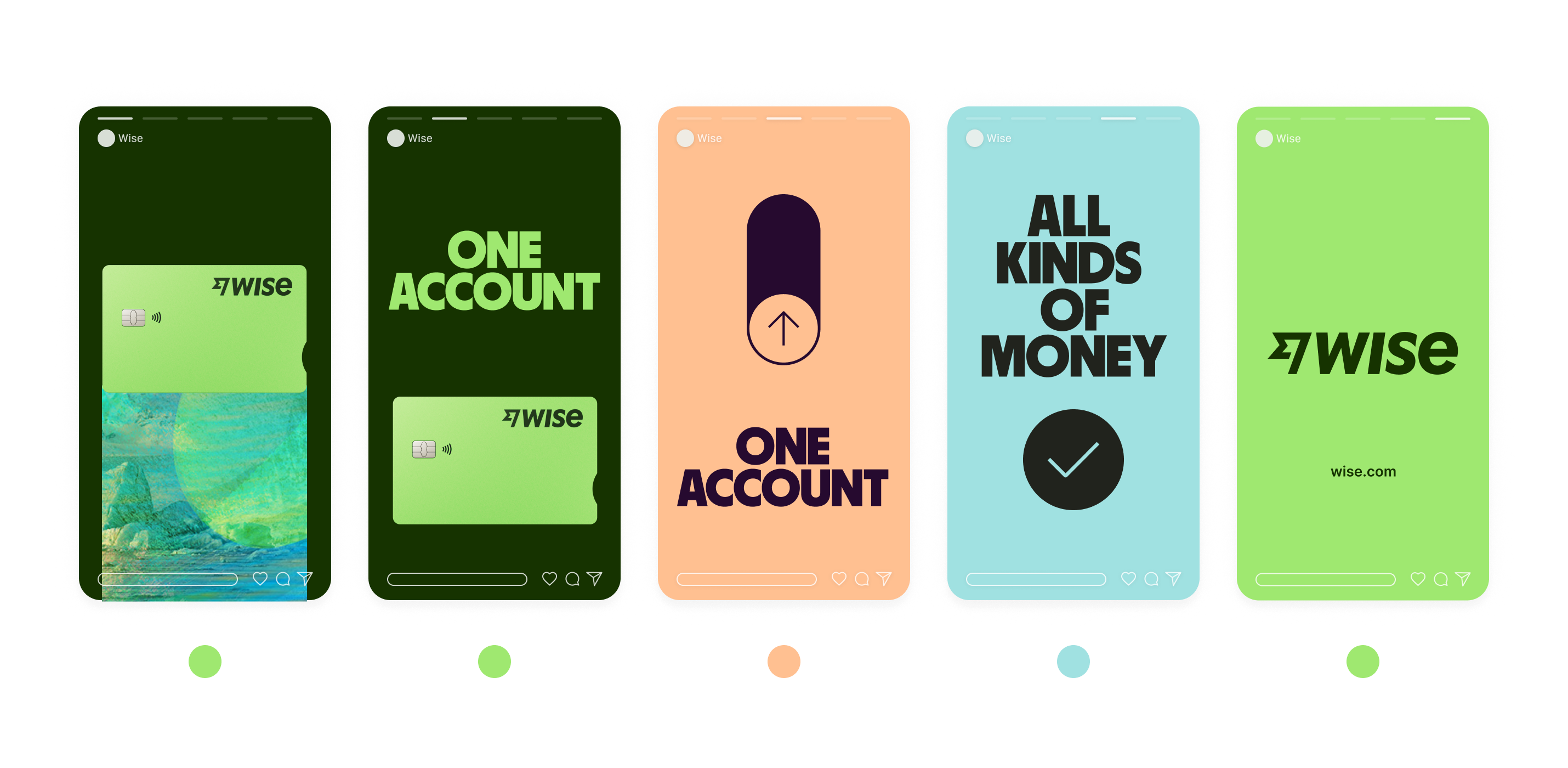
Logos in secondary colours
When deep into a marketing application, you can also apply our secondary palette to our logo. If it feels appropriate.


Our colour combos are purposefully complementary, striking, and accessible. They were made to match up, so let’s keep them that way.
Go to typography guidelines.
Good combinations
Bad combinations
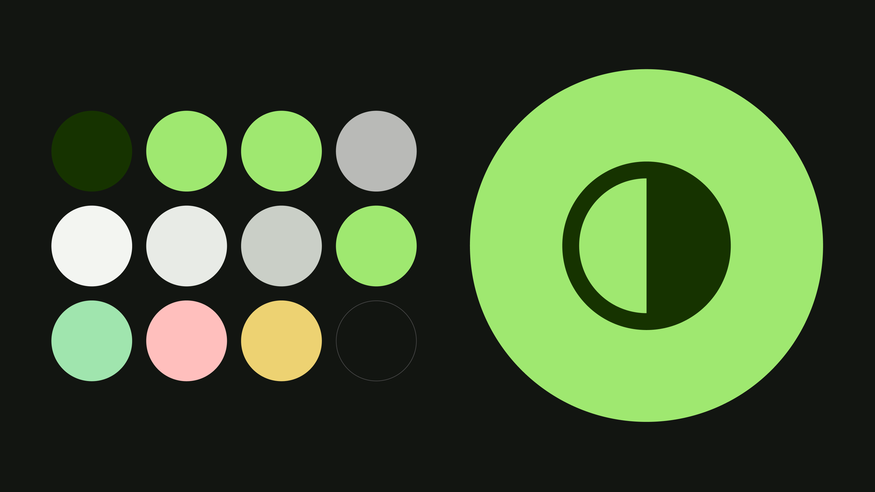
Content colours
Our content colours are based on neutral greys, with a small percentage of green. This creates a clear and accessible visual hierarchy, and makes us distinct by adding hints of our brand colours.
Interactive colours
Our interactive colours are used in interactive components and icons.
Primary and accent colours use the core brand colours to stand out. The secondary and tertiary colours are more neutral, to support the visual hierarchy of the screen.
Background colours
Background colours are used for larger surface areas that are light enough to be overlayed with content and other components.
Border colours
We use border colours to subtly separate different blocks of content.
Sentiment colours
Our sentiment colours are used to indicate positive, negative, or warning.
They're needed in components like alerts and error messages. But it's best to avoid using them elsewhere on screens where possible. If you need to emphasise text, it's better to use bold and the Content Primary instead.
Base colours
Base colours are useful colours that we can use in several different scenarios.
Colour balance in product screens
We’re not afraid of white space. White is the most prominent colour in our UI and we use it to let screens breathe. We complement the white with our neutral colour, which we use to add warmth and separate elements.
Next up are the content greys, followed by a smaller proportion of Forest Green for interactivity, plus an occasional pop of Bright Green as an accent.
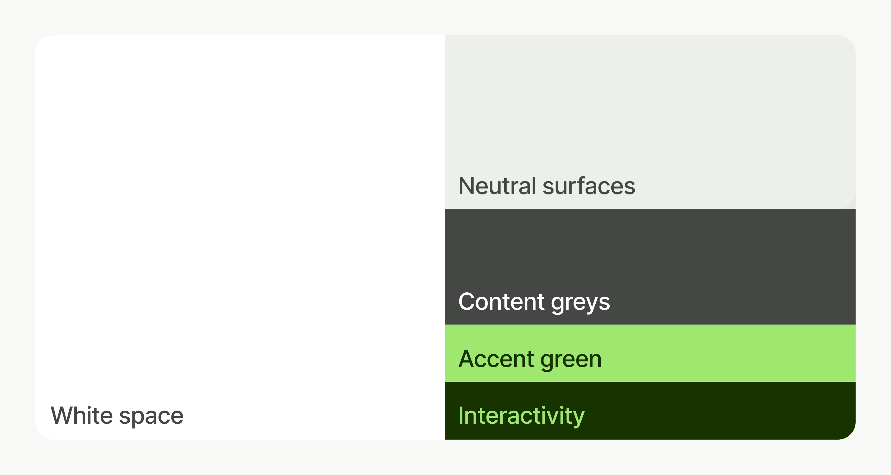
Our colours work equally well in dark mode.
Colours on Background Neutral
Name | Accessible | WCAG score | APCA score |
|---|---|---|---|
Content Primary | AAA | 95.5 | |
Content Secondary | AAA | 81.6 | |
Content Tertiary | Don't use | Don't use | |
Link | AAA | 90.30 |
Colours on white
Name | Accessible | WCAG score | APCA score |
|---|---|---|---|
Content Primary | AAA | 105.6 | |
Content Secondary | AAA | 91.7 | |
Content Tertiary | AA | 105.6 | |
Link | AAA | 100.35 |