Icons

They say a picture paints a thousand words. Well, our icons do that too. They're the ultimate shorthand — straightforward, simple, accessible.

Home icon and globe icon side by side.
Approach
Minus icon.
Less is more

Solid lines, simple shapes, no unnecessary parts. Easy as that.

Eye icon.
Universally understood

We’re not trying to reinvent the wheel (icon). Clarity trumps clever concepts, especially for a global audience.

Collapse icon.
A perfect pairing

The icons are designed to complement our 2 typefaces — Wise Sans and Inter.

They feature the same rounded corners of Wise Sans, the cleaner form and light weights of Inter, and the square terminals of both.

Choosing the right asset

Our assets each come with their own set of strengths. So we’ve outlined which asset to use where. And what the impact of that will be.
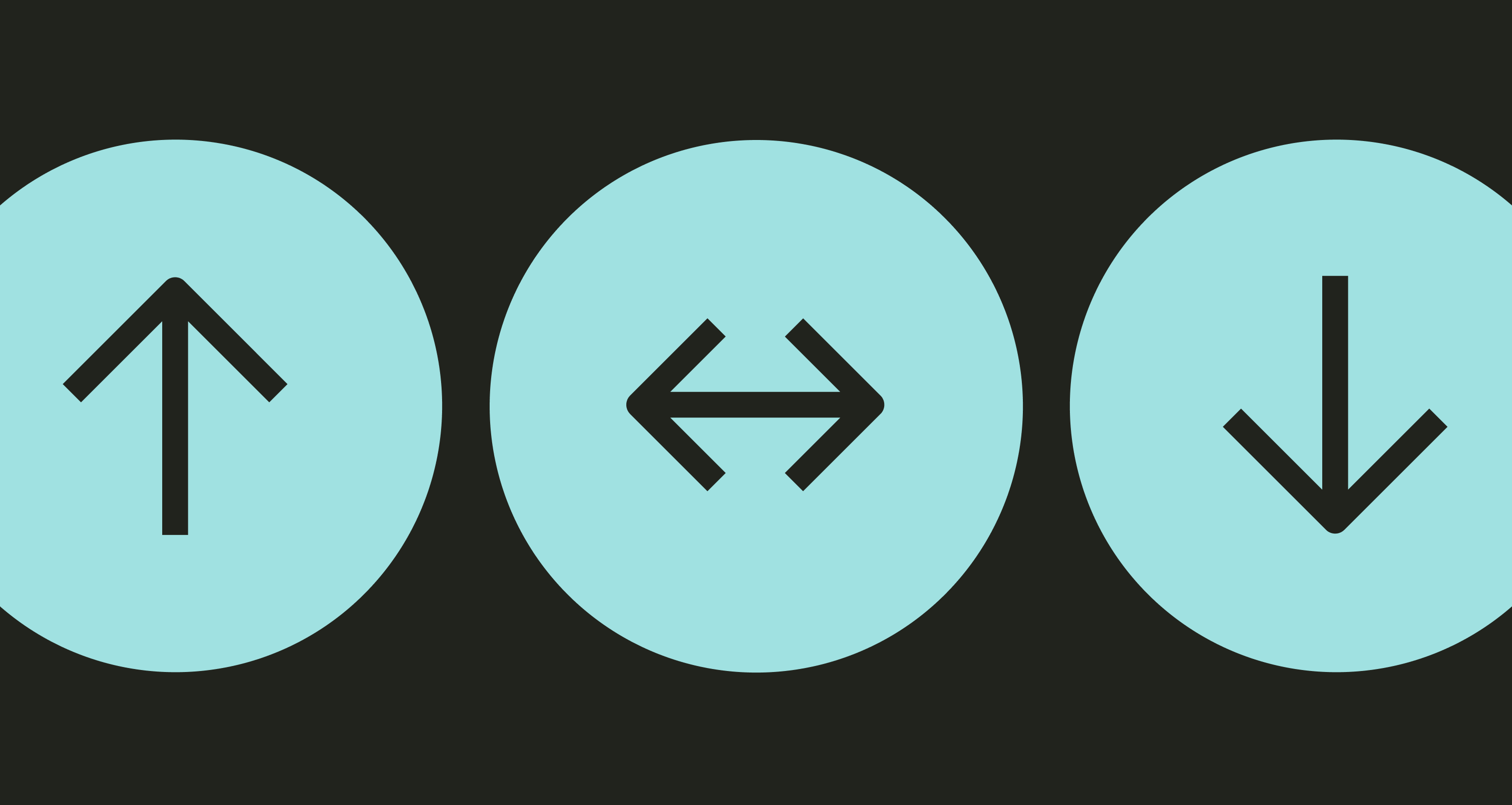
An icon of two arrows pointing in different directions horizontally, one on top of the other
Icons

If you’re talking about product functions, or there are multiple products on one screen, use icons.

A multi-color twirling ribbon with confetti behind it
Illustration

If it’s a moment of celebration, something metaphorical, or just something bigger on screen, use an illustration.

The words Riyal to Real Really Fast on a yellow background with lots of custom glyphs
Words

Finally, if you’re after a change of pace, or it’s more easily said than done, just use words.

Colour variations

In most cases, icons sit on neutral backgrounds. And the icon colour depends on whether it is interactive or informational.

There is also a white version designed to work against a neutral surface. The bright green background is used very sparingly.

Go to colour guidance.

Beach icon
Interactive

For interactive elements like close buttons we use Forest Green (Interactive Primary) on a neutral background.

Freeze icon.
Informational

For informational icons in lists, like in option components, use Content Primary on a neutral background.

Beach icon.
White background

For use on neutral backgrounds, there is an alternative version with a white circular background.

Beach icon highlighted in green.
Highlight

Bright Green backgrounds are used very sparingly to highlight — whether it’s a button or the selected category in a list.

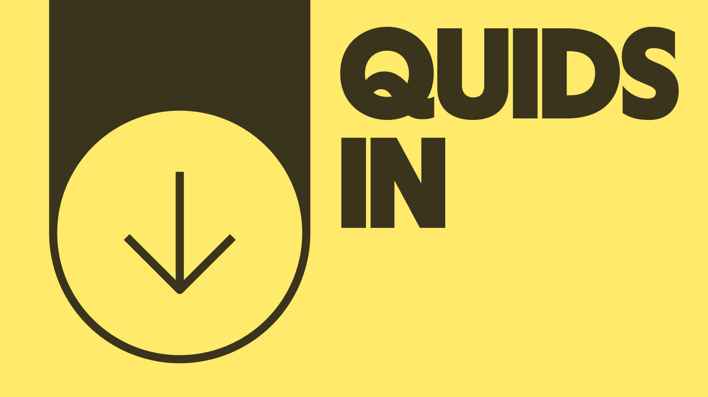
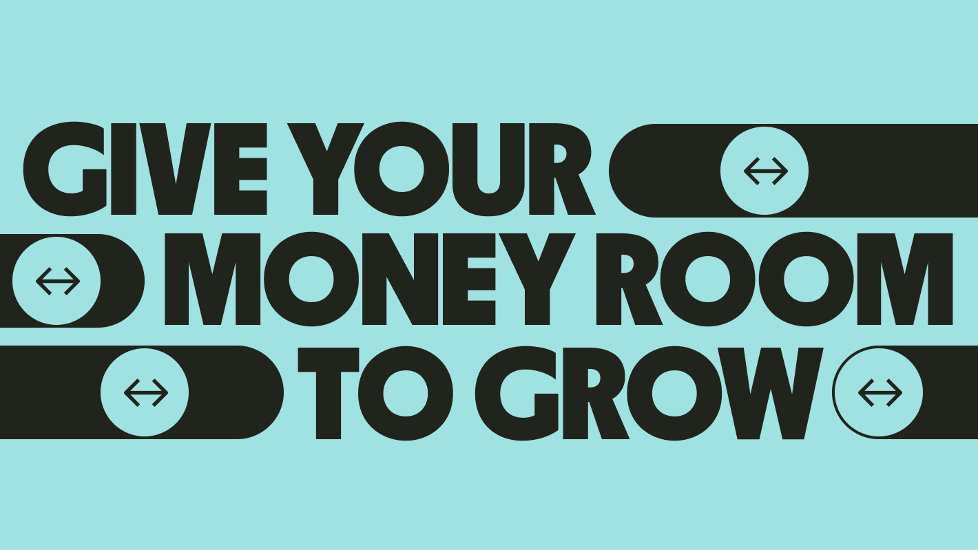
Using icons expressively

Icons can be used outside of their functional boundaries to communicate key features in a far more expressive manner.

Expressive arrow
Key feature icons
Send icon
Send

This icon symbolises sending money to others worldwide.

Receive icon
Receive

Knock, knock, your money’s here. This icon symbolises receiving money straight to your account.

Convert icon
Convert

Real rates. Quick speeds. Fair fees. 
This icon symbolises converting money between different currencies.

Spend icon
Spend

Dollar isn't the default — we want to speak to our customers in their own currency. So we have a set of currency icons for the currencies we support.

Keep icon
Keep

Have 54 currencies on hand? This icon symbolises holding onto them.

Invest icon
Invest

Time to put your money to work. This icon symbolises investing your money with Wise.

Best practice

A receive icon next to text that reads "Quids In".

Key feature icon used in appropriate message.

A few convert icons surrounding copy that reads "Give your money room to grow".

Key feature icon used as decorative graphic.

Sizing

We have two different sizing rules for product and marketing.

Icon sizes in product
Product

In product you can use icons at 16px, 24px and 32px.

Icons sizes for marketing
Marketing

In marketing you can use icons at 16px, 24px, 48px, 64px and 96px.

Full library